Overview
I was stuck earlier this month trying to cajole Tableau into doing something I needed it to do so I contacted my friend Joe Mako. When it comes to Tableau, Joe is the “guru’s guru.” (Joe was the person that showed me how to create filled maps in Tableau before Tableau had native support for this. See https://www.datarevelations.com/tracking-stds-hiv-and-aids-in-texas.)
Joe did in fact have a very slick solution to my problem and I will probably write about in a future post but I would rather focus on a broader issue that came about when Joe commented on a visualization I had on my screen.
Vertical Scatterplot
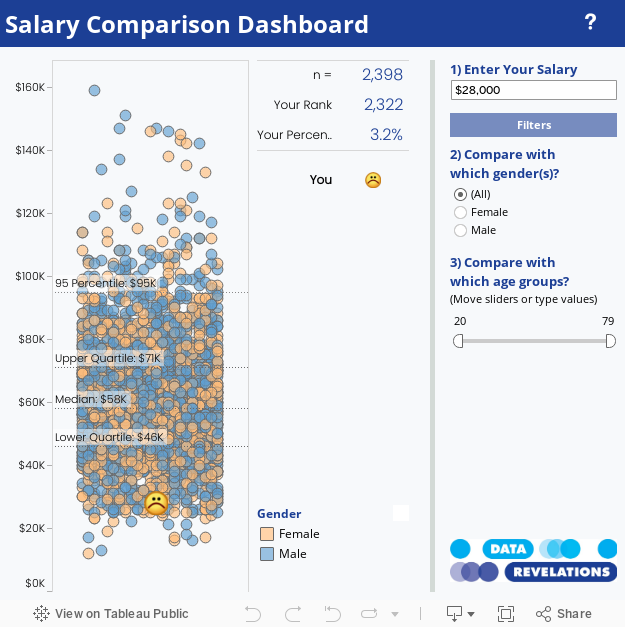
Consider the image below which readers may recall from a post I did awhile back on getting people to care about your viz.

The size of the circle corresponds to number of respondents reporting a salary close to the amount shown.
The red circle shows “your” salary and the other circles show the salaries of everyone else that responded to the survey. The size of the circle indicates the number of respondents that reported earning a particular salary.
There are a number of problems that I had with this approach, the biggest being that I had to group / bin salary amounts so that similar amounts would yield bigger circles. That is, I would run into troubles with salary amounts like these…
$50,150
$50,200
$49,750
… as they would yield three separate small circles instead of one larger circle.
Here’s what the visualization looks like if you plot a circle for each response ID and don’t size the circles based on number of occurences of a particular salary value.

A vertical scatterplot with too many dots.
Our problem is that we cannot glean the clustering as we have so many marks that are stacked in a single column.
Cue the Violins
Joe, who in addition to Tableau expertise is a font of generalized visualization knowledge, asked if I had ever heard of a violin plot (I had not). He then pointed me to this blog post.
In addition to the violin plot, the post discussed “jittering” marks so that you spread dots both horizontally and vertically, like this:

“Jittering” the scatterplot
Joe pointed out that producing this jitter effect was very simple in Tableau. You just need to create an x-y chart where the y-axis contains the salary for each respondent and the x-axis displays the index value (the row number) for the particular response. Interestingly, it is because there is no relationship between the response ID and the salary value that the INDEX() function essentially randomizes the responses and scatters marks across the x-axis. If you were to sort the IDs by salary you would get an interesting chart, but one that makes the clustering harder to see.

You say potato and I say “Pareto”
Creating the Visualization
The screen shot below shows the main components that go into the visualization. We have placed the INDEX() function on the Columns shelf and AVG(Salary) on the Rows shelf (note that it will work fine with SUM or even without an aggregation).

Notice that we are coloring by Gender and that ID is on the Level of Detail
Note that ID is on the level of detail. This is what produces a separate circle for each salary respondent. We also Compute by ID in the Index() table calculation.

Compute using ID
The only thing left to do is resize the visualization so that it is very narrow.
Here’s the Tableau dashboard showing both the “jittered” scatterplot and your salary as a separate dot.
(I will leave it as an exercise for the reader to download and see how to display the dot.)