
Overview
My obsession with finding the best way to visualize data will often infiltrate my dreams. In my slumbers I find myself dragging Tableau pills in an ongoing pursuit to come up with the ideal dashboard that shines light on whatever data set has invaded my psyche.
But is the pursuit of the perfect dashboard folly?
Probably, as I’ll explain in a minute, but I don’t want to suggest anyone not at least try for the clearest, most insightful and most enlightening way to display information.
Is this way is the best way?
This pursuit of the ideal chart preoccupies a lot of people in the data visualization community. Consider this open discussion between Stephen Few and Cole Nussbaumer Knafflic that transpired earlier this year.
As you will read, Few weighs in on Knaflic’s book Storytelling with Data and her use of 100% stacked bar charts. He cited this particular example.
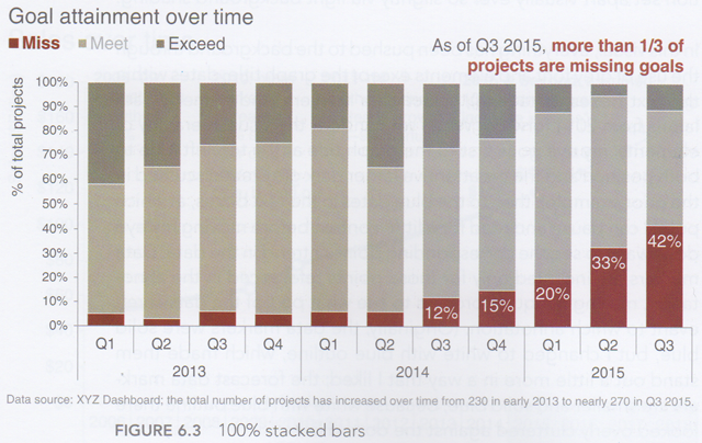
Figure 1 — Knafflic’s 100% stacked bar
Few argued that there was a better approach and that would be to have a line chart with a separate line for each goal state.

Figure 2 — Few’s line chart
Having written about visualizing sentiment and proclivities, I chimed in suggesting that a divergent stacked bar chart would be better (see Figure 3.) I think this presents a clearer and more flexible approach, especially if you have more than three categories to compare as the 100% stacked bar chart and line chart can become difficult to read.
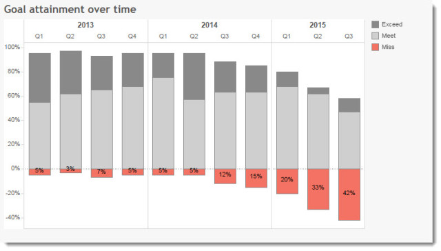
Figure 3 — My divergent stacked bar chart
The ongoing public discussion was engaging and congenial but I’ve seen similar cases where one or more of the parties advocating a solution become so certain that his / her approach is without a shadow of a doubt the only right way to present the data that tempers flare high. Indeed, I’ve seen instances where some well-respected authors have declared a type of “Sharia Law” of data visualization and have banned so-called heretics and dilettantes from leaving comments on blogs and even following on Twitter!
My take? While I prefer the divergent stacked bar, the real question is whether the intended audience can see and understand the data. In this case, if management cannot tell from any of the three charts that there was a problem that started in Q3 2014 and continued for each quarter, then that company has some serious issues.
In other words, if the people that need to “get” it can in fact make comparisons, see what is important, and make good decisions on their new-found understanding of the data — all without having to work unnecessarily hard to decode the chart — then you have succeeded.
I’m not saying don’t strive to be as efficient , clear, and engaging as possible, it’s just that the goal shouldn’t be to make the perfect chart; it should be to inform and enlighten.
And in this case I think all three approaches will more than suffice. So stop arguing.
Understanding and educating your audience
Earlier this year I got a big kick out of something that Alberto Cairo retweeted:
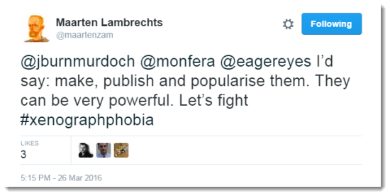
Figure 4 — Avoid Xenographphobia: The fear of unusual graphics / foreign chart types.
Xenographphobia! What a wonderful neologism meaning “fear of unusual graphics.”
So, why do I bring this up? While it’s critical to know your audience and not overwhelm them with unnecessary complexity, you should not be afraid to educate them as well. I’ve heard far too often people proclaim “oh, our executive team will never understand that chart.”
Really? Is the chart so complex or the executive so close-minded that they won’t invest a little bit of time getting up to speed with an approach that may be new, but very worthwhile?
I remember the first time I saw a bullet chart (a Stephen Few creation) and thought “what is this nonsense?” It turns out it wasn’t, and isn’t, nonsense. It took all of 60 seconds for somebody to explain how the chart worked and I immediately saw how valuable it was.
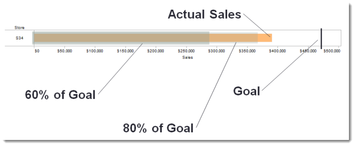
Figure 5 — A bullet chart, explained.
I had a similar reaction when I first heard about jump plots from Tom VanBuskirk and Chris DeMartini. My thoughts at the time were “oooh… curvy lines. I love curvy lines! But I suspect this is a case where the chart is too much decoration and not enough information. I bet there are better, simpler ways to present the data.”
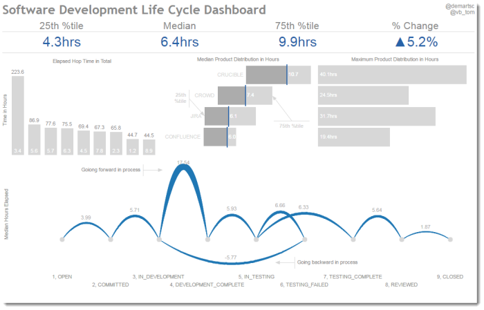
Figure 6 — Jump plot example. Yes, these are very decorative, but they are also wickedly informative.
Then I spent some time looking into the use cases and came to the conclusion that for those particular situations jump plots and jump lines worked really well.
That said, there are some novel charts that I don’t think I will ever endorse, with the pie gauge being at the top of my list.
Figure 7 — The pie gauge, aka, a donut chart within a donut chart, aka, stacked donut chart. I won’t go into the use case here but a bullet chart is a much better choice.
So, what should we do?
I’ve argued that you should always try to make it as easy as possible for people to understand the data but you should not go crazy trying to make the “perfect dashboard.”
I also argue that that while you should understand the skillset and mindset of your audience, you should not be afraid to educate them on new chart types, especially if it’s a “learn once, use over and over” type of situation.
But what about aesthetics, engagement, and interactivity? What roles do these play? Is there a set of guidelines or framework we should follow in crafting visualizations?
Alberto Cairo, in his book The Truthful Art, suggests such a framework based on five key qualities.
I plan to write about these qualities (and the book) soon.


