April 2, 2018
Overview
Followers of the Data Revelations blog and website know that my “go to” visualization for Likert scale data is a divergent stacked bar chart.
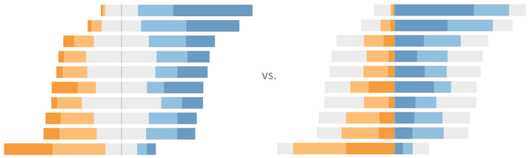
Earlier this year there was some debate about whether this is a better approach than a stacked bar chart. I’m still completely in favor of the divergent approach, but after reading some great arguments from Friedrich Hartmann and a stunning article from Daniel Zvinca, I think placing the more polarized views in the center and the neutrals on the outside makes a great deal of sense.
In this blog post I will explain how to build this stronger-views-in-the-center divergent stacked bar chart but before I do I encourage you to read Daniel’s article.
Note: To review my take on showing sentiment and why I like divergent stacked bar charts, click here. if you want to know how to build a divergent stacked bar chart where the neutrals are in the center, click here.
Understanding our data
What are we visualizing?
Before we get too deep, let’s see how our data has been encoded.
The figure below shows a snipped of the Satisfaction Likert-scale question. Note that the scale goes from 0 to 4 where a value of 2 is neutral.
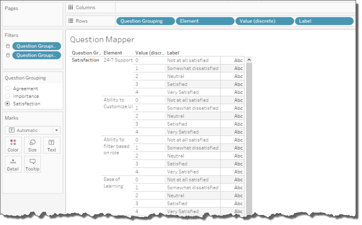
Figure 1 — How the Satisfaction question is coded.
Positives and Negatives
We are going to create two calculated fields, one showing the percentage of positive-sentiment values and showing the percentage of the negative-sentiment values. We will then create a dual-axis chart that shows the two measures together.
Before we tackle this we need to create a calculated field that figures out how many positive values there are. Here’s how we’ll define [Count Positive]:
IF [Value]>2 then 1
ELSEIF [Value]=2 then .5
ELSE 0
END
The English translation might be “if [Value] is greater than 2 then it’s positive, if it equals 2 then it’s half positive.”
Here’s the definition of [Count Negative]
IF [Value]<2 then -1
ELSEIF [Value]=2 then -.5
ELSE 0
END
At this point we could just place these measures on Columns, [Element] on Rows and [Label] on Color, make it a dual axis chart and we’d have something bordering on useful, as shown below.
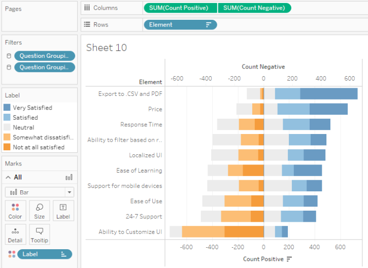
Figure 2 — First try at a divergent stacked bar chart with more concentrated values in the middle. The legend is going to be a problem.
Percentages, not counts
Our goal is to show the percentage of respondents, not counts. Here’s the calculated field that will give is the Positive Percentages:
SUM([Count Positive]) /
SUM({Exclude [Label]:SUM([Number of Records])})
This tells Tableau to add up all the positive values for each Label (Very Satisfied, Satisfied, etc.) and divide by the total number of responses. We use the {Exclude} Level-of-detail expression so that we get the total for all responses and not just for each Label.
The calculated field for Negative Percentage is similar.
SUM([Count Negative])/
SUM({Exclude [Label]:SUM([Number of Records])})
Here’s the dual axis chart rendered using the new calculated field.
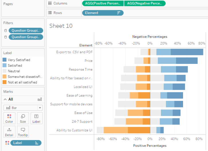
Figure 3 — A divergent stacked bar chart using percentages.
Note: You may be wondering why I went with a dual axis chart instead of a Measure names / Measure values construct. The latter would certainly work, but when I tried it I ran into some difficulties with mark labels as I wanted all the labels to be positive even though I had negative values. My OCD was more easily placated with the dual axis approach.
Ordering the segments
We need to reorder the elements so that the neutrals are on the outside and the more concentrated opinions are on the inside. This required re-jiggering the color legend as shown below.
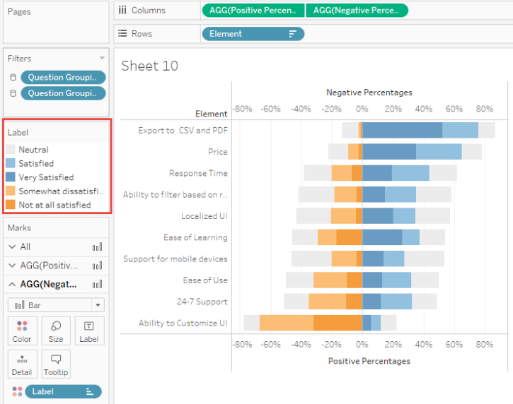
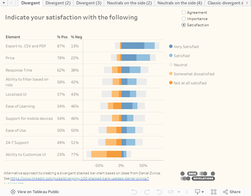
Figure 4 — Divergent stacked bar chart with elements in the right order but with a confusing color legend.
Important: We’ll address the legend confusion in a moment, but make sure that the dual axis chart is synchronized by right-clicking the secondary axis and selecting Synchronize. Without synchronizing you’ll see a bad distortion if many of the values skew positive or negative. Here’s how it should look:
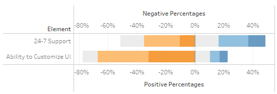
Figure 5 — With synchronization.
And this is what it looks like without synchronization:
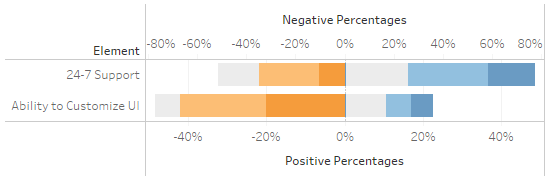
Figure 6 — Without synchronization.
Rolling your own legend
The biggest problem people have with this “outside in” divergent stacked bar is that the colors aren’t arranged in sequence from most negative to most positive. I was able to adjust quickly and now prefer this arrangement but I recognize that my audience might struggle with it so I would either have to spend a little time on education or go with the standard divergent stacked bar chart I’ve recommend in the past.
So, while I am fine with the neutrals on the outside approach, I have a lot of trouble with the seemingly random arrangement of the color legend. One solution is to build a secondary visualization that looks and functions like a regular legend, which I show below.
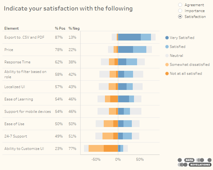
Figure 7 — Divergent stacked bar chart with a secondary visualization that serves as a color legend. The dashboard uses action filters so clicking a color in the “legend” will highlight the applicable portion in the main visualization.
Other considerations
Adding a histogram
While the divergent stacked bar chart allows for an easy comparison across different elements (i.e., we can see that Price in the second row is about half as “negative” as Localized UI in the fifth row) it’s hard to make a comparison within an element; that is, it’s difficult to determine how much large the Very Satisfied bar is compared to the Satisfied bar in any of the rows.
In Chapter 16 of The Big Book of Dashboards my fellow author Jeffrey Shaffer suggests adding a histogram to see the within-a-row comparisons.
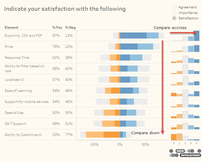
Figure 8 — Divergent stacked bar chart with histograms showing distribution.
Dan Zvinca points out that the small histograms may be difficult to read. Indeed, I was constrained by my desire to fit all of this into a small dashboard. One possible solution would be to use a visualization in a tooltip, as shown below.
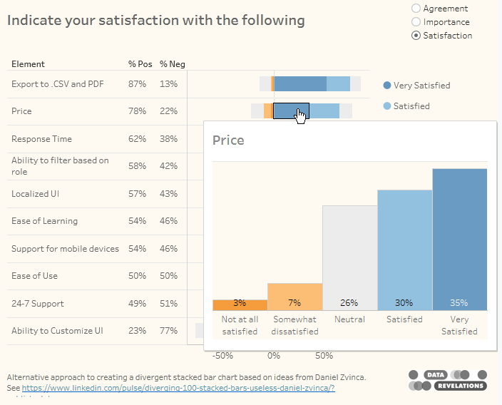
Figure 9 — Showing the distribution within an element using a tooltip. I’m not sure how I feel about the thick bars, but it certainly works.
Combining all the positives and negatives
Do we need to have to degrees of positive sentiment and two degrees of negative? I think the beauty of Zvinca’s recommended approach is that it’s easy to compare both very positive and overall positive sentiment as well as very negative and overall negative sentiment. But if you want to combine responses it’s easy to do, as shown below.
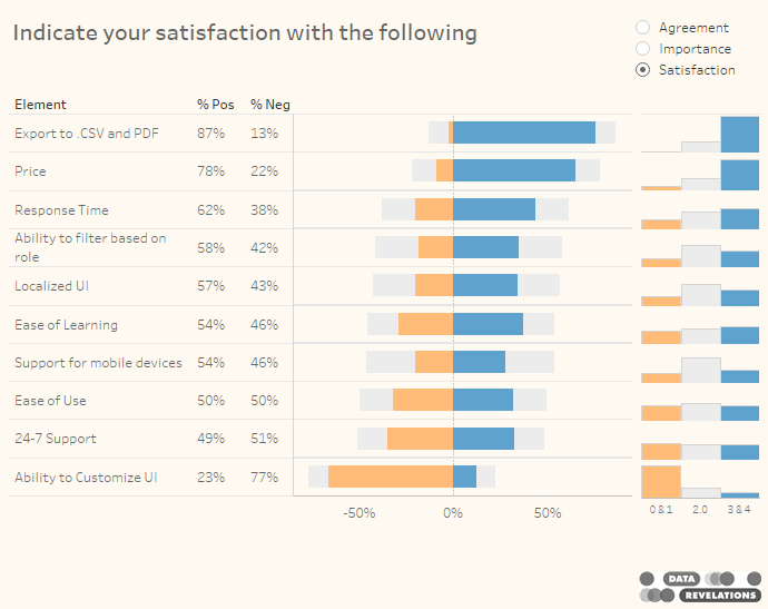
Figure 10 — Divergent stacked bar chart with histograms showing three degrees of sentiment
Focusing on the Neutrals
As I’ve written previously, sometimes the most important story is in the neutrals and having them be half-positive and half-negative may hide their importance. Consider the chart below where we place the neutrals in their own column.
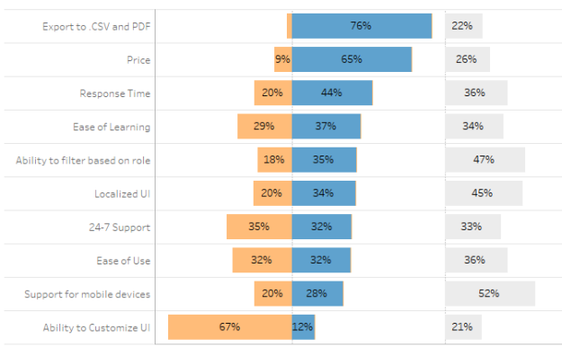
Figure 11 — Segregating the neutral values allows us to see where people are ambivalent.
Here we can see that 52% of people responding to the question about Support for mobile devices (second from bottom) are ambivalent about satisfaction whereas people have very strong views about the top row and bottom row.
Final thoughts
While I’ve bought into this approach I will need to run it by my clients. While they will probably all need a little convincing I think most of them will see the benefits of using the neutral, negative, strong negative, strong positive, positive, neutral approach.
I’ve embedded some sample dashboards below. Please try them and feel free to download.
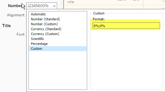
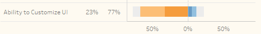
Postscript: I suspect some folks are going to have a problem with the axis having negative numbers. I don’t have a problem as it aligns with my concept of negative sentiment vs. positive sentiment, but if it bothers you (or your audience) you can use a custom number format and have all positive numbers, as shown here.