Much thanks to Susan Ferrari for exposing me to the concept of Net Promoter Score, Susan Baier for encouraging me to blog about it, and Helen Lindsey for providing anonymized NPS data.
Overview
My wife and I recently went out to a restaurant to celebrate our anniversary. Accompanying the check was a survey card with three questions, one of which looked like this.

Figure 1 — The classic Net Promoter Score question
We both agreed that the restaurant was very good, if not excellent, and that we would indeed recommend it to friends. My wife suggested we circle the “8”.
I told her that if we were enthusiastic about recommending the restaurant we should give it a “9” as a 7 or 8 would be tabulated as a “neutral” or “passive” response.
She looked at me quizzically and asked why an “8” would be considered neutral.
I then explained how the Net Promoter Score works.
Understanding the Score
Respondents are presented with the question “Using a scale from 0 to 10, would you recommend this product / service to a friend or colleague?”
- Anyone that responds with a 0 through 6 is considered a Detractor.
- Anyone that responds with a 7 or 8 is considered a Passive (or Neutral).
- Anyone that responds with a 9 or 10 is considered a Promoter.
The Net Promoter Score (NPS) is computed by taking the percentage of people that are Promoters, subtracting the percentage of people that at Detractors, and multiplying that number by 100.

Figure 2 — How to compute NPS, courtesy B2B International.
If you are like me (and my wife) you’re probably thinking that a “6” is a pretty good score and that it shouldn’t be bunched among the detractors.
I’m not going to get into a debate about NPS methodology and its usefulness, but I do want to show you some good ways to visualize NPS data.
The Problem with the Traditional Presentation
Consider this snippet of NPS survey data with responses about different companies from people in different roles.

Figure 3 — Raw NPS data about different companies from people with different occupations.
If we just focus on the NPS and not the components that comprise the NPS we can produce an easy-to-sort bar chart like the one shown here.
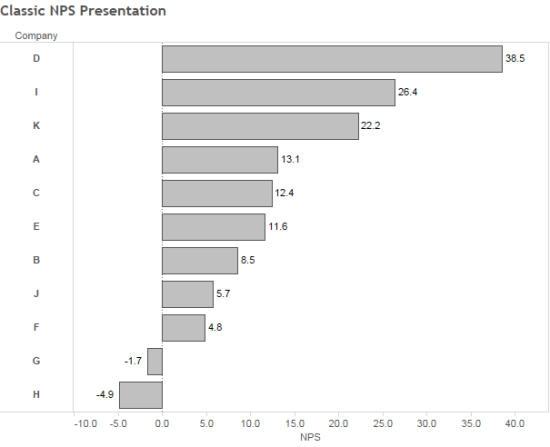
Figure 4 — Traditional way to show NPS
Yes, it’s easy to see the company D has a much higher NPS than company H, but by not showing the individual components – and in particular the Neutrals / Passives – we’re missing an important part of the story as the Neutrals / Passives are right on the cusp of becoming promoters.
For example, a Net Promoter Score of 40 can come from
- 70% Promoters and 30% Detractors
- 45% Promoters, 50% Passives, 5% Detractors
Same score, big difference in makeup.
An Alternative Approach to Displaying NPS Results
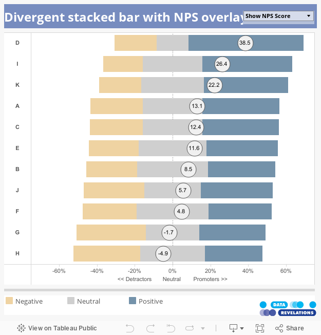
Consider the dashboard below which presents the data as a divergent stacked bar chart.
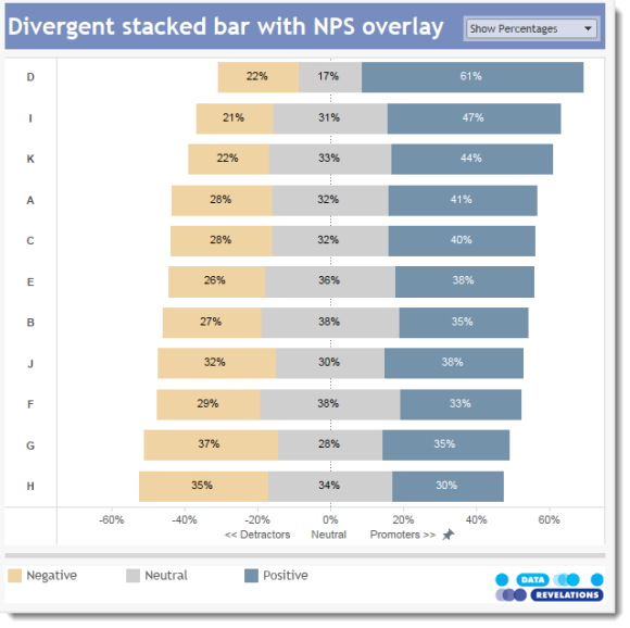
Figure 5 — NPS dashboard with toggle to show percentages and score.
The chart is easy to sort and you can also see that Company B and Company F have a relatively large group of Neutrals.
That said, being able to see the NPS score is very useful so the dashboard (see working version at the end of this post) has a toggle that switches between percentages and the score, as shown below.
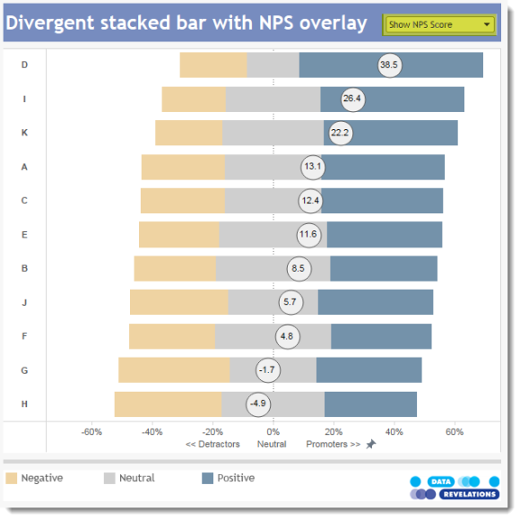
Figure 6 — Divergent stacked bar chart with NPS overlay.
Note that the NPS divergent stacked bar chart is just a variation on a Likert scale divergent stacked bar chart. You can find an explanation of how to build this type of visualization here.
What’s Next?
We now have what I think is a more insightful way to visualize Net Promoter Score data.
But clients and readers of my blog have asked me to address some of these questions as well:
- How do you show the difference in NPS, or just the difference in percentage of promoters, between this quarter and the previous quarter?
- If there is a difference, is the difference statistically significant?
- What’s a good way to visualize and analyze NPS over time?
I will be addressing these issues in an upcoming post. Stay tuned.