
Visual representation of error bars using Tableau
August 20, 2018
Much thanks to Ben Jones whose book Communicating with Tableau provides the blueprint for the calculations I use, Jeffrey Shaffer for providing feedback on my prototypes and sharing research papers from Sönning, Cleveland, and McGill, and Daniel Zvinca for his thoughtful and always invaluable feedback on the article.
Introduction
You’ve just fashioned a dashboard showing the percentages of people that responded to a check-all-that-apply question and your quite pleased with how clear and functional it is. You even have an on-demand parameter that will allow you to break down the results by gender, generation, and so on.
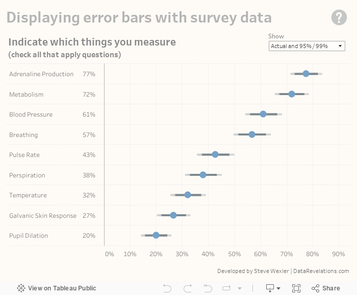
In your preliminary write-up you note that measuring adrenaline production is ranked highest with 77% and Metabolism is second with 72%. Before presenting your findings, you ask one of your colleagues to review your work and she asks you “what is the margin of error for these results?”
Not sure what she means you ask her to clarify. “If you were to conduct this survey again with a similarly-sized group of people, how confident are you that you would get the same result?”
Clueless on how to determine this, your colleague explains some very useful statistical methods built around the mean limit theorem and how these simple formulas can help you state a range of values for the survey results.
You thank her profusely, do a little research, then come back and tell her that, with a confidence interval of 95%, the range of values for Adrenaline Production is 72% to 82% and the range for Metabolism is 67% to 77%.
The “survey result” is the percent of the sample who selected an item, below displayed as a blue dot. The “true result” is the percent of the entire population who would select that item. A confidence level of 95% means the true result will be within the calculated Confidence Interval (the error bar range) 95 times out of 100.
This also means that 5% of the time the true result may be outside the error bars.
She applauds your work but asks you if there’s a compelling way to show these ranges and not just present numbers. (She also asks if you can change the confidence interval to 99% because folks like to know both 95% and 99% confidence intervals.)
In this post we’ll look at
- How to show confidence intervals / error bars
- How to build the visualization in Tableau
- Some alternative visualization approaches
- How to deal with a low number of responses
Displaying actual and error bar ranges
Rather than have you wait until the end of the blog post to interact with the dashboard I’ll, present it here.
Use the “Show” parameter to switch among four views.
What’s behind the scenes in Tableau
Note: the following fields are based on Chapter Seven from Ben Jones’ book Communicating Data with Tableau. It helped me get to where I needed to be very quickly, and I recommend it highly.
For a more thorough explanation of the central limit theorem, polling, and why all these formulas work I recommend Naked Statistics by Charles Wheelan and Statistics Unplugged by Sally Caldwell.
Here are the fields we’re going to need to fashion the visualization. Yes, there are a lot of them but many are variations on the same theme, so don’t be put off.
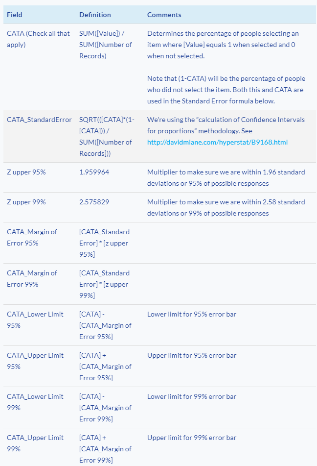
Understanding the chart
Here is the pill arrangement for a simplified view where we see the actual value and the 95% error bars (you can download the workbook to see how the 95% and 99% bars are combined and how the parameter controls which, if any error bars, get displayed).
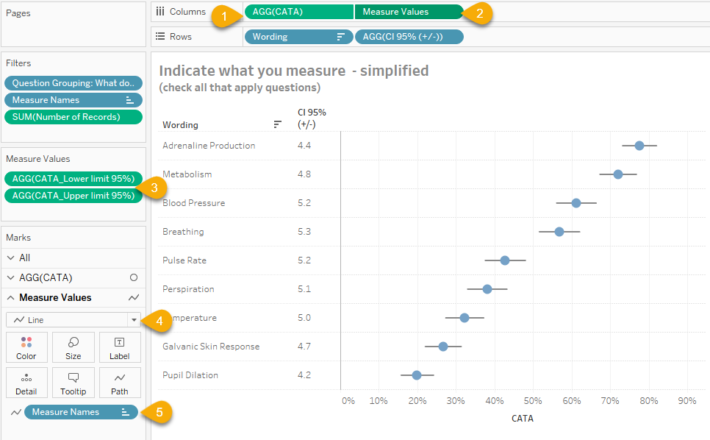
Figure 1 — How the combination circle chart / line chart showing error bars is built. Given the peculiarities of this data set and the response size the Confidence Intervals are similar but not identical for the options respondents selected.
On columns we combine (1) AGG(CATA) as a blue circle and (2) Measure Values into a dual axis chart. You may recall that the field [CATA] determines the percentage of people that selected an item in a check-all-that-apply question.
Measure Values refer to [CATA_Lower limit 95%] and [CATA_Upper limit 95%] (3).
Note that these two measures are displayed as a line chart (4) and that Measure Names is on the path (5). This tells Tableau to draw a line from the lower part of the error bar to the upper part of the error bar. The dual axis chart is synchronized so the blue dot is centered within the line.
Some alternative views that didn’t make the cut
The circle with dual error bars came after several iterations and some feedback from Jeff Shaffer (more on the feedback in a moment).
I started first with a dot and Tableau reference lines connected by a line.
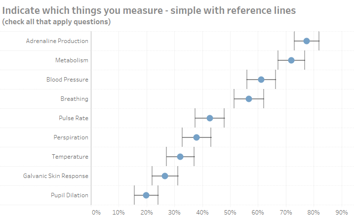
Figure 2 — A dot and a line connecting reference lines. This is easy to build but gives too much attention to the vertical error bars.
This is very easy to build in Tableau, but I found the height of the reference bars distracting. Indeed, this led to the creation (and abandonment) of the Imperial TIE Fighter chart.
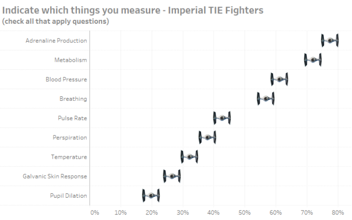
Figure 3 — Showing error bars with Imperial TIE Fighters. This may work if you’re creating a visualization about Star Wars. Note that to present this accurately the length of the wings would have to expand and contract based on the Confidence Interval.
Here’s another version where the ends of the error bars are shorter.
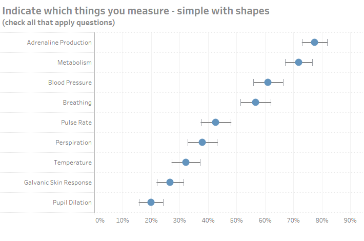
Figure 4 — Dot with less pronounced error bars.
This is a combination line chart and shape chart where the whiskers at the end are in fact shapes (as is the dot) and the line simply connects the shapes.
I call this next one a “Fingernail” chart.
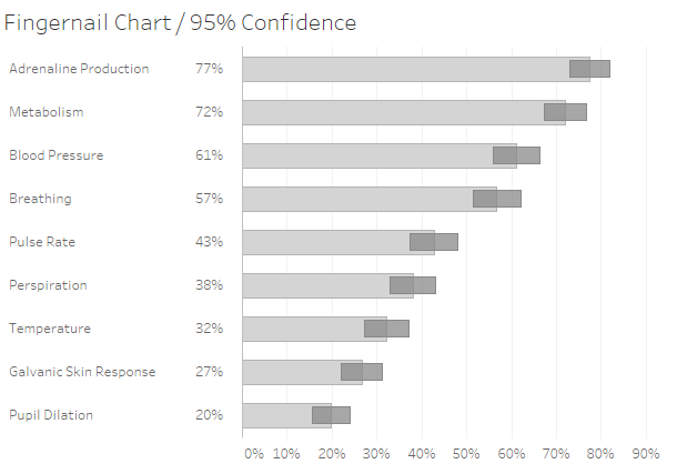
Figure 5 — “Fingernail” chart where “fingers” show survey responses and the “nails” show the range of values within a 95% confidence interval.
The bars or “fingers” show the survey responses and the “nails” show the range of values within a 95% confidence interval. I’ll confess that the thing I liked most about this chart was the name I gave it.
Here’s a chart that uses gradients.
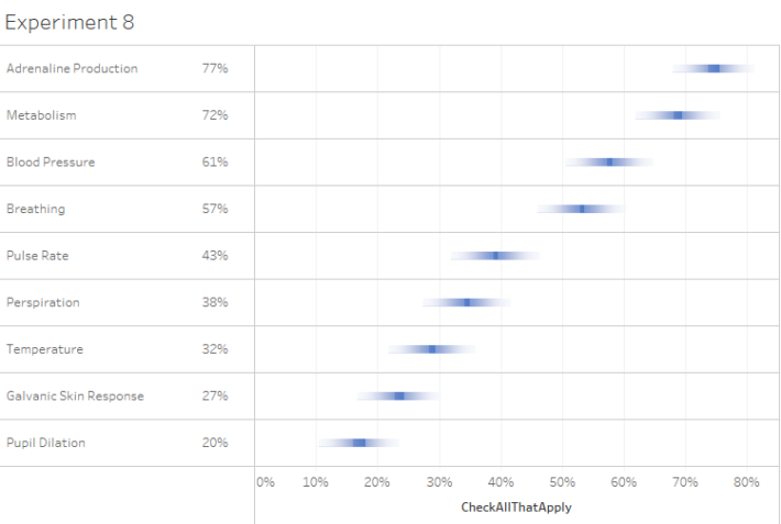
Figure 6 — Gradient bars.
The gradient bars passed the “looks cool” test but not so much the “more useful than distracting test.”
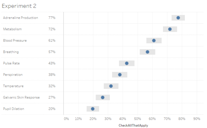
Figure 7 — Dot with Gantt error bars. With red dots this would look like the flag of Japan.
This one was a strong contender but “lost” after getting feedback and reading some research on visual cognition (see below).
Why the chart that “won” won
Anyone who has attended my workshops know that I’ve become a big proponent of iterate, feedback, iterate, feedback, etc. I don’t publish anything that is reasonably “high stakes” without having colleagues review it and the feedback I get always results in more insightful visualizations.
Jeff Shaffer and Andy Cotgreave have been great collaborators, and both gave me very good feedback on my approaches. Jeff also encouraged me to read William Cleveland and Robert McGill’s seminal research on graphical perception and especially Lukas Sönning’s paper on the dot plot.
It was Sönning’s advocating for salience (the notion that prominent elements should receive more attention) along with the ease with which we can show the actual values and more than one confidence interval at the same time that won me over. With the other approaches showing the survey percentages along with both 95% and 99% confidence interval error bars became unwieldy.
What happens when response count is low
You may not really appreciate just how useless survey results are with low (n) counts until you see how wide the error bars become when the number of respondents is below a certain threshold. Consider the interactive dashboard below where we break down the results by Generation.
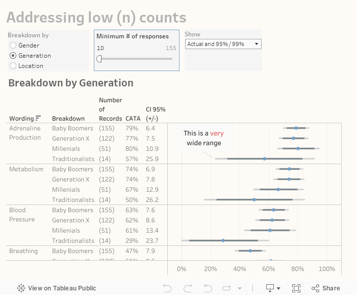
Notice the results for Traditionalists for Adrenaline Production (fourth row.) Only 14 respondents fall into this group so the 57% of that group that selected this item… it’s plus or minus 25.9!
This is why I advocate having a mechanism to either display a polite error message or simply remove findings when the response count is so low as to make the results meaningless.
Note that you can find lots of discussion about just what the criteria should be for removing questionable results (e.g., n<30, np <5, np(1−p)<10, etc.) All of these can be programmed into Tableau easily so just keep in mind that as your n gets smaller the error margin gets larger.
Versatile approach
While the example I use for this article uses check-all-that-apply questions the dot with bi-modal error bars will work for Likert data as well. The packaged workbook embedded in the dashboards on this page also contains a visualization that shows percentage of people that selected the top 2 boxes for Likert scale data.
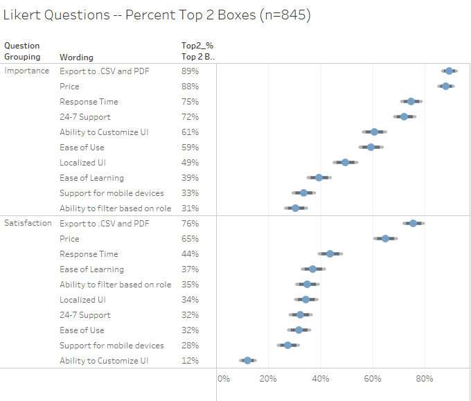
Figure 8 — Error bars with Likert data. Notice that the response count is higher in this example so that error bars are considerably narrower.
There are also formulas and a simple visualization for single-punch questions (radio-button questions where respondents can only select one item):
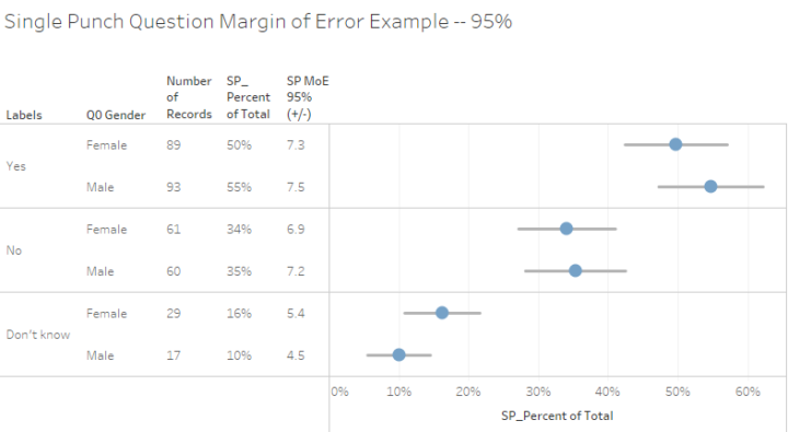
Figure 9 — Actual results and 95% error bars for a single-punch question. The embedded workbooks contains this example and the calculations you’ll need.
Conclusion
I’ve made my case for the dot and the bi-modal error bars for showing response percentages and confidence intervals. Whether you use this or one of the other approaches is up to you but please do yourself and your stakeholders a favor and make sure they realize that there is always a margin of error with survey results.


