jitterplot

Is this better than a Jitterplot? Could be

By |2020-02-16T23:25:08+00:00July 22nd, 2018|Business Visualizations, General Discussions, Visualizing Survey Data|

July 22, 2018 Overview After writing my blog post about why I still love the Jitterplot, I got some thoughtful feedback from Adam McCann, Jeffrey Shaffer, and the always provocative Daniel Zvinca. Dan had written a wonderful article suggesting a Stingray plot as an alternative, and Jeff and Adam’s comments encouraged me to revisit [...]

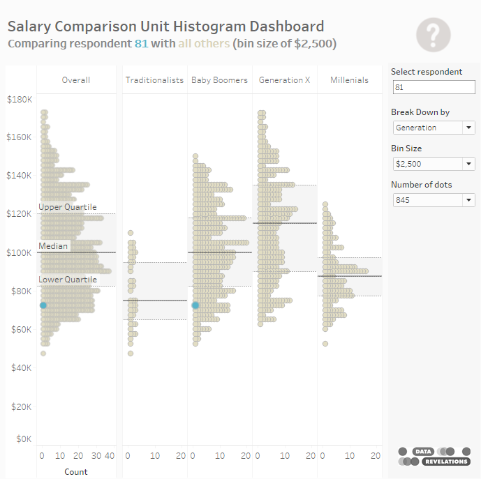
Seeing things with fresh eyes (and why I still love the jitterplot)

By |2020-02-16T23:41:04+00:00June 26th, 2018|Business Visualizations, General Discussions|

June 26, 2018 Thanks to Brad Epstein, Joe Mako, Jeffrey Shaffer, Andy Cotgreave, and Daniel Zvinca for helping me develop and refine my thinking on this. The FedEx Logo I wonder how many people reading this article know about the arrow hidden in the FedEx logo. Here’s the logo.  Do you see the arrow? [...]

Marginal Histograms — They’re Not Just for Scatterplots

By |2017-04-25T13:21:35+00:00April 25th, 2017|Business Visualizations, General Discussions|

April 25, 2017 Overview I became a big fan of adding a marginal histogram to scatterplots when I first saw them applied in Tableau visualizations from Shine Pulikathara and Ben Jones. For those not familiar with how these work, consider the scatterplot shown in Figure 1 that shows the relationship between salary and age. [...]