Chart Chat Live — Round 19
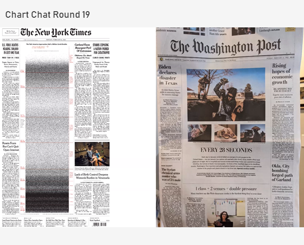
We discuss bar-in-bar charts, scaredy-cats and TURDs, great work from the New York Times, how to visualize 500,000 deaths, and the orange/blue debate. https://youtu.be/kco5U5wgDfY

We discuss bar-in-bar charts, scaredy-cats and TURDs, great work from the New York Times, how to visualize 500,000 deaths, and the orange/blue debate. https://youtu.be/kco5U5wgDfY

January 18, 2021 Some thoughts about critique in data visualization. Background For the past 18 months I’ve been working on a new book (more on this in a moment). Last September, I asked some colleagues to review selected chapters. I asked everybody to review the preface, which included this passage: My friend Jonathan Schwabish provided [...]

