Showing now versus then? Consider a Comet chart
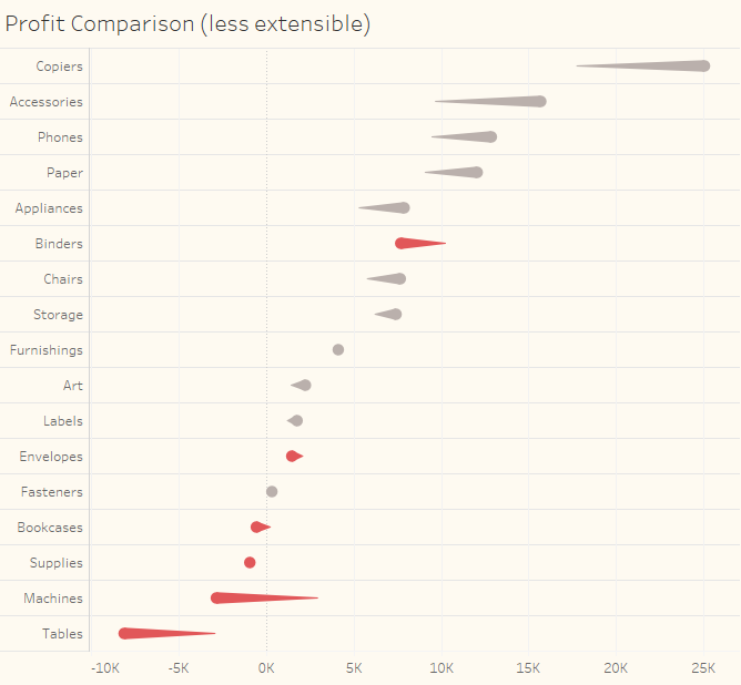
May 29, 2019 Overview Showing how a measure for one period compares with a previous period is a common need in data visualization. Here’s an example from one of the dashboards featured in The Big Book of Dashboards. Figure 1 -- "Ranking by now, comparing with then" dashboard from The Big Book of Dashboards. [...]