
May 29, 2019
Overview
Showing how a measure for one period compares with a previous period is a common need in data visualization. Here’s an example from one of the dashboards featured in The Big Book of Dashboards.
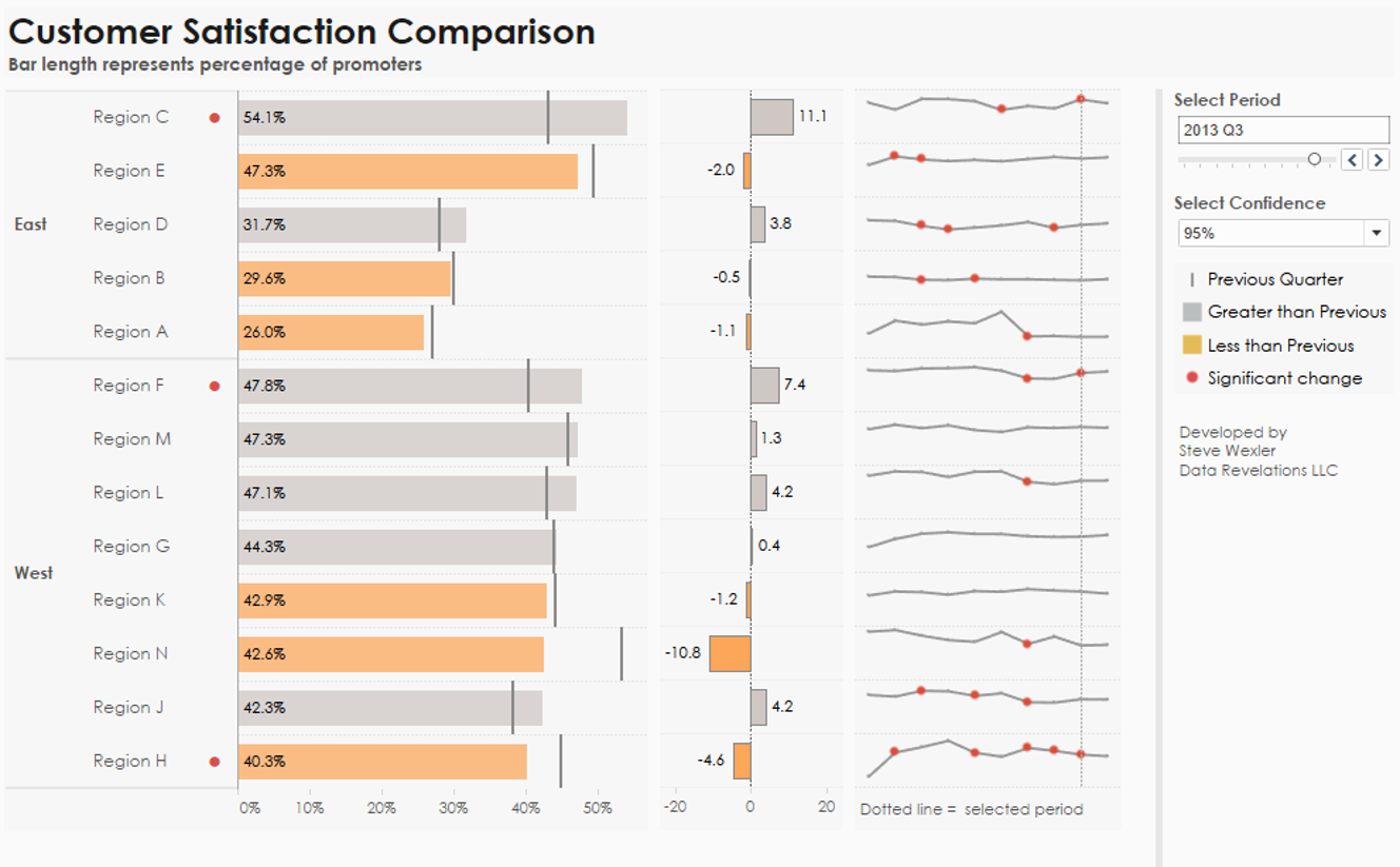
Figure 1 — “Ranking by now, comparing with then” dashboard from The Big Book of Dashboards.
Let’s focus on the bar chart that makes up the left side of the dashboard. It’s easy to rank and compare the length of the bars (the current period) and see which bars are greater than or less than the previous period (the vertical lines).

Figure 2 — It’s easy to compare the bars with each other as well as the bars with the vertical lines.
Are bars and vertical lines the best way to show the data?
Bars and vertical lines play into visual perception strengths; i.e., comparing length and position from a common baseline, but is there a way to play into these same strengths and have a viz that isn’t quite so, well, “heavy,” as the bars require a lot of ink?
Here’s the same data presented as a distributed slope graph.

Figure 3 — Distributed slope graph.
This works in that is plays into strengths (position from a common baseline). While I would not describe this chart as “heavy” it does take up a LOT of screen real estate.
How about a gap chart?
I’ve become a big fan of this chart type (also called a barbell chart, dumbbell chart, and connected dot plot).

Figure 4 — a Gap Chart. I’m a big fan of this way to compare two or three items (in this case just two).
Can you see where the big gaps are? Can you see where this period (dark blue) is ahead / behind the previous period (gray)?
I have no problem with this, but many of my workshop attendees do. That is, the “is this more or smaller than last period, and by how much” isn’t as easy for them to read as I thought it would be.
How should I address this, outside of reverting to the bars and vertical lines? I can try to educate my audience, or see if there is a way to modify the chart so that my audience just “gets” it.
Say hello to the Comet chart
Here is the same data rendered as a Comet chart.

Figure 5 — Now vs. then rendered as a Comet chart.
So, if you were having trouble before, do you see it now? The tail of the comment is the previous period and the head is the current period. If the comet is gray, we had an increase from the previous period. If orange, there was a decrease.
Where did this chart come from?
My first exposure was in an e-mail from Dan Lesh who had read my blog post about showing importance vs. satisfaction in survey data. I think Dan came up with a great way to show how this comparison changed over time by combining a Comet chart with a Scatterplot.
In researching this post, I discovered that the first person to name this chart was my friend and fellow author, Andy Cotgreave (see update at end of this post). You can read his post here, but also make sure to read the inspiration for this approach, which came from Naomi Robbins and her Arrow chart.
So, now that we see why the chart works and how it came into being, let’s see how to create one in Tableau.
For this next example we’ll use the SuperStore data set and compare 2017 Profit with 2016 Profit, broken down by subcategory
How to create a Comet chart in Tableau
Here’s the dashboard.
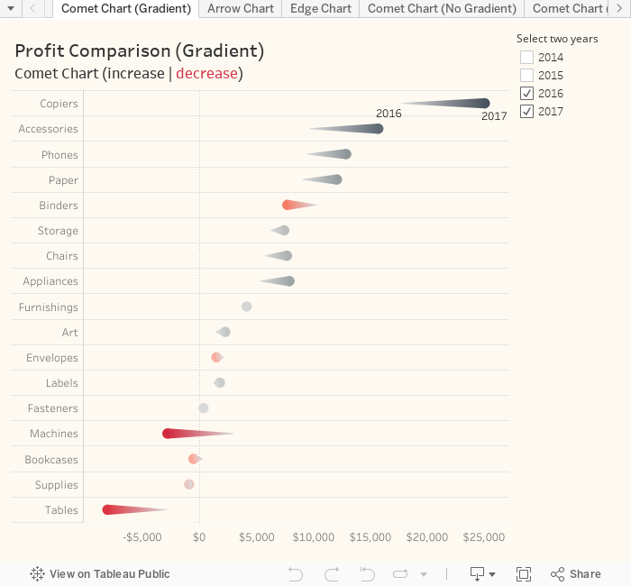
Let’s look under the hood to see how this is built.

Figure 6 — How to build the Comet chart.
The data set in question has four years of data. Notice the filter (1) and the selections (2) indicating we only want to see 2016 and 2017.
With the field placement in (3) we indicate we want to see SUM([Profit]) broken down by sub-category. By default, Tableau would normally draw bars but here we change the mark type to a line (4).
So, how are we getting a line that connects 2016 and with 2017 and not a jagged line that starts at Copiers at the top and winnows its way down to Tables? Notice that YEAR([Order Date]) has been placed on Path (5), indicating that we want Tableau to draw a line between the two years for which we have data.
Notice also that YEAR([Order Date]) is also controlling the size of the line. This is what makes 2016 thin and 2017 thick, and that’s what produces the comet.
Coloring the comets
I’m using a divergent color palette that goes from dark red indicating a large negative profit to dark gray indicating a large positive profit. The field that determines the degree of color is called Diff Profit and is defined as follows:
LOOKUP(SUM([Profit]),0)-LOOKUP(SUM([Profit]),-1)
This translates as
“Lookup the SUM([Profit]) for the current period and subtract the SUM([Profit]) from the previous period.”
This table calculation is extensible in that it will work with any two years (and not just 2017 and 2016).
Do the comets need to have gradations of color? Probably not, but I don’t see the harm. Here’s a version where the colors are flat.

Figure 7 — Comet chart without gradations.
The downloadable workbook has both versions (as well as two approaches to specifying the time periods). As for whether to use the flat or gradient colors… I would ask my audience which they prefer.
Conclusion
Will the Comet chart replace Gap charts in my practice? In discussing this with Andy Cotgreave we both agreed that you couldn’t use a Comet to compare purely categorical items; for example, the percentage of people that prefer Coca Cola to Pepsi, because there is something diminutive about the tail of the comet. But Andy maintains Comets can work with ordinal data and not just dates. For example, showing the differences in Salary between a Manager and Director, broken down by different companies. The tail of the comet would be the lower position job. In both cases the comet would reinforce the idea of “you started here, and you moved to here.”
Update: There’s been a lot of discussion about this chart type on Twitter as well as uncertainty as to who came up with the term. See Van Armstrong’s paper about Visualizing Statistical Mix Effects and Simpson’s Paradox from 2014, Andy Cotgreave’s 2013 Information is Beautiful Awards submission, and a Tableau forum discussion from 2012 where Andy first coins the term.
If anyone finds an earlier mention, please let me know.


