Some thoughts on why pursuing the perfect chart is not a great use of your time
January 22, 2019
Background
During Chart Chat (Round Two) I discussed my affection for the lollipop chart and why I thought it was an acceptable alternative to the bar chart. My friend and colleague, Chris Love, was watching the event live was so inspired / incensed he wrote this blog post.
That blog post in turn led to the longest twitter thread ever (I will not subject you to it). Some great ideas from some terrific people, but I couldn’t help thinking that we were engaging in a little bit of intellectual self-gratification. After reviewing the discussion I couldn’t help wondering if we should save our energy for visualization battles that are worth fighting (more on this in a moment).
Before I go further, I realize I should have provided the background for my support of the lollipop chart. To be clear, I was not suggesting that chart on the right was “better” than the chart on the left.

Figure 1 — Bar chart vs. Lollipop chart.
My advocating its use was in trying a client from abandoning bar charts in favor of this, er, interesting dashboard.

Figure 2 — A “screaming cat” dashboard where the appeal of the visuals compromises the analysis.
My point here—and in the “Succeeding in the Real World” section from The Big Book of Dashboards—is that if your client or stakeholders pine for “cool”-looking charts because they are, well, cool, you may be able to use a lollipop chart to placate their “that looks cool” needs while not compromising the analytic integrity of the dashboard.
Fighting the battles that are worth fighting
I’ve written previously that there is no perfect chart nor perfect dashboard, and trying to find the perfect solution is not a great use of your time. Let me give an example of this using a real-world data set.
Here’s an example from my Building world-class business dashboards workshop where I ask attendees to visualize this data set:

Figure 3 — How would you visualize this?
The catalyst for this exercise was this graphic from the Wall Street Journal.
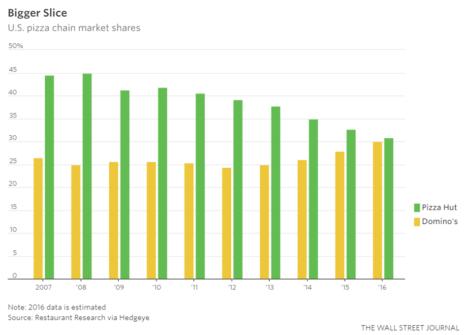
Figure 4 — Paired bar chart from the Wall Street Journal
I’m not a big fan of paired bar charts as the require a lot of ink and take up a lot of space (and while I very much like Jamaica, I’m not a fan of the colors in this context). But, if the client were dead-set on using this chart I think it is “good enough” as it makes it easy to compare the companies to themselves and with each other.
Here are some alternative approaches from workshop attendees.
Here’s the data rendered as a gap chart.
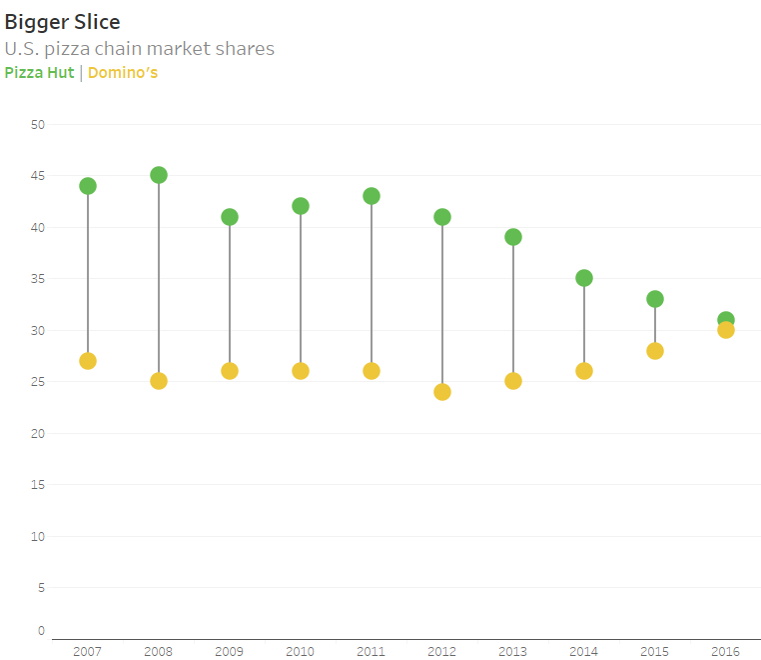
Figure 5 — Same data rendered as a gap chart (aka, “connected dot plot”, aka “barbell chart”)
Below please find the data as a bar-in-bar chart. I’m not a big fan of this, but it’s certainly “analytically valid” as you can compare the length of bars from a common baseline. I’ve heard some arguments that the area of the wider bars may suggest more “heft” than exists, so I tend to avoid this approach (but I do think it is “good enough.”)
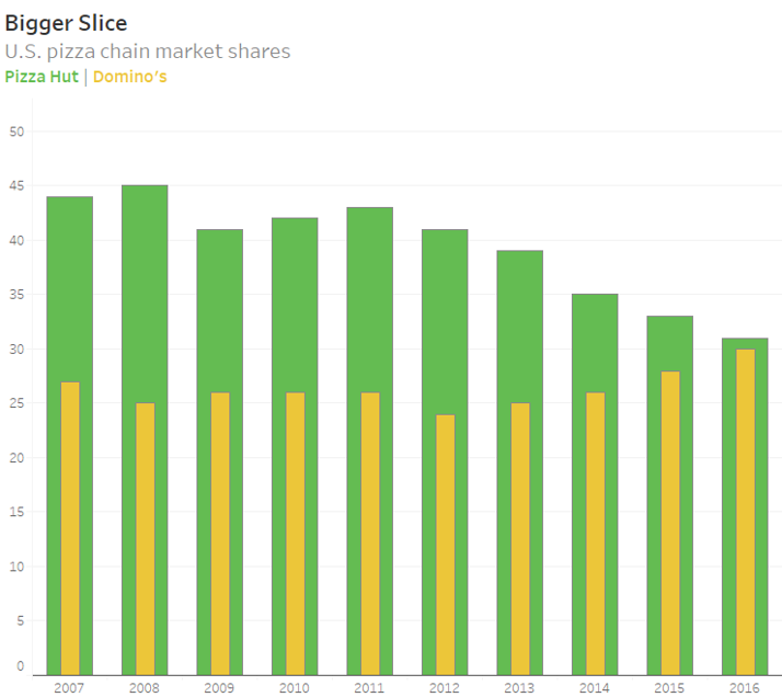
Figure 6 — Bar-in-bar chart
Here’s the same data rendered as a line chart. This is certainly easy to understand and isn’t weighted down by lots of ink.

Figure 7 — Line chart
There are at least three other ways to display the data that I would consider analytically sound. A special “shoutout” to those workshop attendees who went beyond the scope of the original exercise and plotted “other” as a third brand, as in this slope graph.

Figure 8 — Slope graph showing three brands.
So, I would say that all of these “work” and that they are all “good enough.”
Here’s an example that I don’t think is good enough.

Figure 9 — Divergent bar char (this one is NOT good enough.)
While it’s easy to compare a green bar with the other green bars and a yellow bar with the other yellow bars it’s very hard to compare a yellow bar with a green bar because those bars don’t have a common baseline with bars going in the same direction. This is the reason I don’t like population pyramids.
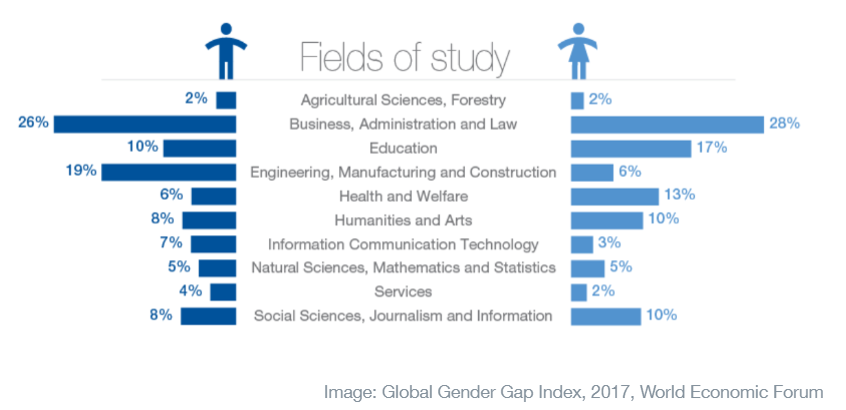
Figure 10 — Population pyramid.
Pop quiz: Looking at the chart above, in which fields of study is the gap between men and women greatest? Where is the next largest gap? This is very hard to tell with this type of chart, but very easy with a gap chart (blog post on this coming soon).
Going to the mat
I would fight hard to convince my stakeholders not to adopt the divergent bar / population pyramid approach as it only does one thing well (comparing the yellows with the yellows and the greens with the greens) while the other charts allow both intra and inter-company comparisons. And while I would dissuade my clients from using the paired bar / bar-in-bar approach I wouldn’t “go to the mat” about it.
But how do we decide among all of the “good enough” approaches?
I’m going to save that discussion for another blog post but will say that it involves iteration and getting your stakeholders involved in the design process.
And that process will lead to both better visualizations and greater adoption by your stakeholders.


