February 4, 2019
A special thanks to Chris Love who provided an elegant way to build the dashboard I show at the end of this post.
Note: Make sure to read the follow-up article here. Some amazing stuff happened in just a couple of ours from when I first posted this article.
Background
I’ve seen two population pyramids over the last few weeks and thought that both examples made the audience work considerably harder than they needed to make comparisons. While both graphics were attractive, they both fell short in making it as easy as possible for people to “get it.”
In this article I’ll look at one of these graphics and show a better way to present the same data.
A Population Pyramid example
Here’s the graphic that showed up in my twitter feed a few weeks ago. It’s from the Global Gender Gap Index report from the World Economic Forum.

Figure 1 — Gender gap population pyramid from World Economic Forum.
So, what’s wrong with this chart?
Before digging in, let me render this using Tableau.

Figure 2 – Population pyramid rendered in Tableau, sorted alphabetically.
The goal of this type of chart is to make it easy to see the population distribution differences between men and women. But just how easy is that? Let’s see if you can answer these questions quickly.
- Which field had the overall largest percentage of people?
- Which field had the third largest?
- In which field is the gap between men and women the largest?
- In which field is the gap between men and women second largest?
- In which fields do the percentage of women outnumber men?
None of these questions are easy to answer with the population pyramid sorted alphabetically. If we sort the fields from highest overall percentage to lowest, we can answer the first two questions easily.
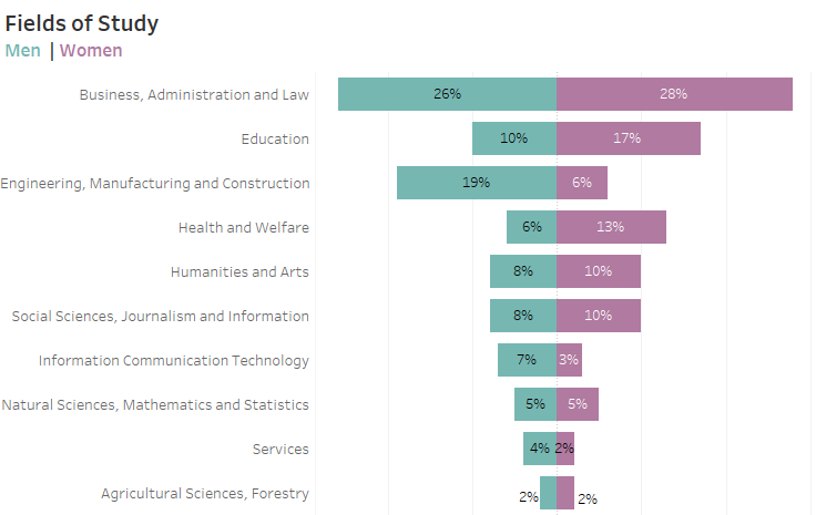
Figure 3 — Population pyramid sorted by most the least popular fields of study.
Now it’s easy to see that “Business, administration and Law” is first and “Engineering, Manufacturing, and Construction” is third.
But why are the other three questions more difficult? Sure, you can figure them out, but you have to work hard; they are far from an “instant” read.
The main reason is that while the bars have a common baseline, they extend in opposite directions. This means it’s easy to compare the green bars with the green bars, and the purple bars with the purple bars, but’s it’s very hard to compare a green bar with a purple bar.
Let me try to accentuate this by removing the percentages and just comparing the bars themselves.
Consider the example below where I want to compare how much larger the field of study for Education is compared with Engineering, Manufacturing and Construction, for just men.

Figure 4 — Focusing on one comparison
That looks like a very fast read. Even without the numbers present its easy to see that the second green bar is about twice as large as the first green bar.
Let’s try another comparison where we look at the difference between men and women for Health and Welfare.
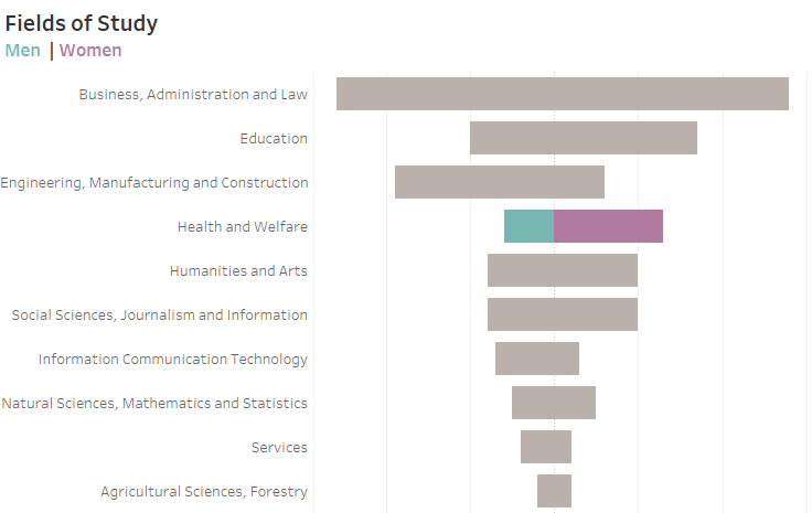
Figure 5 — Comparing percentage of men vs. women in Health and Welfare.
I’m a professional chart looker-atter and I find this a difficult comparison. If, however, I move all the bars to one side it become a much easier comparison, as shown below.
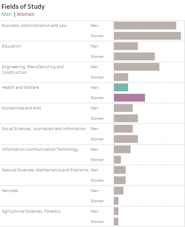
Figure 6 — Comparing bar length from a common baseline.
Now that’s quick read! It’s readily apparent that the purple bar is around twice as large as the green bar.
But… this is a pretty cumbersome visualization.
Is there a better way to show this? A way that is easy to understand, compact, and attractive?
Of course!
How Pew Research handles this type of thing
I’m a big fan of the Pew Research Center and think their research and visualizations are exemplary. Consider this graph that shows the percentage of democrats vs. republicans who believe it is essential for someone in high office to have certain personality traits.
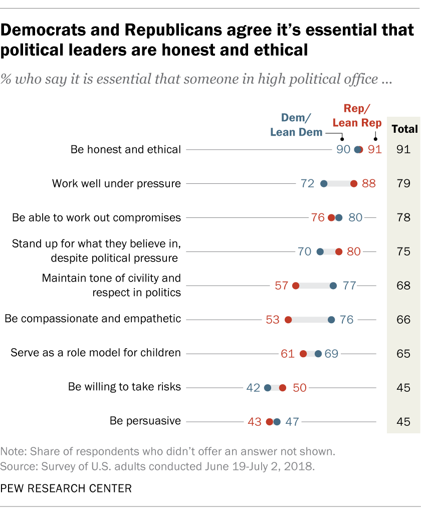
Figure 7 — Pew Research poll comparing Democratic and Republican views.
Pew Research has crafted a very elegant connected dot plot (aka, “barbell chart”, aka “dumbbell chart”, aka “gap chart.”) Look how easy it is to see where the gaps are big and where the gaps are small, as well as just how large the percentages are for each personality trait.
Notice, too, how there is a thin line that guides the eye for each attribute, and that there is a thicker gray line that connect the dots for each trait, emphasizing the gap.
So, what does our “Fields of Study” chart look like when rendered using this type of chart?
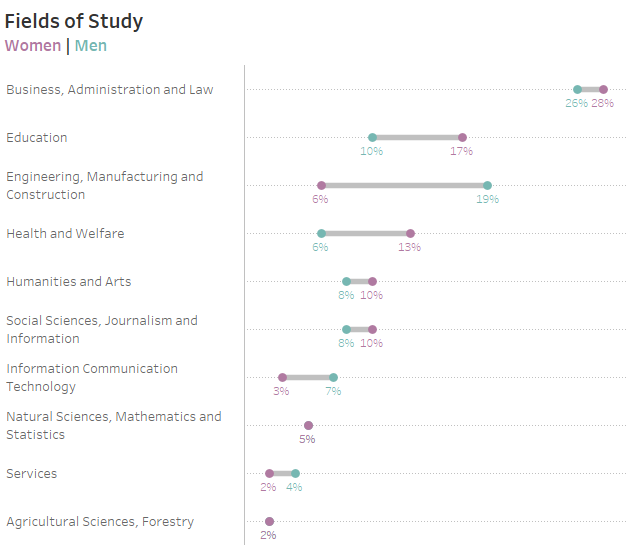
Figure 8 — Fields of Study poll rendered as a connected dot plot.
Look how easy it is to answer the five questions we posed earlier! The gaps really pop out, but we can also make all the other comparisons very easily.
Conclusion
While population pyramids are attractive and compact, they make it difficult to compare across the diverging categories. I think you’ll do better with a connected dot plot.
Note: Make sure to read the follow-up article here. Some amazing stuff happened in just a couple of ours from when I first posted this article.


