Be careful what you amplify
And some thoughts on color palettes / color ramps
Background
This tweet got a lot of attention recently (see https://twitter.com/andishehnouraee/status/1284237474831761408?s=20)
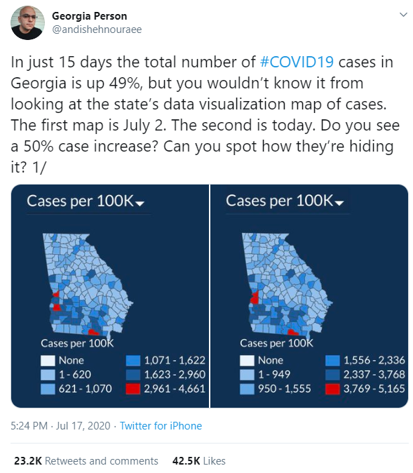
Figure 1 — Tweet suggesting that Georgia is trying to hide something.
While I did not retweet it, I did blindly chime in that this looked like gross incompetence, and that this type of thing has been a hallmark of the Georgia Department of Health website since I first looked at the site on May 21.
While there are a lot of reasons to not trust the website (and I have a video presentation about this), this chart is not one of them. The chart is not evil or manipulative as the person who tweeted it suggests. The chart just isn’t very useful.
What’s going on in the chart?
Based on the tweet, I thought the website was presenting the charts side by side. That is NOT the case; instead, the tweet shows a snapshot of July 2 on the left and July 17 on the right. I guess I should have been suspicious when there was not a link to the page in question.
And just what do the colors mean?
The chart is designed to show accumulated hotspots relative to other counties, on the day the chart is presented. Light blue means few cases per 100K residents; darker blue means more cases per 100K residents, and red means the MOST cases per 100K residents. Notice that the color legend shows different ranges in the two charts, even though the color coding has not changed. Might this be misleading? On July 2 a county with 2,961 cases per 100K would be red, but on July 17 it would be dark blue.
Realize that the numbers are going to get larger every day as this chart shows accumulated cases, not cases this week, or percentage of positives for this week (more on that in a moment).
I do not think there is anything inherently evil in this chart, but I do question the color ramp as well as the usefulness of the metric. With respect to the metric (accumulated cases per 100K)… that red part over there… is that a recent development or are a lot of the cases from months ago?
Quick note on the blue / red: Is this an election map? The color choices are very confusing (light blue, blue, dark blue, darker blue… RED!) and would be better served with a sequential color palette where we have different saturation of the same color as in light red, red, dark red, really dark red.
Absolute vs. relative performance
My biggest complaint with the color approach is that it is encoding color based on relative vs. absolute performance. Let’s explore this.
Consider this table below that shows results by county for two different math exams.
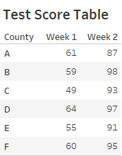
Figure 2 — Math test results for six counties.
Everybody failed the first test, and everybody did quite well on the second. Using the “whoever is best gets this color, and whoever is worst gets this other color” we’d have some head-scratching color choices.
Let’s look at results for Week 1 using a relative color palette where the dark blue is best, and dark orange is worst.
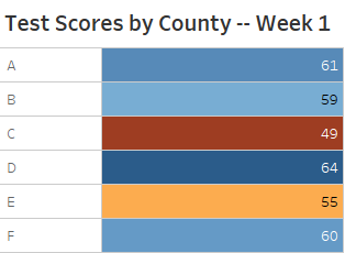
Figure 3 – Using a relative divergent color palette.
Looking at this you might think “County D did really well, and county C did terribly” but in fact, all the counties failed.
The same problem happens when we color code the Week 2 test results.
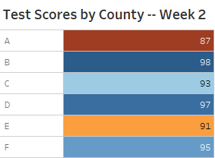
Figure 4 – Using a relative divergent color palette for a different test.
It looks like Counties A and E did poorly when in fact they just did a little less well than County B.
This is the problem of using relative scales. Contrast that with the approach below where we have an absolute scale (which we can do here as we know failing is 65% and the most you can score is 100%).
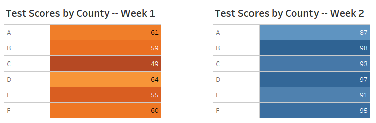
Figure 5 – Using an absolute color range.
What should Georgia do, if anything?
Besides the odd color ramp (blue, bluer, red), the biggest problem I have is giving so much prominence to the filled map, given the measures it is encoding. Maps can be very helpful when tracking outbreaks, but I don’t know how valuable accumulated cases or accumulated cases per 100K is compared with other measures, such as percent of tests coming back positive this week, percentage of ICU beds that are occupied right now, etc.. A toggle that would allow me to compare overall cases with more recent cases would allow me to see where things are getting worse or better.
Showing what’s getting better or worse and where is why I think this chart from New York State is much more useful (you can filter by individual counties).
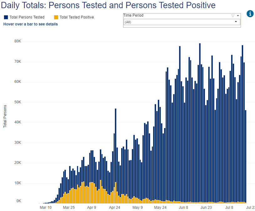
Figure 6 — Number of positives vs. overall tests. From NYS website.
Note that New York had around a 50% positive rate in early April. Yes, there were fewer tests as only those with symptoms were tested back then, but it was a very scary time. For the past six weeks the positive rate has been steady at around 1%.
And how is Georgia doing with respect to this? It’s hard to tell from the official website, but Kelley Krohnert has put together a website to track Georgia Covid-19 data and it appears to do a much better job than the official site. Here’s Kronhert’s take on the same positive / overall issue.
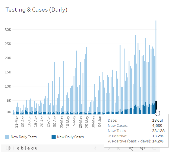
Figure 7 — How Kelley Krohnert’s Covid-Georgia website shows positive vs. tests over time.
I have not carefully vetted Krohnert’s site but I have found the information much clearer than the Georgia Department of Health website.
As for having a filled map, it is certainly useful, but maybe they should track a different, better measure using an absolute scale and allow people to track filter these views to look at particular time slices. Here is a side by side example where we are tracking the rate of something bad, where the darker the orange, the worse the rate is.
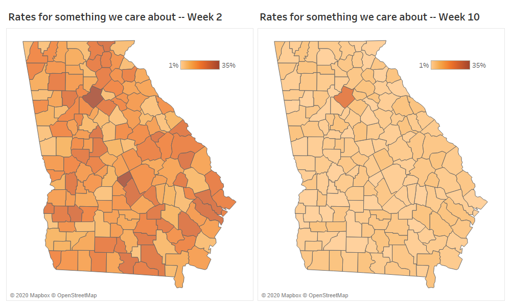
Figure 8 – Comparing rates between two maps using a consistent color scale. I acknowledge that the top range of 35% is arbitrary and assumes that the rate would never surpass this.
Realize that we would never see the maps side by side (although if they maintained longitudinal data, we could); instead, we might look at the map on the left one week and think “there’s a lot of orange, and a lot of it is dark… particularly there and there.” Then we might return weeks later and think “there’s way less orange, except over there. Looks like a big improvement.”
Heeding my own advice
I’ve told people to be careful what of what they chose to amplify and while I did not retweet the item in question I did chime in without careful review. I should know better.
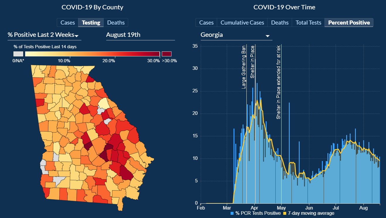
While there have been serious problems with the way the state of Georgia has reported critical data to its citizens, I do not consider the assertion in the tweet—that cases were increasing significantly and that this map was an attempt to hide it—is at all fair, especially since there is a time series chart directly to the right of the map in question. You can see for yourself by clicking here and scrolling down a little.
My colleague, Jon Schwabish, has written about this as well. Please see his post.
UPDATE: There have been some big improvements on the Georgia Department of Public Health website. I find this visualization very useful (and honest).