Or at least have a very good reason for doing so.
Note: My observations are for dashboards in languages where one reads from left to right. If you create dashboards in Aramaic, Arabic, Hebrew, Urdu, etc., just reverse everything.
IMPORTANT: Since posting I’ve received lots of feedback on this. I want to clarify that my concerns are about what happens when you have multiple lines of text and not single-line items.
December 3, 2019
Overview
I’m back from the 2019 Tableau Conference and both attended, and am watching recordings of, some great presentations.
I was surprised to see one presenter remarking that while you should avoid centered text, right-aligned text was fine. This surprised me because the very reason this presenter said to avoid centered text applies to right-aligned text, too.
Here’s why: we read in a z-pattern, and the left-aligned text helps us quickly find where the beginning of the next line is.

Figure 1 — how we read in a z-pattern.
Let’s compare the readability of left, centered, right, and justified text (where justified is both left and right aligned).
Here’s left-aligned text.

Figure 2 — Reading left-aligned text is easy.
Easy, right? Now here’s centered text.

Figure 3 — The symmetry may be nice, but reading centered text is more difficult.
This is much harder because we have to work to find where the beginning of each line is (but it looks very nice on a wedding invitation.)
Here’s right-aligned text.

Figure 4 — Reading right-aligned text is also difficult as we must work to find the beginning of each line.
Like centered text, here we must work hard to find the beginning of each line.
Here’s justified text.

Figure 5 — While it’s easy to find the beginning of each line, with justified text the extra spaces between words makes reading more difficult.
With justified text you don’t have the “where’s the beginning of the line” problem, but the extra space between words create “space rivers” and this has been proven to reduce readability.
Yes, most published books have justified text, but the typesetters work like mad to adjust the word and letter spacing so the text is readable. If you have the software and the patience and like how it looks on your dashboards, go for it!
What do others have to say about this?
Here are some thoughts on the subject from Richard Ambrose of Ambrose Design.

Figure 6 — Ambrose makes his case for left-aligned text.
I think the vertical orange line helps drive home the ease of and difficulties associated with left and centered / right-aligned text.
Here also is good summary from the eZine Design Shack.

Figure 7 — Design Shack’s recommendation for left, centered, and right-aligned text.
Does left alignment apply to other elements, too?
In the book Storytelling with Data: Let’s Practice, Cole Nussbaumer Knaflic advocates “upper-left-most justifying graph and axis titles and labels.” Consider this chart from page 131 of her book.

Figure 8 — Chart with title and subtitle centered. From Storytelling with Data: Let’s Practice.
Here’s what Cole suggests to improve this chart:
“Without other visual cues, your audience will start at the top left of your page, screen, or graph, and do zigzagging ‘z’s’ to take in the information. Because of this, I advocate upper-left-most justifying graph and axis titles and labels. This means your audience sees how to read the data before they get to the data itself. As we discussed [previously], I tend to avoid center alignment of text because it leaves things hanging out in space … When you have text that goes onto multiple lines, this creates jagged edges that look messy. While I was changing the positioning of the title, I also eliminated the italics, which were unnecessary.”
Here’s the makeover.

Figure 9 — Chart with left-aligned title and subtitle. From Storytelling wit Data: Let’s Practice.
So, is it ever okay to center or right-align text?
Of course, but just be aware of the tradeoffs.
Here’s an example from my own work.

Figure 10 — A dashboard by the author with some right-aligned text.
So, why did I right align this? I thought it looked better with the other dashboard elements and didn’t hinder readability much, but had there been more text – and had there been more text blocks – I would have aligned the text to the left.
So, what should you do?
Consider whether the emphasis on graphic design warrants making your audience work harder to read right-aligned or centered text.
Postscript
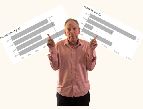
There was a LOT of twitter discussions about this blog post with people questioning whether I thought Tableau’s default of right-aligning the headers for horizontal charts was a good or bad idea. Here’s an image the compares the default with a left-aligned alternative.

Figure 11 — Right vs. Left-aligned headers
I’ll confess that I am fine with Tableau’s default here. But when the text comprises multiple lines I think the left-aligned text is much easier to read. Here’s an example with left-aligned text:

Multi-line text that is left aligned.

Multi-line text that is right aligned.
Also, my friend and fellow Big Book of Dashboards author Jeffrey Shaffer has some thoughts on the subject. Please read his post here.


