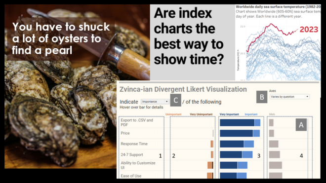
JLL Analytics Keynote — Charts on Screens
Private eventHow charts in the movies and TV can help us think differently about charts in our world What can movies and TV teach us about how we think about data? Can people look at a table full of numbers and glean real insight? Can you tell when a chart is deceitful? Are there visualizations from [...]
Chart Chat Round 42 — June 15
Online NY, United StatesWatch as Jeffrey Shaffer, Steve Wexler, Andy Cotgreave, and Amanda Makulec debate the good, the bad, and the "scaredy-cats" of data visualization.
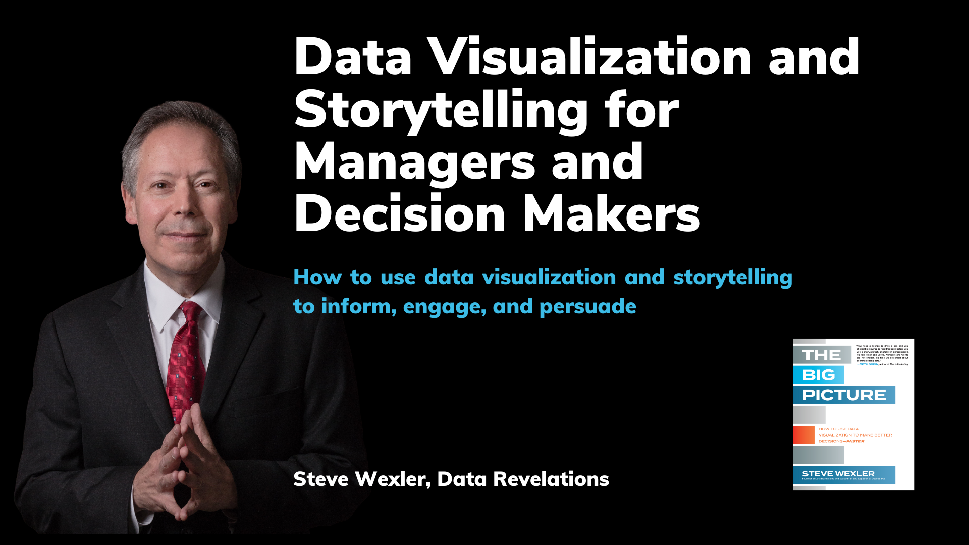
Data Visualization and Storytelling for Managers — June 27
Online NY, United StatesHow to use data visualization to inform, engage, and persuade
Chart Chat Round 43 — July 20
Online NY, United StatesWatch as Jeffrey Shaffer, Steve Wexler, Andy Cotgreave, and Amanda Makulec debate the good, the bad, and the "scaredy-cats" of data visualization.
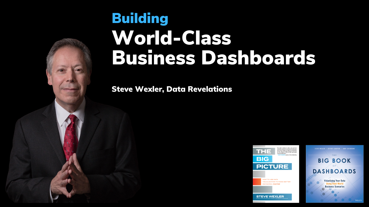
Dashboard Design Workshop Online — July 25 and 27
Online NY, United StatesLearn how to build world-class business dashboards from the author of the best-selling book The Big Book of Dashboards.
Data Visualization and Storytelling for Managers — September 19
Online NY, United StatesHow to use data visualization to inform, engage, and persuade
Chart Chat Round 44 — September 21
Online NY, United StatesWatch as Jeffrey Shaffer, Steve Wexler, Andy Cotgreave, and Amanda Makulec debate the good, the bad, and the "scaredy-cats" of data visualization.
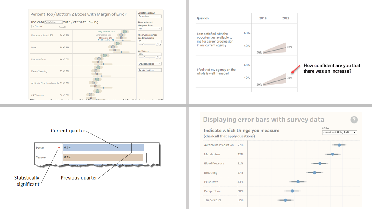
Visualizing Uncertainty in Survey Data
Online NY, United StatesLast month an attendee of my Visualizing Survey Data Using Tableau course asked me to explore showing confidence intervals / margin-of-error around longitudinal data. That is, he wanted his stakeholders to be able to see just what plus-or-minus X points looks like with respect to Likert responses over time. I get it. I’ve seen too many [...]
Dashboard Design Workshop Online — November 14 and 15
Online NY, United StatesLearn how to build world-class business dashboards from the author of the best-selling book The Big Book of Dashboards.
Data Visualization and Storytelling for Managers and Decision Makers — January 30
Online NY, United StatesLearn how to communicate effectively with data from the best-selling author of The Big Picture and co-author of The Big Book of Dashboards.


