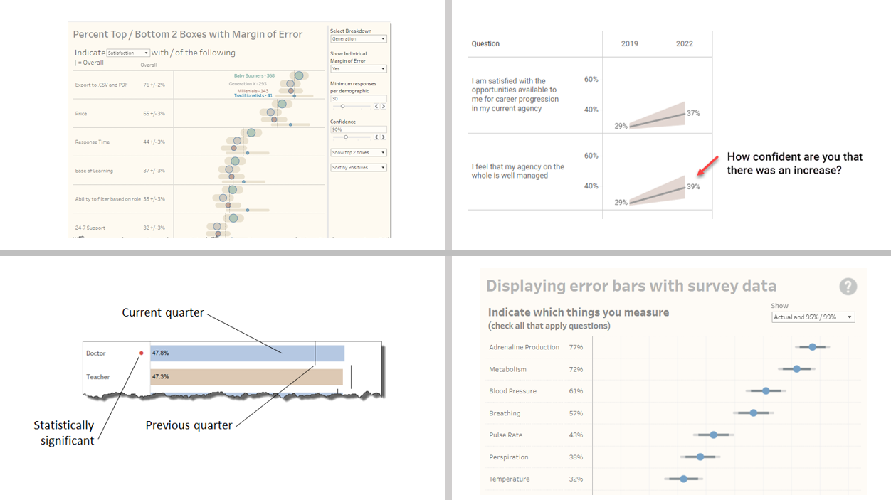
Visualizing Uncertainty in Survey Data
Online NY, United StatesLast month an attendee of my Visualizing Survey Data Using Tableau course asked me to explore showing confidence intervals / margin-of-error around longitudinal data. That is, he wanted his stakeholders to be able to see just what plus-or-minus X points looks like with respect to Likert responses over time. I get it. I’ve seen too many [...]

Dashboard Design Workshop Online — November 14 and 15
Online NY, United StatesLearn how to build world-class business dashboards from the author of the best-selling book The Big Book of Dashboards.
Data Visualization and Storytelling for Managers and Decision Makers — January 30
Online NY, United StatesLearn how to communicate effectively with data from the best-selling author of The Big Picture and co-author of The Big Book of Dashboards.

Chart Chat Round 49 — March 7
Online NY, United StatesWatch as Jeffrey Shaffer, Steve Wexler, Andy Cotgreave, and Amanda Makulec debate the good, the bad, and the "scaredy-cats" of data visualization.

Dashboard Design Workshop Online — March 19 and 21
Online NY, United StatesLearn how to build world-class business dashboards from the author of the best-selling book The Big Book of Dashboards.
Chart Chat Round 51 — May 16
Online NY, United StatesWatch as Jeffrey Shaffer, Steve Wexler, Andy Cotgreave, and Amanda Makulec debate the good, the bad, and the "scaredy-cats" of data visualization.

Dashboard Design Workshop Online — June 5 in Phoenix, AZ
Sheraton Phoenix Downtown Hotel Phoenix, AZ, United StatesLearn how to build world-class business dashboards from the author of the best-selling book The Big Book of Dashboards.

Dashboard Design Workshop Online — Sept 10 and 12
Online NY, United StatesLearn how to build world-class business dashboards from the author of the best-selling book The Big Book of Dashboards.

Chart Chat Round 55 — October 23
Online NY, United StatesWatch as Jeffrey Shaffer, Steve Wexler, Andy Cotgreave, and Amanda Makulec debate the good, the bad, and the "scaredy-cats" of data visualization.

Dashboard Design Workshop Online — December 3 and 5
Online NY, United StatesLearn how to build world-class business dashboards from the author of the best-selling book The Big Book of Dashboards.

