June 26, 2018
Thanks to Brad Epstein, Joe Mako, Jeffrey Shaffer, Andy Cotgreave, and Daniel Zvinca for helping me develop and refine my thinking on this.
The FedEx Logo
I wonder how many people reading this article know about the arrow hidden in the FedEx logo.
Here’s the logo. Do you see the arrow?

Figure 1 — FedEx logo
How about now?
Figure 2 — FedEx logo with arrow highlighted.
So, now that you’ve seen this you will never be able to un-see it. You’ve lost your fresh eyes.
I preach that in creating data visualizations you should endeavor to provide the greatest degree of understanding with the least amount of effort.
I often fear that what is clear to me may not be clear to others. That is, I fear that some charts that are easy for me to understand may be hard for people who are less experienced than I am.
I fear that I’ve lost my fresh eyes.
I’m a big fan of the jitterplot but I wonder if my lack of fresh eyes is preventing me from seeing it as others might. Specifically:
- Is it a worthwhile visualization?
- Is it worth taking the time to teach people to understand it?
- If the answers to 1 and 2 are “yes,” what can we do to get people to understand it faster?
Why I am a big fan
Four years ago, I was working with a large health care company that had health and wellness data on hundreds of thousands of people working in thousands of organizations. This company speculated that if they could get their clients to really see and understand the health proclivities of their employees and families they might be able to change behavior for the better.
The following visualization had an enormous impact on the company and the organizations under their care.

Figure 3 — Percentage of people in a organization with a disease compared to other organizations. The top line is the top quartile, the middle line is the median, and the bottom line represents the lower quartile.
The image shows that for the company in question (the big black dot), 18.5% of employees and their family members had diabetes, making this company a bad outlier.
What struck me was that everyone in the room just “got it” immediately: The black dot is your company; all the other dots are other companies. Look how poorly your dot is compared with the others!
Indeed, nobody asked what the x-axis was about (which sometimes happens when I first show a jitterplot.) Maybe it was the narrative when we presented the chart, but this approach influenced people in a big way and generated over $400K in sales of the benchmarking system they built around it.
In data visualization, creating a dashboard that has an almost visceral impact and that drives change is as good as it gets.
Emboldened by this success I started evangelizing the jitterplot.
But is the jitterplot the best way to present this type of data? Let me walk you through a salary benchmarking scenario and explore different ways of showcasing the data.
Here’s your salary and here’s everyone else’s
Imagine you are in the baby boomer generation and have just participated in a salary survey. You are curious as to where your salary is with respect to your peers who also participated in the survey. Here’s a visualization showing your salary versus the median of everybody else.

Figure 4 — Comparing a single value with an aggregate.
How does this make you feel? Miffed? Really pissed off? How good a sense do you have as to where you are versus everyone else.
Here’s another way of presenting the same data, this time as a gap chart (also known as a connected dot plot, dumbbell chart, or barbell chart.)

Figure 5 — Another approach to comparing a single value with an aggregate.
While this shows the gap between you and the median of all others, it still doesn’t give a great sense of where you are in the salary universe. Maybe showing a breakdown by generation would help.

Figure 6 — Your salary vs. median of all others, broken down by generation.
Well, this shows you where you are among similarly-aged individuals, but there’s a lot of information we would need to determine just how much lower the salary is.
Here’s another approach showing your salary and lines marking the lower, median, and upper quartiles.

Figure 7 — Your salary with respect to lower, median, and upper quartiles.
Okay, now we see that not only are you quite a bit below the median, you’re below the lower quartile as well.
Your world and your place in it
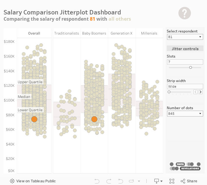
Let’s see what happens when we show all the respondents, using the jittering technique I showed in Figure 3.

Figure 8 — Your salary with respect to all other respondents.
Yikes! Now we can see that there are a lot of dots, most of which are above you and only a few that are below you. For me this gives me a better sense of where one is in the salary universe.
And if we break this down by generation, we can get an even better sense, as shown here.

Figure 9 — Your salary with respect to all other respondents, broken down by generation.
Wait a minute! Isn’t this why there are box-and-whisker plots?
Yes, the box-and-whisker plot is designed to show the distribution of elements along a single axis. Here’s what the overall salary distribution looks like using this type of chart.

Figure 10 — Your salary with respect to all other respondents, broken down by generation, using a box-and-whisker plot and no jittering.
If you’re not familiar with the box-and-whisker plot (also called a box plot) here’s how to read it.

Figure 11 — How to interpret a box plot. An outlier is defined as 1.5 times the interquartile difference (the difference between the upper and lower quartiles).
I know this gives me everything I need to understand the data, but without the jittering just doesn’t resonate with me as I don’t get a good sense of how many dots there are. I know that’s what the shaded area is for, but it doesn’t work for me.
Here’s what the box plot looks like with jittering.

Figure 12 — A box plot with jittering.
While I still prefer the simple lines marked upper, median, and lower quartiles over the box-plot, if I am pressed to use a box plot I do find that the jittering helps me get a better sense of just how many dots there are and where they are.
Important: Most of my audiences neither understand nor like box-plots, even after an explanation. But if your audience understands and likes them (imagine a room full of statisticians) you would be insulting them by not using the visualization with which they are familiar. Know your audience!
Yes, but what is the x-axis about?
As I indicated before, when I look at a jitterplot I know exactly how to interpret it and I know that the numbers are just randomly jittered so they are not all on top of each other.
But what about folks who haven’t spent four years living with this type of chart?
Well, for one thing you can explain to them how to read the chart. It takes me on average ten seconds to explain how to read a jitterplot vs. 20 seconds to explain how to read a bullet graph. I think most people will agree that the bullet chart is more than worth the one-time 20 second explanation; I hope your audience will give jittering the same consideration.
But… all of this makes me wonder are there things we can do to make the jittering easier to understand and, are there situations where there are either too many or too few dots for the jittering to be useful?
When does it work, when does it fail?
I’ve developed an interactive dashboard (see below) that allows you to experiment with different settings to see if and when the jitterplot resonates with you and your audience (and if and when it fails.)
For me jittering works for up to around 2,500 marks after which I lose the ability to see my dot within the universe of dots. With more marks I would probably compare my dot with an aggregate. Note that the example below maxes at 845 marks, but I have an example here that has around 2,400 marks.
Here’s how to use the dashboard controls.
Slots
Use this to place each dot in a separate slot or column. Moving the slider to 1 will create a simple strip plot.
Strip width
This changes how tightly packed the dots will be and how much white space there will be to the left and right of the dots.
Number of dots
There are 845 survey responses. Use this to change reduce the number of responses see if and when the chart becomes more useful or less useful. For example, are 845 dots too many to make sense of the data? Is the jittering unnecessary when there are only 50 dots?
Let me know that you think. Please leave comments below.
One last thought: Stephen Few, author of The Perceptual Edge blog and several excellent books on data visualization, doesn’t buy into the value of the jitterplot. You can read his criticism and his proposed alternative, the wheat plot, here.
Also read Jeffrey Shaffer’s response to Few’s article.