
January 18, 2021
Some thoughts about critique in data visualization.
Background
For the past 18 months I’ve been working on a new book (more on this in a moment). Last September, I asked some colleagues to review selected chapters. I asked everybody to review the preface, which included this passage:
My friend Jonathan Schwabish provided some excellent feedback but also found the screaming cat a big turn off in that he felt it was mean and trivializes the effort people put into their work.
Being mean and trivializing effort is certainly not my intention, so I sent out a poll to my newsletter subscribers and to Data Visualization Society members.
The Poll / Polls
Actually, I sent out two polls as I wanted to see if changing the wording would change the responses.
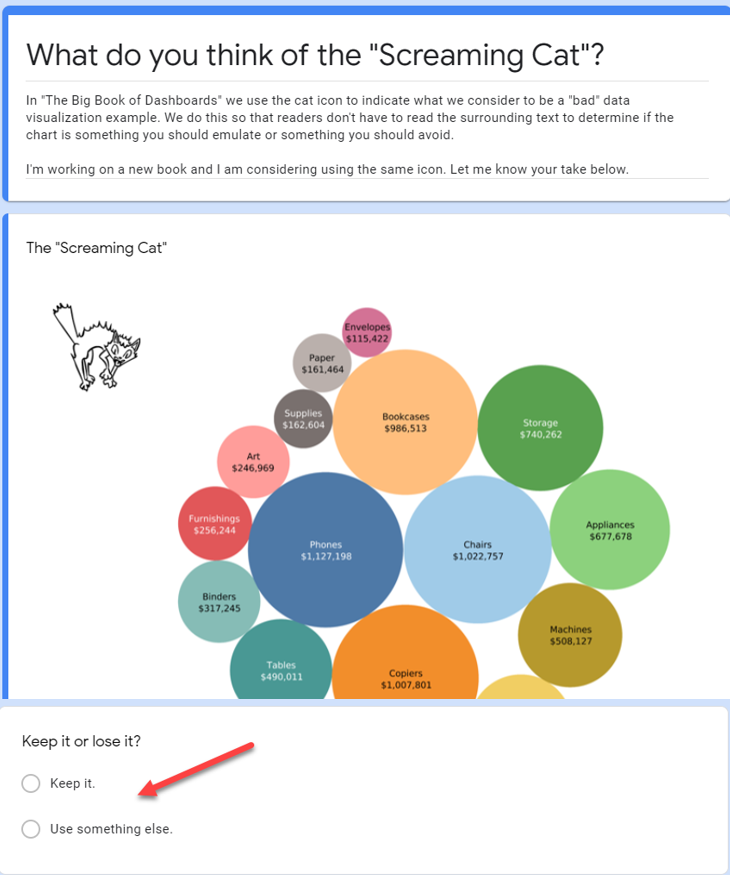
Here’s the first poll.
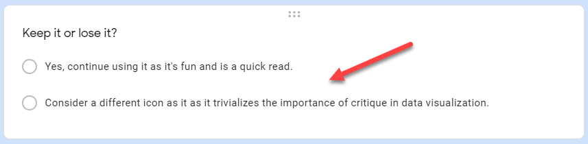
The second poll was the same, except for the wording of the two choices:
I thought this second version would steer people against the Screaming Cat, but to my surprise more people went with “keep the cat.”
Here are the results of the two polls.
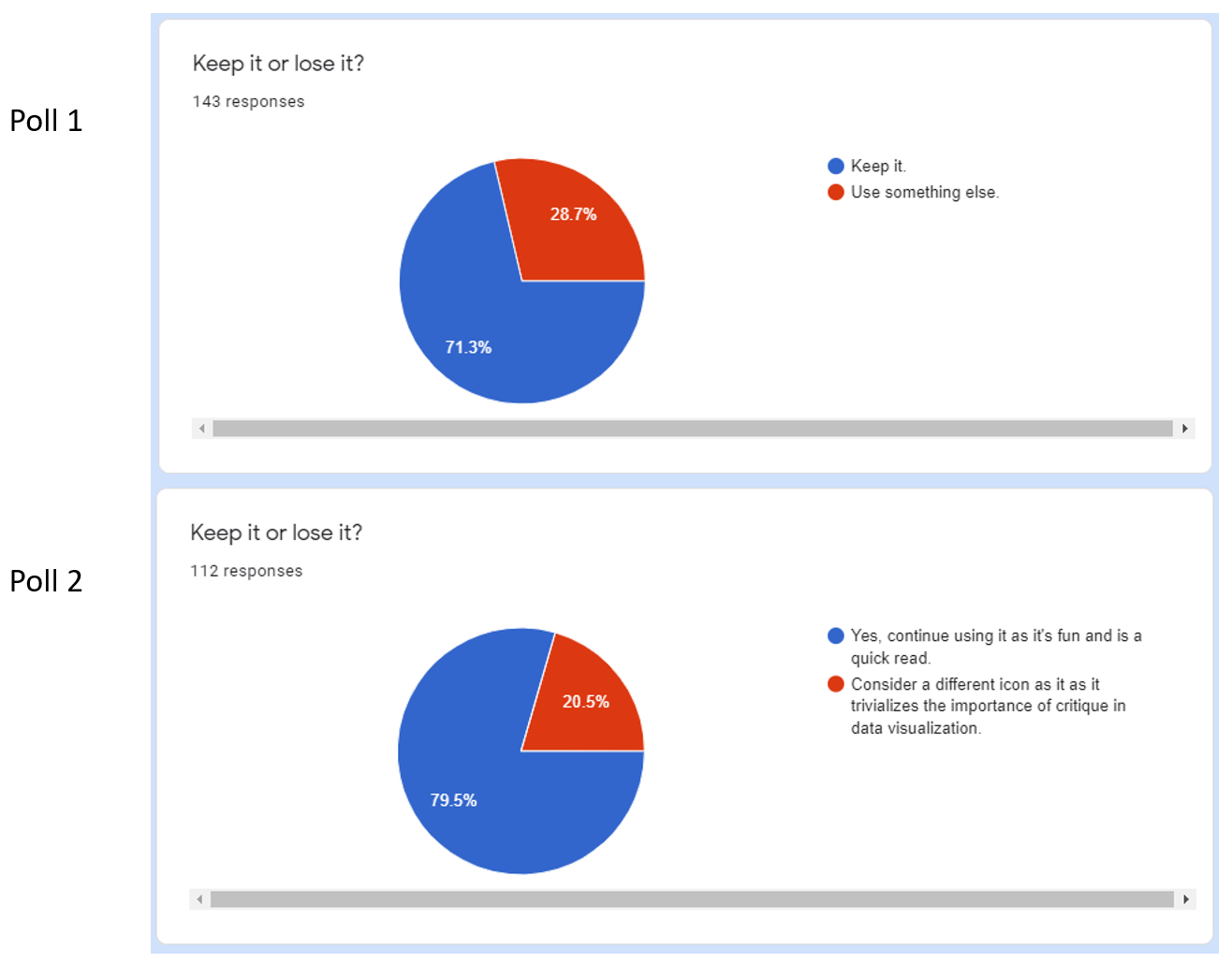
This is the Google Forms default colors and presentation – I’m doing everything I can NOT to place a cat icon next to this as trying to compare across two pies is a terrible way to present the results!
But… you get the idea. The vast majority of people like the cat icon.
Unhelpful vs. Misleading, and Not Being Mean
I thought the issue was settled until two of my “deep readers,” Cole Nussbaumer Knaflic and Kendall Crolius, brought up some questions. By “deep reader” I mean people who read the entire draft manuscript.
Cole had concerns that echoed Jonathan’s, stating that no one sets out to make a chart that a cat would scream at.
Kendall noted that the book contains three different types of graphics
- Helpful graphics
- Unhelpful graphics
- Misleading graphics, also known as TURDs.
Kendall suggested having three icons, or at least two different icons to differentiate between unhelpful and misleading. Indeed, an icon for the TURDs – Truly Unfortunate Representations of Data, a wonderful term from Christopher Danielson – would be easy to make.
I asked my editor, Casey Ebro, if we should have two different icons. Upon determining that of the 280 graphics in the book, 22 were unhelpful and 9 were misleading, she argued that having different icons would be unnecessarily complicated and readers would simply need to read some of the surrounding text to distinguish between non-optimal vs. deceitful charts.
So, we’re sticking with the cat… but what about the idea that we’re being mean to those who are trying their best?
It occurred to me that the issue with the cat might not be the icon so much as calling it a “Screaming” cat. Indeed, in the first two print runs of The Big Book of Dashboards we just called it the “cat icon.” The more I thought about it, the more I thought of somebody new to the field trying their best only to be hit with “you just made a Screaming Cat… you suck!”
So, Casey suggested using the term “Scaredy-Cat.”
Yes, I like that! Is says “there’s a problem with this graphic” and not “You are a terrible person!”
Are we letting folks that produce misleading charts off the hook? I don’t think so as I’ll continue to call those things Screaming Cats and TURDs.
Here’s the modified wording that will appear in the new book:
The Scaredy-Cat
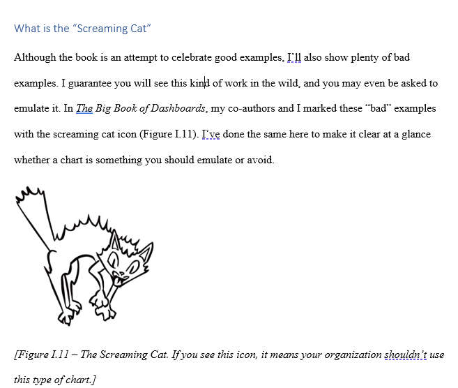
Although this book is an attempt to celebrate good examples, I’ll also show plenty of unhelpful and even misleading examples. I guarantee you will see this kind of work in the wild. In The Big Book of Dashboards, my coauthors and I marked these “bad” examples with the cat icon. While nobody sets out to make bad graphics (except those who are intentionally trying to mislead), I want to make it clear at a glance whether a chart is something you should emulate or avoid.
About the New Book
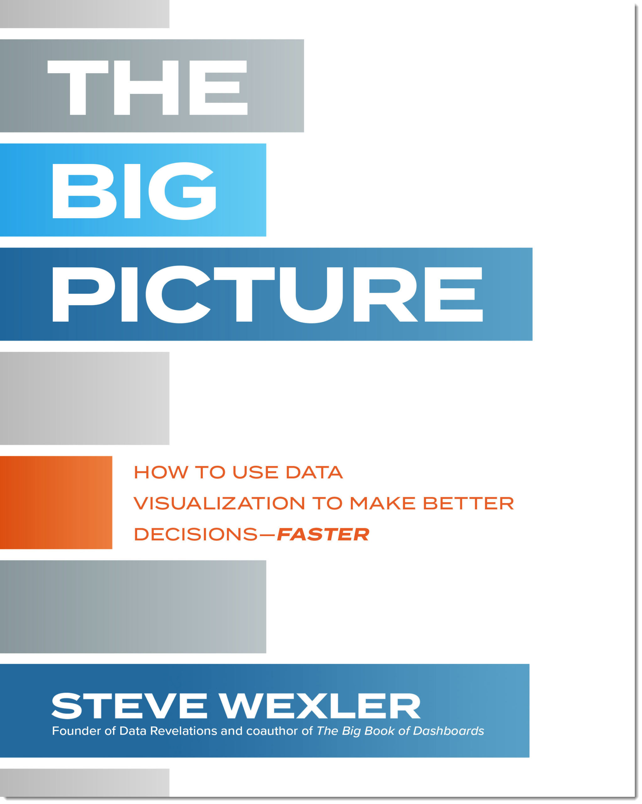
My new book, The Big Picture: How to Use Data Visualization to Make Better Decisions—Faster, will be available for purchase in May 2021.
Unlike The Big Book of Dashboards, this book is targeted towards the people who consume charts and dashboards, not the people who create them. My thesis is that good data visualization leads to better and faster insights, which in turn leads to better and faster decisions.
But to have discussions around data visualization you need to have a fundamental graphic literacy. This book will help you and your organization get there, faster.


