December 18, 2017
Updated September 27, 2018 to include single-select questions.
Special thanks to Shaelyn McCole at Hootology who suggested the topic, Ryan Gensel at CPI who came up with a wonderful enhancement to the connected dot plot, and Jeffrey Shaffer at Data Plus Science who suggested some cosmetic improvements.
Note: The original blog post only covered check-all-that-apply questions. I’ve added a section that explains how to make this work with single-select questions as well.
Overview
If you have filters in your dashboards you’ve probably had a thought similar to this: yes, it’s great that I can filter the results, but what did the dashboard look like before I applied the filter? I can’t remember if the bars were smaller or larger, let alone by how much.
Consider the example below that shows the results to a multi-select survey question were we see results from all respondents that answered a set of questions.
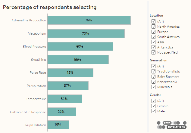
Figure 1 — Results from all survey respondents.
Now compare this with results with women from North America.
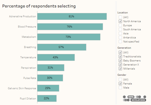
Figure 2 — Results from female respondents who live in North America.
Unless you process information and memories differently than the vast majority of people it’s very hard to compare the two populations and harder still if you can only see one result at a time (here you can at least scroll up and down to compare).
So, is there an easy way in Tableau to display both filtered and unfiltered results in the same visualization?
The answer is a resounding yes, with a refreshingly straightforward Level-of-Detail (LoD) calculation.
Determining the calculations
Let’s first look at the calculation we need to determine the percentage of people that checked “Yes” to a question. The “pill arrangement” in Tableau is shown below.
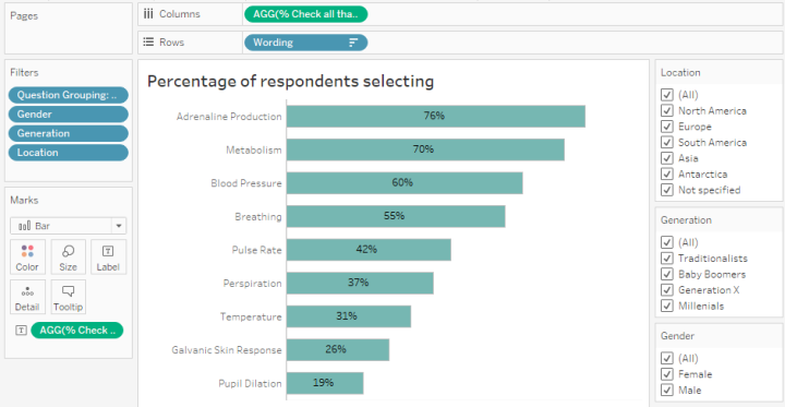
Figure 3 — Pill arrangement for a check-all-that-apply survey question.
Notice that we have Wording on the rows shelf. The Question Grouping filter is limiting the results to only those rows that have responses for the survey questions that interest us. Notice also the filters for Gender, Generation, and Location.
Here’s the calculation that determine the percentage of people that selected an item.
SUM([Vales]) / SUM([Number of Records])
As the survey has been coded so that folks that selected an item have a Value of 1 and those that did not select an item have a Value of 0, this calculation add up all the ones and divide by the number of people that answered the question.
Okay, so we have the calculation that will adjust the bars as we change the settings for the demographic filters.
What is the calculation that will keep the bars the same length even if we change the demographic filters?
All we need to do is lock the results to the Wording field using the following LoD calculation:
{FIXED [Wording]: SUM([Value])/
 SUM([Number of Records])}
This tells Tableau even though there may be filters, ignore them fix this to all the rows associated with the [Wording] field. For those of you wondering, you could also fix this to the [Question ID] field and you would get the same results.
So, does this work?
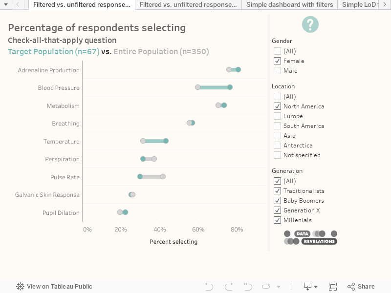
Consider the pill configuration below where we can compare, one below the other, the results for the Filtered population and the Entire population. When all options in the demographic filers are checked, the bars are the same length.
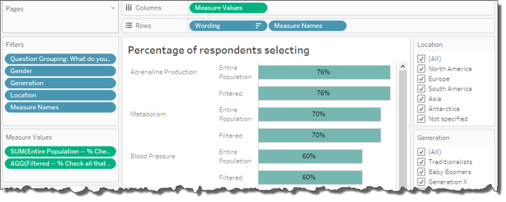
Figure 4 — Filtered vs. Unfiltered results. Right now, with everything selected, the bars are the same length.
Now let’s see what happens when we apply some filters (keep you eyes on Adrenaline Production for the Entire Population, currently at 76%).
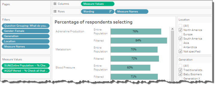
Figure 5 — One set of bars changes but the other remains fixed
Notice that one set of bars change, but the bars for the Entire Population (the ones using the LoD calculation) don’t change.
A gap chart… with a twist!
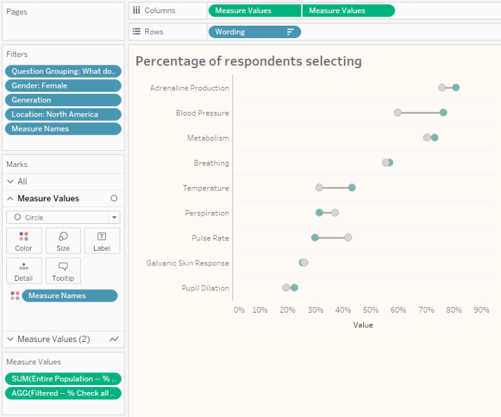
I experimented with several ways to visualize the differences and settled on a gap chart (also called a dumbbell chart, also called a connected dot plot). Let’s see how to build the chart (and how to improve it, using color coding that Ryan Gensel suggests).
Let’s start with the dots.
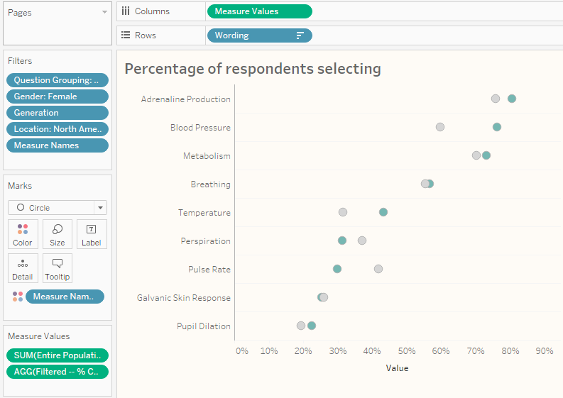
Figure 6 — Dot plot using Measure Names and Measure Values
This is very similar to the bar chart we had earlier but instead of bars we are using circles and we’ve placed Measure Names on Color so the circles are different colors.
We now need to create a line that connect the two dots on each row.
First, we will duplicate the Measure Values pill that is on columns and have two identical charts, side-by-side, as shown here.
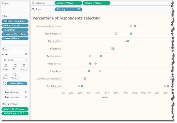
Figure 7 — Duplicating Measure Values
Next, for the second instance of Measure Values we will change the Mark type to Line and move Measure Names from Color to Path, as shown below.
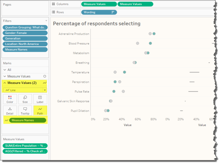
Figure 8 — Making the second instance of Measure Values a Line chart, connecting the two measures by placing Measure Names on Path
Now we’ll right-click the second Measure Values pill and select Dual Axis, then we’ll right-click the secondary axis and select Synchronize Axis, then we’ll right-click the secondary axis again and de-select Show Header, giving us a chart that looks like this.
Making the difference stand out
I was chatting with CPI’s Ryan Gensel, one of he authors of the Agency Utilization Dashboard that appears in The Big Book of Dashboards. Ryan told me about a technique he was using that colors the line based on which dot has the larger value.
Here I apply the technique by creating a field called Line Color which is defined as follows.
IF [Filtered -- % Check all that apply]>
SUM([Entire Population -- % Check all that apply]) THEN
"Filtered"
ELSE
"Entire Population"
END
We can then place this field on Color for the Line chart instance of Measure Values. We will also need to make the size of the line a little thicker by clicking the Size button and moving the slider to the right. This yields a chart that looks like this.
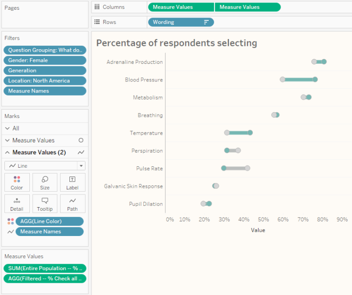
Figure 10 — A better gap chart.
But what about single-select questions?
We’ll need to create a new calculation to handle single-select (also known as single-punch) questions. Usually people will just apply a simple table calculation showing percent of total. This works great, but we’ll run into some trouble when we try to combine this with an LoD expression.
The solution is to avoid the table calculation and instead use a LoD expression to get the percentage of the total.
Consider the visualization shown in Figure 11 below and notice that Label is on the rows shelf.
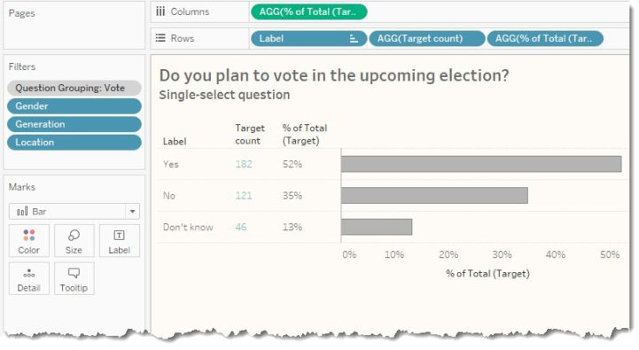
Figure 11 — Determining percentage of total using an LoD expression.
The calculation that will do the trick for us is as follows.
SUM([Number of Records]) /
SUM({EXCLUDE [Label]: SUM([Number of Records])})
This translates as “take the number of people who indicated [Label] and, ignore the different labels, and divide by the total number of people that answered this question.”
Note that the percentages will change when we apply any filters. That is, if we were to just look at responses from women the count and percentages would reflect those changes.
So, how are we going to fashion a calculation that won’t change the overall count and percentages when we apply a filter?
The modified calculation that will address this is shown here.
{FIXED [Label]: SUM([Number of Records])} /

{FIXED: SUM([Number of Records])}
The numerator translates as “determine the number of people that selected ‘Yes’, ‘No’ or ‘Don’t know’, and keep it fixed even if a filter is applied.” The denominator translates as “determine the total number of people that answered this question and only apply a filter if that filter has been added to the context.”
That last part about context is very important. For this to work we need to make sure that the Question Grouping question has been added to context so that Tableau will apply that filter before considering the LoD expressions.
At this point we have our two calculations, one that will change the percentages when we apply filters and the other that will stay fixed. The mechanism for creating the gap chart is the same as that for the check-all-that apply question. Here’s what the completed version look like.
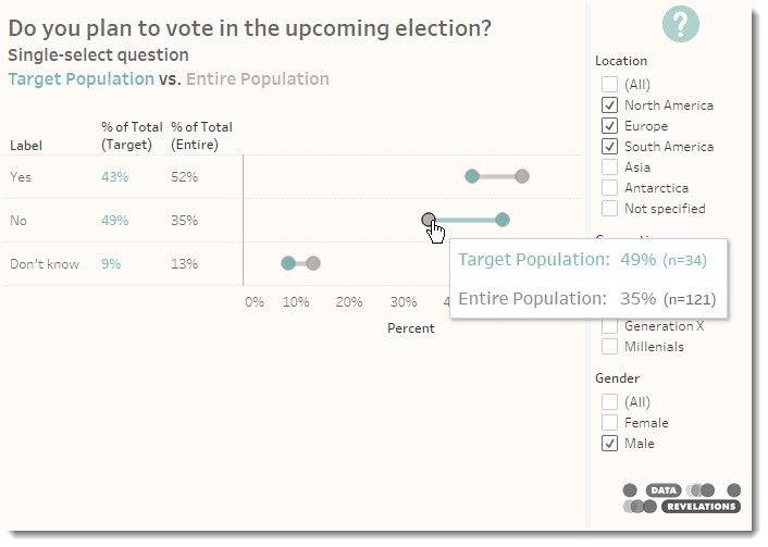
Figure 12 — Showing filtered vs. unfiltered for a single-select question
I’ve embedded the working dashboard below. Please feel free download and explore the dashboard as well as some alternative approaches saved in the workbook.