
Overview
I’ve written previously about how difficult it can be not to get sucked into the 24/7 Coronavirus vortex. I’m trying to be mindful of who and what I follow and wanted to share this.
The person I watch
I encourage you to watch New York Governor Andrew Cuomo’s daily press briefings, even if you don’t live in or care anything about New York as I think you will find this helpful. No spin. No politics. Just what’s going on and how to understand it all. He also adds personal commentary that I comforting and uplifting.

He usually presents live every day, sometime between 11 AM and noon. Most of the major news outlets cover this, but you should also be able to access the livestream from https://www.governor.ny.gov/.
The people I follow
I’ve not published any Coronavirus-related visualizations as I am not an expert and am terrified that I may inadvertently spread misinformation and at the same time distract people from reading things from people with better-informed insights.
I’m also more careful about who I retweet and cite. With this in mind I encourage you to following the following people.
Andy Slavitt, former Acting Administrator of the Centers for Medicare and Medicaid Services. Slavitt has posted informed and thoughtful commentary. See https://twitter.com/ASlavitt
Carl T. Bergstrom, Professor Biology at University of Washington and is currently working at the intersection of infectious disease modeling and the study of misinformation. Spent ten years working with a team to develop the epidemiological modeling infrastructure to help us detect and forecast emerging infectious diseases in real time. See https://twitter.com/CT_Bergstrom
Amanda Makulec MPH, Operations Director for The Data Visualization Society and Data Visualization Lead for Excella. Amanda is one of my Chart Chat colleagues and is my “go to” person for helping me navigate the flood of Coronavirus data and commentary. See https://twitter.com/abmakulec
Alberto Cairo, Knight Chair of Visual Journalism at the University of Miami and author of many good and important data visualizations books including How Charts Lie. See https://twitter.com/AlbertoCairo
The sites I follow
Worldometers. I admit that I am obsessed with this site.
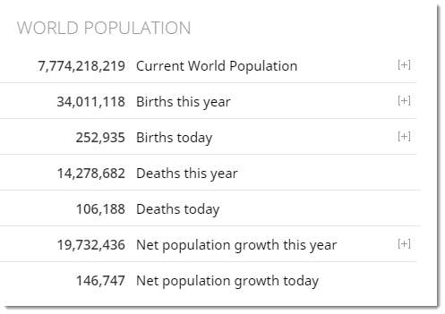
I’ve been visiting it at least ten times a day since my fellow Big Book of Dashboards author Jeff Shaffer told me about it in early March 2020.
The Financial Times Coronavirus Tracking site. Here you can see daily updates of the amazing index charts John Burn-Murdoch built that allows you to compare case and death rates among different countries and cities.
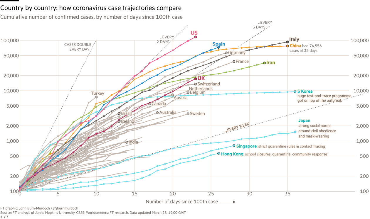
Note that several other organizations now have interactive versions of these charts, including The New York Times.


