Chart Chat Round 55 — October 23
Watch as Jeffrey Shaffer, Steve Wexler, Andy Cotgreave, and Amanda Makulec debate the good, the bad, and the "scaredy-cats" of data visualization.


Watch as Jeffrey Shaffer, Steve Wexler, Andy Cotgreave, and Amanda Makulec debate the good, the bad, and the "scaredy-cats" of data visualization.

Watch as Jeffrey Shaffer, Steve Wexler, Andy Cotgreave, and Amanda Makulec debate the good, the bad, and the "scaredy-cats" of data visualization.

Watch as Jeffrey Shaffer, Steve Wexler, Andy Cotgreave, and Amanda Makulec debate the good, the bad, and the "scaredy-cats" of data visualization.

Watch as Jeffrey Shaffer, Steve Wexler, Andy Cotgreave, and Amanda Makulec debate the good, the bad, and the "scaredy-cats" of data visualization.
Watch as Jeffrey Shaffer, Steve Wexler, Andy Cotgreave, and Amanda Makulec debate the good, the bad, and the "scaredy-cats" of data visualization.

Watch as Jeffrey Shaffer, Steve Wexler, Andy Cotgreave, and Amanda Makulec debate the good, the bad, and the "scaredy-cats" of data visualization.

Watch as Jeffrey Shaffer, Steve Wexler, Andy Cotgreave, and Amanda Makulec debate the good, the bad, and the "scaredy-cats" of data visualization.
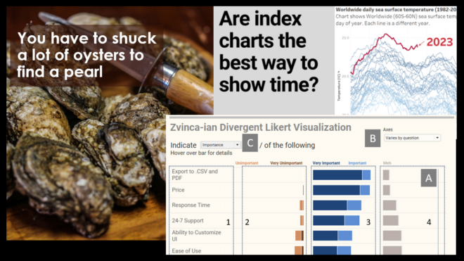
I subscribe to a lot of newspapers and magazines (some of which I read), but to satisfy my interest in data visualization, I find the best information often comes from people I follow on Twitter and from newsletter subscriptions. I’ll confess that I’m surprised at how many good conversations I see about data visualization on [...]

Watch as Jeffrey Shaffer, Steve Wexler, Andy Cotgreave, and Amanda Makulec debate the good, the bad, and the "scaredy-cats" of data visualization.
Watch as Jeffrey Shaffer, Steve Wexler, Andy Cotgreave, and Amanda Makulec debate the good, the bad, and the "scaredy-cats" of data visualization.

