Chart Chat Round 32 — July 14
Watch as Jeffrey Shaffer, Steve Wexler, Andy Cotgreave, and Amanda Makulec debate the good, the bad, and the "scaredy-cats" of data visualization.


Watch as Jeffrey Shaffer, Steve Wexler, Andy Cotgreave, and Amanda Makulec debate the good, the bad, and the "scaredy-cats" of data visualization.

Watch as Jeffrey Shaffer, Steve Wexler, Andy Cotgreave, and Amanda Makulec debate the good, the bad, and the "scaredy-cats" of data visualization.

Watch as Jeffrey Shaffer, Steve Wexler, Andy Cotgreave, and Amanda Makulec debate the good, the bad, and the "scaredy-cats" of data visualization.

Watch as Jeffrey Shaffer, Steve Wexler, Andy Cotgreave, and Amanda Makulec debate the good, the bad, and the "scaredy-cats" of data visualization.

Watch as Jeffrey Shaffer, Steve Wexler, Andy Cotgreave, and Amanda Makulec debate the good, the bad, and the "scaredy-cats" of data visualization.
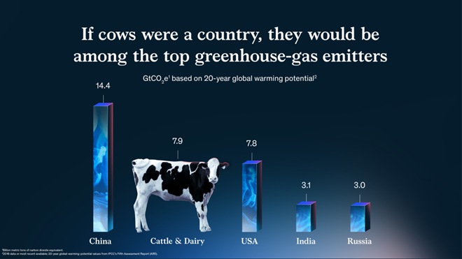
So many wonderful things from 2021. In this post I share my favorite chart, channel, chat, and tool. My favorite chart: If cows were a country I love this McKinsey gem from Jason Forrest, Gabrielle Merite, and Gergo Varga. I know, it violates so-called best practices. The bars are 3D (they look like smoke-filled containers) [...]
Watch as Jeffrey Shaffer, Steve Wexler, Amanda Makulec, and Andy Cotgreave, debate the good, the bad, and the “scaredy-cats” of data visualization. By tuning in you’ll learn how to apply their thought processes to your own work. You’ll be entertained, and you’ll build better data visualizations. Register
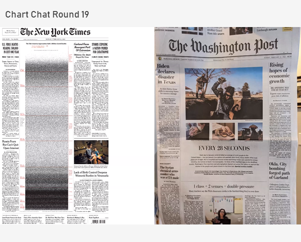
We discuss bar-in-bar charts, scaredy-cats and TURDs, great work from the New York Times, how to visualize 500,000 deaths, and the orange/blue debate. https://youtu.be/kco5U5wgDfY
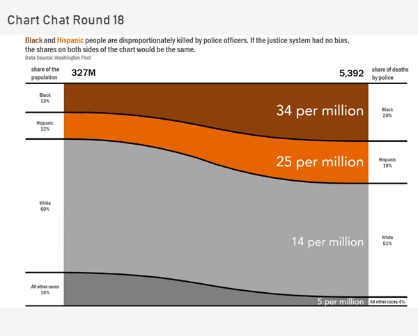
In this Chart Chat we reflect on Sankey and proportion charts, unit charts, unemployment charts and presenting complex data. https://youtu.be/IIirXyOcbeQ
Watch as Jeffrey Shaffer, Steve Wexler, Amanda Makulec, and Andy Cotgreave, debate the good, the bad, and the “screaming cats” of data visualization. By tuning in you’ll learn how to apply their thought processes to your own work. You’ll be entertained, and you’ll build better data visualizations. Tentative agenda: Scaredy-cats, Screaming cats, and TURDs in [...]

