Confidence

More thoughts on visualizing uncertainty in survey data

By |2023-10-04T23:28:36+00:00October 4th, 2023|Business Visualizations, Visualizing Survey Data|

I recently participated in a LinkedIn Live discussion about how to visualize uncertainty in survey data with Bob Walker, Anna Foard, and Jon Cohen. I find myself contemplating whether we have a type of moral obligation to try to make sure our audience understands that there may be a big difference between the survey results [...]

More thoughts on showing Margin of Error in survey data with Tableau

By |2021-11-18T14:07:27+00:00November 17th, 2021|Business Visualizations, General Discussions, Visualizing Survey Data|

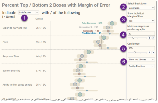
A big “thank you” to Daniel Zvinca, Chris Lay, Anna Foard, Jeffrey Shaffer, and Joe Cohen for their feedback and encouragement. Overview I published a blog post earlier this year on how I recommend showing results for Likert-scale questions broken down by different demographics. I had become fond of how organizations like Pew Research does [...]

Showing uncertainty in survey results

By |2021-11-15T15:52:10+00:00August 20th, 2018|Business Visualizations, Visualizing Survey Data|

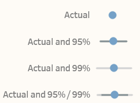
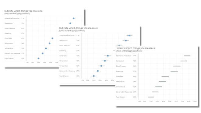
Visual representation of error bars using Tableau August 20, 2018 Much thanks to Ben Jones whose book Communicating with Tableau provides the blueprint for the calculations I use, Jeffrey Shaffer for providing feedback on my prototypes and sharing research papers from Sönning, Cleveland, and McGill, and Daniel Zvinca for his thoughtful and always invaluable [...]

Title