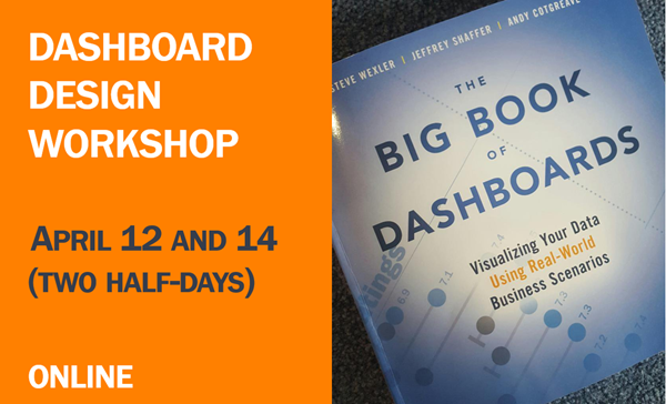
Dashboard Design Workshop Online — April 12 and 14
Learn how to build world-class business dashboards from the author of the best-selling book The Big Book of Dashboards.

Learn how to build world-class business dashboards from the author of the best-selling book The Big Book of Dashboards.

Should you use dashboards to tell stories or to find stories? You can’t tell a good story if you don’t understand the data, and a good dashboard will help you understand the data, faster. My thanks to Adam McCann, Athan Mavrantonis, Andy Cotgreave, and Jeffrey Shaffer for reviewing and providing feedback. Why do we [...]
Overview Prior to working with Jeffrey Shaffer and Andy Cotgreave on the The Big Book of Dashboards I tended to look at BANs -- large, occasionally overstuffed Key Performance Indicators (KPIs) -- as ornamental rather than informational. I thought they just took up space on a dashboard without adding much analysis. I’ve changed my mind [...]
Overview So, here's why until recently I've recommended that my clients avoid large dashboards. We've been working on a collection of killer dashboards and we're all set to make a big presentation to the CEO. This thing is so high profile we get to use the executive conference room with the super bright projector and [...]
Overview I’ve had a spate of requests from clients to show how survey responses rank across different categories and I’ve come up with a way that makes it very easy to see where the big stories are. Note that this approach works for any measure that can be ranked, not just survey responses. Let’s see [...]
I recently attended the Tableau Customer Conference. It was a great conference and if you are into Tableau you should definitely go to next year's event (see http://tcc14.tableauconference.com/seattle/). In any case, during the myriad networking opportunities I was very pleased by the number of people who told me how much they had gotten out of a [...]

