Zvinca

Likert Scale Questions the Zvinca Way

By |2023-07-24T17:35:46+00:00June 13th, 2023|Business Visualizations, Makeovers, Visualizing Survey Data|

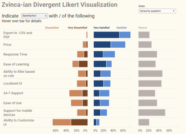
Overview Although I was on vacation in April of 2023, I did see this twitter post. Daniel Zvinca’s response knocked my socks off. Here’s the post from Cole Knaflic. And here was Daniel’s response. “Goodness, yes” I thought. This addresses the shortcomings of what I’ll call the “inside out” approach for displaying Likert scale survey [...]

Some people to follow

By |2022-09-21T23:14:37+00:00September 21st, 2022|Business Visualizations, General Discussions|

I subscribe to a lot of newspapers and magazines (some of which I read), but to satisfy my interest in data visualization, I find the best information often comes from people I follow on Twitter and from newsletter subscriptions. I’ll confess that I’m surprised at how many good conversations I see about data visualization on [...]

Is this better than a Jitterplot? Could be

By |2020-02-16T23:25:08+00:00July 22nd, 2018|Business Visualizations, General Discussions, Visualizing Survey Data|

July 22, 2018 Overview After writing my blog post about why I still love the Jitterplot, I got some thoughtful feedback from Adam McCann, Jeffrey Shaffer, and the always provocative Daniel Zvinca. Dan had written a wonderful article suggesting a Stingray plot as an alternative, and Jeff and Adam’s comments encouraged me to revisit [...]

Rethinking the divergent stacked bar chart — placing the stronger views in the center

By |2020-02-17T02:20:59+00:00April 1st, 2018|Business Visualizations, Visualizing Survey Data|

April 2, 2018 Overview Followers of the Data Revelations blog and website know that my “go to” visualization for Likert scale data is a divergent stacked bar chart. Earlier this year there was some debate about whether this is a better approach than a stacked bar chart. I'm still completely in favor of the divergent approach, [...]

Title