
March 14, 2019
Overview
Since 2011 a highlight of Tableau’s annual conference is “Iron Viz,” a data visualization competition loosely based on “Iron Chef.” The premise of the Tableau contest is that three contestants who have won feeder competitions have 20 minutes to build a fully functional, interactive dashboard from scratch, with each contestant using the same data set. The winner is determined by tallying results from a panel of four judges (who account for 90 of the points awarded) and the audience (who account for 10 of the points). The victor is crowned Iron Viz Champion and wins $2,000. (The winner used to get an iPad, too, but now it’s just cash and bragging rights.)
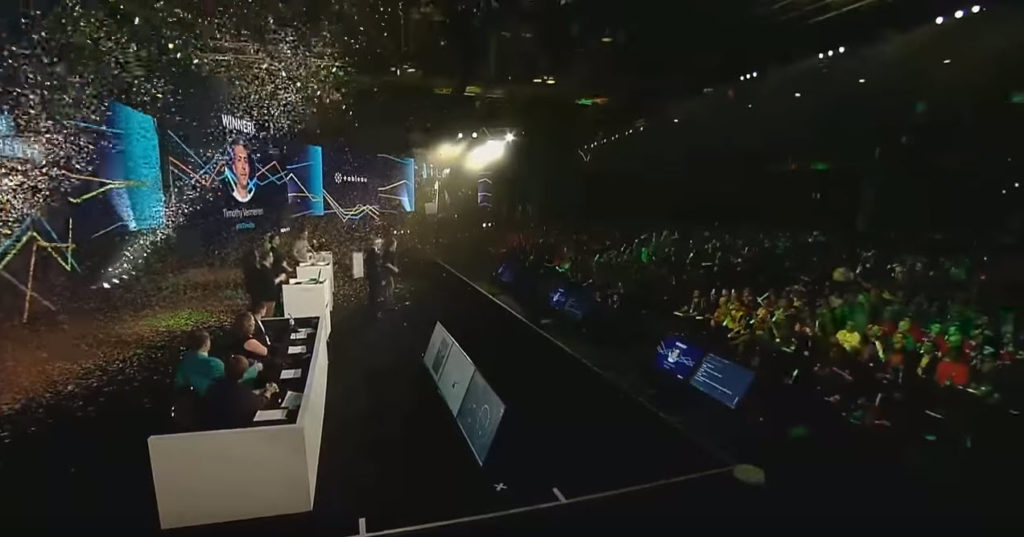
Figure 1 — The audience watches as the 2018 Iron Viz champion is crowned.
I won the first Iron Viz competition ins Las Vegas. Back then, and for the first four years, the competition was a “breakout” session and competed for attention with other sessions. My guess is that one-quarter of the entire conference attended the first Iron Viz competition, meaning there were at most 350 people there. Contrast that with the 2018 competition where there were over 10,000 people watching.
Iron Viz is now huge, with production values that rival any major network TV competitions (think “America’s Got Talent” or “American Idol.”) If you’ve not seen the competition or don’t have a sense of how it works and how big it is, have a look at this video from last year.
So, given its success and popularity, why do I think anything is wrong with it, let alone suggest there’s a way to fix it?
I will try to articulate where the competition has lost some of its helpfulness to the community and how I think it can be fixed (and I will do my best to avoid too many “back in my day” pinings.)
So, what has changed for the worse?
Here are the five areas where I think there are problems and how I think they can be improved.
- Data sets are no longer identical
- Competitors can build too many things ahead of time
- All the competitors’ entries should be downloadable from Tableau Public
- Audience voting needs to be transparent and fair
- Establish a code of conduct to eliminate what I think is cheating
Data sets are no longer identical
In 2018 Tableau added the requirement that attendees use Tableau Prep Builder to prepare and blend different data sets – different data sets of their own choosing. Yes, all the competitors received the same proprietary IBM weather data, but each could take his own data and add it to the mix and even ignore the main data set.
I think this “visualize whatever you want” hurts the competition. There was something amazing about “wow… look what *that* person found in the data” that made the competition special.
How might we fix this? Maybe a Tableau officiant can use Tableau Prep Builder to blend multiple data sets ahead of time and give this same, blended data set to each competitor? Perhaps have the show hosts demonstrate Tableau Prep Builder during the show preamble? I think the audience would appreciate seeing how the data was prepared and the audience will get a good understanding of just what is in the blended data set. You don’t get this if you allow competitors to bring in any data set
Competitors can build too many things ahead of time
By requiring Tableau Prep Builder you also encourage people to build calculations ahead of time. I was surprised to see how much stuff – calculations, images, digital assets – were either already in the database (thanks to Tableau Pep Builder) or sitting in a Word document, ripe for copying and pasting. I’d like to see Iron Viz return to its roots of “you, the data, Tableau. Start from scratch. 20 minutes.”
All the competitors’ entries should be downloadable from Tableau Public
All the Iron Viz dashboards are amazing and making them readily downloadable is a great way to educate the Tableau community. I know I’ve learned a ton by downloading Iron Viz dashboards and opening them in Tableau to see how they were built. For example, check out Curtis Harris’ winning dashboard from the 2016 competition, or Tristan Guillen’s winning dashboard from the 2017 competition.
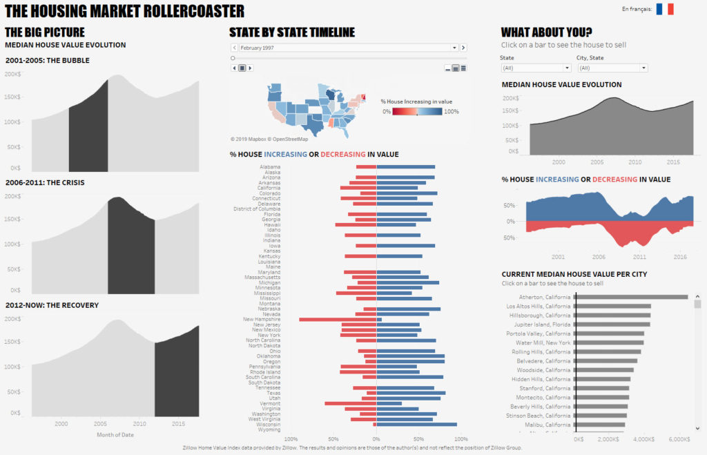
Figure 2 — I can download this dashboard from Tristan Guillen. That’s a good thing.
What about the dashboards form the 2018 competition? They were built using proprietary weather data from IBM and cannot be downloaded. What a shame!
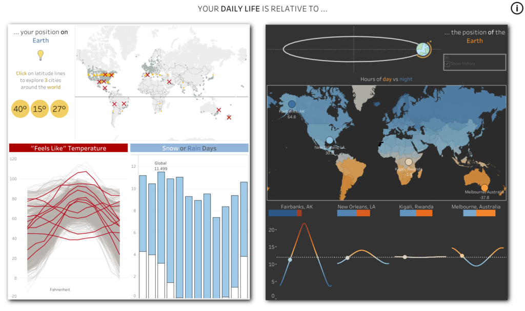
Figure 3 — I can’t download this dashboard from Timothy Vermeiren. That’s a bad thing.
Audience voting needs to be transparent and fair
If I understand correctly, the winner is decided based on the findings from four judges and audience voting. The judges account for 90 possible points and the audience accounts for the remaining 10 points. Each contestant can earn a maximum of 100 points.
And just how does the audience get counted? Through twitter hash tags. What is unclear is whether the audience vote is a winner-take-all thing, or if the 10 points are awarded proportionately. The 2018 winner, Timothy Vermeiren, wowed the audience by making a motion chart using Tableau’s pages shelf.
I won’t get into a discussion as to whether the animation was helpful or gratuitous, but I believe it did earn Timothy more tweets. My question is whether that earned him 10 points or some fraction of that. It would be wrong for the tweet winner to get all ten points.
Note: Several people with insider knowledge have told me the twitter votes decided the winner on more than one occasion.
Establish a code of conduct to discourage cheating
Each contestant gets to work with a “sous vizzer.” This is Tableau employee that is available to coach, cajole, calm and assist the competitor during what is a very stressful few days. When I was competing my “sous vizzer” was Dustin Smith and I found it very helpful to be able to bounce ideas (and tater tots) off of him.
For me, it was implied but not explicitly stated that figuring out what to build was between me and my sous vizzer. It didn’t occur to me to look for additional help as that just seemed wrong.
Apparently not everyone shares my view on this. There was at least one year where the winning contestant received more than a little input from several of his work colleagues on analyzing the data and coming up with the best way to present the results. If this is true, I think it completely violates the spirit of the competition. I encourage Tableau to establish a code of conduct where each contestant pledges to only get help and feedback form his / her sous vizzer.
Conclusion
I am grateful for Tableau and Iron Viz as winning the competition helped establish my data visualization practice. I also enjoy attending the competitions as they are enormously entertaining – just look at host Andy Cotgreave’s tuxedo!

Figure 4 — A resplendent Andy Cotgreave.
I very much want to see the competition thrive, so I encourage Tableau to have contestants use the exact same data, reduce the pre-built stuff, make sure all entries are downloadable from Tableau Public, ensure the audience voting is transparent and fair, and establish a code of conduct to eliminate cheating.
Want to learn more about Iron Viz? Click here.
Thinking of participating, but afraid to try? Check out Sarah Bartlett’s Iron Quest initiative.


