Chart Chat Live — Round 33
The Chart Chat hosts welcome guest Cole Nussbaumer Knaflic who discussed her new book, Storytelling with You. https://youtu.be/2MVJhgQjtVc

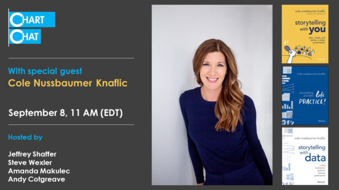
The Chart Chat hosts welcome guest Cole Nussbaumer Knaflic who discussed her new book, Storytelling with You. https://youtu.be/2MVJhgQjtVc
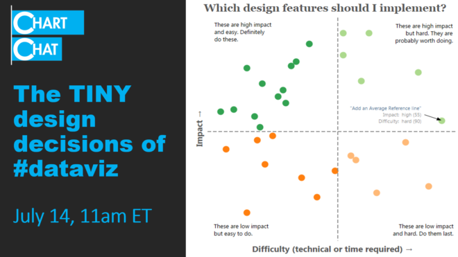
The Chart Chat hosts discuss the tiny -- and not so tiny -- design decisions that go into crafting effective data visualizations. https://youtu.be/3qa94Yxt8Ks

The Chart Chat hosts speak with guests Seth Godin and Jasper Croome about creating the charts for The Carbon Almanac. https://youtu.be/Kz_EFINGXXY

Amanda Makulec interviews Steve, Jeff, and Andy as they reflect on The Big Book of Dashboards, five years later. https://youtu.be/kVh7I6gFB_c
And some other thoughts on conditional formatting. Overview A few weeks ago my friend, Yamil Medina, asked me to attend a weekly livestream he hosts with his colleague at Data Meaning, Aaron Simmons. The livestream is called 3@3: A Mystery Chart Show and I enjoyed it so much I decide to hangout the following week. [...]
Let me show you a few techniques that will allow you to ditch color legends and in so doing make it easier for your audience to understand the charts you create. Direct Labeling Lines Here’s a “before” picture of a simple line chart with a color legend. Figure 1 - Line chart with color legend. [...]

January 18, 2021 Some thoughts about critique in data visualization. Background For the past 18 months I’ve been working on a new book (more on this in a moment). Last September, I asked some colleagues to review selected chapters. I asked everybody to review the preface, which included this passage: My friend Jonathan Schwabish provided [...]
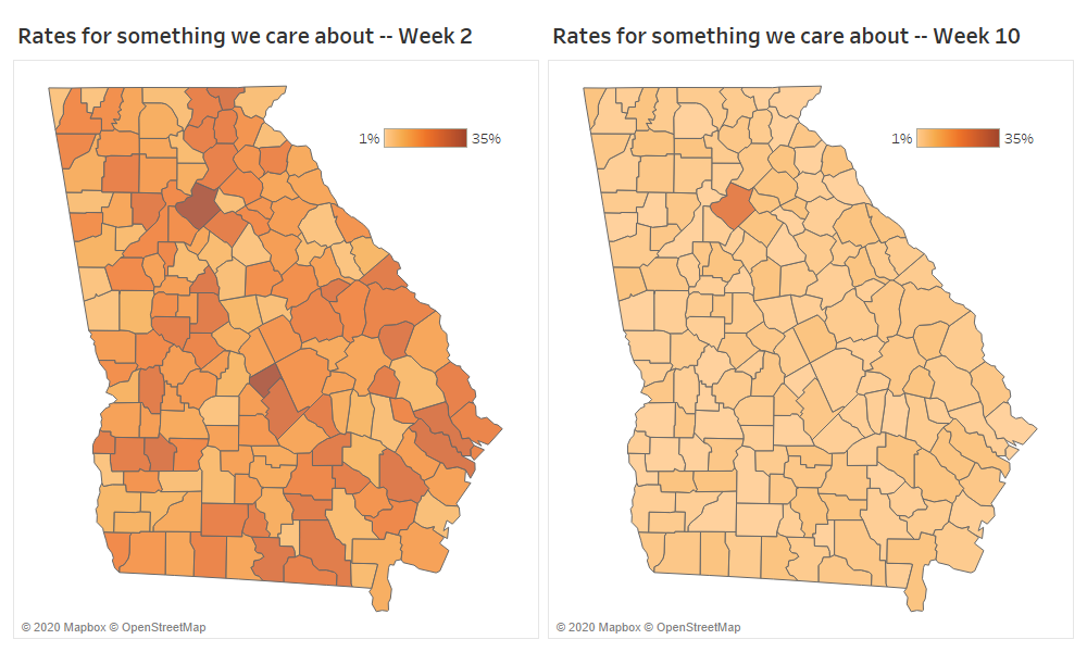
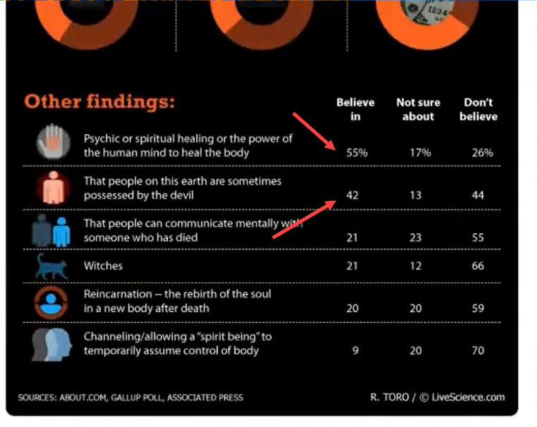
Be careful what you amplify And some thoughts on color palettes / color ramps Background This tweet got a lot of attention recently (see https://twitter.com/andishehnouraee/status/1284237474831761408?s=20) Figure 1 -- Tweet suggesting that Georgia is trying to hide something. While I did not retweet it, I did blindly chime in that this looked like gross incompetence, [...]

Should you use dashboards to tell stories or to find stories? You can’t tell a good story if you don’t understand the data, and a good dashboard will help you understand the data, faster. My thanks to Adam McCann, Athan Mavrantonis, Andy Cotgreave, and Jeffrey Shaffer for reviewing and providing feedback. Why do we [...]
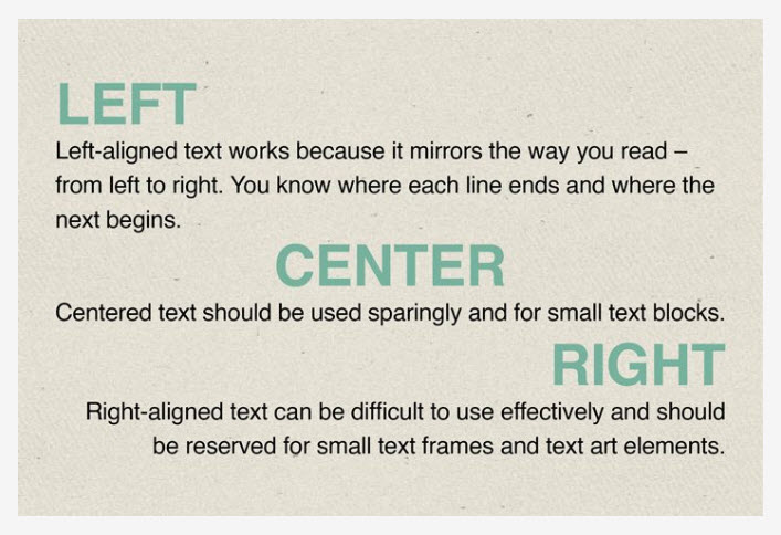
Or at least have a very good reason for doing so. Note: My observations are for dashboards in languages where one reads from left to right. If you create dashboards in Aramaic, Arabic, Hebrew, Urdu, etc., just reverse everything. IMPORTANT: Since posting I've received lots of feedback on this. I want to [...]

