Overview
As anyone who has read this blog knows I’m definitely a “bar charts are better than pie charts are better than donut charts” kind of guy, at least when you need to make an accurate comparison.
But in my classes, as I rearticulate the case against pies and donuts, I find myself wondering if there are in fact times when a pie chart might be a better choice.
Most of my data visualization work is for internal purposes so I focus on making it easy for people to make an accurate comparison.
But as my clients and I make occasional forays into public-facing visualizations I think about how to make it easy for people to make an emotional comparison. By this I mean that I want people viewing the visualization to just “get it”.
Better yet, I want people to get it, be engaged by it, and in some cases, “feel” it.
With this in mind, in this post we’ll explore cases where
- a pie chart is in fact as good, if not better, than a bar chart.
- circles and spheres do a better job conveying magnitude than do bars.
- a waffle chart produces an emotional wallop without compromising analytic integrity.
Where a pie chart trumps a bar chart
So, it’s the year 2034 and in this somewhat dystopian future there’s a movement afoot to add an amendment to the US constitution banning the use of pie charts.
Those of you familiar with the United States Constitution know that three-quarters of the states need to approve an amendment for said amendment to become law. In 2034 it turns out the 39 of 50 states will in fact ratify the amendment.
Does that get us the needed 75%? Here’s a simple, compact chart that lets us know immediately.

Figure 2 — The amendment banning pie charts passes as I can see that the “Yes” votes fill more than three quarters of the circle.
It’s so easy to see that the “Yes” votes fill more than three-quarters of the pie that I don’t need labels indicating the large slice is 78% and small slice is 22%.
Compare this with a bar chart.
Without labels showing the percentages I cannot tell for sure if the “Yes” bar is more than three times larger than the “No” bar.
Okay, Okay, Okay! I know that a simplified bullet chart would work, too.
Yes, the bullet chart makes it clear that I’ve exceeded my goal but I need to know that the goal was 75%. I don’t need the goal line with the pie chart.
So, does this mean that it’s okay to use pie charts instead of bar charts?
No. Based on this example it’s only okay to use a pie chart (singular). In addition, your pie chart (singular) needs to meet the following conditions:
- One of the slices has to make up at least 50% of the pie.
- If you’re pie has more than two slices you don’t ask people to compare the smaller slices.
Where circles and sphere’s do better than bars
As we all know Jupiter is big, really big.
Just how much bigger is it than Earth?
Should I create a bar chart to show this? If I were to create one should I compare the radius or the surface area of each planet?
Or should I really go nuts and compare the volume of the planets?
I don’t think the dashboard shown above is nearly as effective as the visualization shown below.
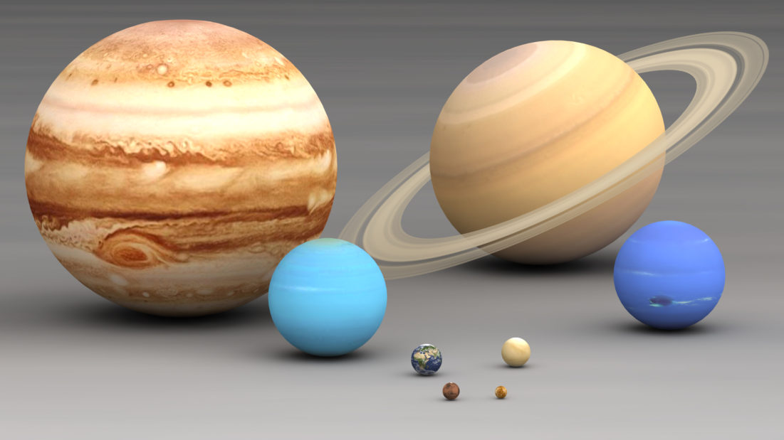
Figure 5 — “Size planets comparison” by Lsmpascal – Own work. Licensed under CC BY-SA 3.0 via Commons – https://commons.wikimedia.org/wiki/File:Size_planets_comparison.jpg#/media/File:Size_planets_comparison.jpg
Jupiter and Saturn – and even Neptune and Uranus – really dwarf earth and the other planets and with this visualization I feel it.
Even the simple chart comparing the area of the cross section of the planets gives me a better feel for the data than does the bar chart.

Figure 6 — Circles comparing cross-section area of the planets. Yup, I can tell that Jupiter is way bigger than Earth.
Is it essential that I can tell exactly how much larger one planet is than another? I don’t think it is and I much prefer the emotional pull of the circles and the spheres.
A Fun Tangent
One thing that’s very hard to express in a static chart is how much space there is between the sun and the planets. To get a sense of just how incredibly vast the distances are check out this fascinating, albeit somewhat tedious, interactive visualization from Josh Worth.
Getting an emotional wallop with waffles
A few weeks ago Cole Nussbaumer posted a tweet asking people what they thought of this chart from The Economist:

Figure 7 – A waffle chart from the article “Teens in Syria”. See http://www.economist.com/blogs/graphicdetail/2015/08/daily-chart-6?fsrc=rss.
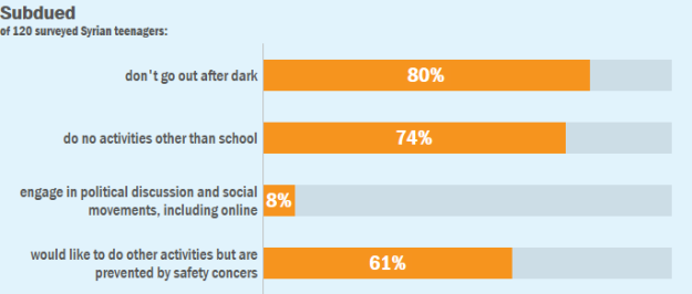
The first thing that surprises me about this is that The Economist went with a waffle chart and not a bar chart, like the one below.
The second thing that surprised me was that I preferred the waffle chart. Yes, as Jeffrey Shaffer correctly points out, the dots are so tightly packed that you literally see stars between the circles, but this can easily be remedied. The question on my mind is why do I prefer waffles?
My answer is that the having each dot represent one of the 120 people surveyed connected with me in a way that the bar chart did not. Combined with the percentage labels (which are critical to the success of the visualization) the waffle chart hit me hard and it did so without dumbing down the importance of the discussion one bit.
So, are bars charts always boring?
No! In another blog post I’ll show you an example of a bar chart embedded inside a “come hither” graphic that
- attracts and engages
- does not trivialize an important issue
- represents the data clearly and accurately
Stay tuned.


