
Overview
I’ll admit that I have a problem with treemaps in Tableau, but it’s not because the chart type is in some way inferior. My problem is with how people use – and misuse – treemaps.
Here’s a good example of misuse. Instead of displaying something straightforward that looks like this…

Figure 1 — The humble, but accurate bar chart
… some people feel compelled to add “visual variety” to their dashboards and instead create something that looks like this.

Figure 2 — Look , Ma! I made a Mondrian!
Except for the “it looks cool” factor there’s no good reason to use a treemap in this situation.
So, when should you use a treemap?
What’s in a treemap and why it can be useful
With a treemap you have two attributes at your disposal:
- The size (area) of rectangles, and
- The color of the rectangles
A treemap consists of packed rectangles where the area of a rectangle corresponds to the size of a particular measure. In the example above the size of the rectangle is based on the number of people that come from a particular region. North America has the largest value so it’s represented with the largest rectangle. Europe has a smaller value to its rectangle is proportionally smaller.
Treemaps really come in handy is when you have A LOT of marks to plot and you need to show all of the marks in a compact area.
So, this sounds like a great chart – we’ve got rectangles to show how big and small stuff is, color to group related rectangles intelligently, and we can fit a lot of stuff in small space. Why not use this chart all the time?
The downside is that we are comparing the area of rectangles and with rectangles it is difficult to make an accurate comparison. People may be very good at comparing the length of bars but as a species we are not particularly good at comparing the area of rectangles (and we’re downright awful at comparing the area of circles.)
So, given the advantages and shortcomings, just when should you use it? Let’s look at a particular scenario.
Showing Presidential Electoral Results
A Filled Map
Consider the electoral map below showing electoral votes by state for Barack Obama and Mitt Romney in 2012.
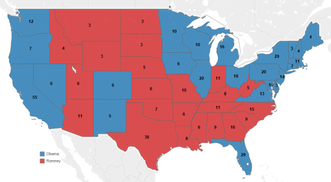
Figure 3 — Filled map showing electoral votes for the 2012 presidential election (displaying 48 out of 50 states)
Our Electoral College system is fairly confusing and I can only imagine how somebody from outside the US would look at this as there appears to be more red on the map than blue… but the blue guy won!
This discrepancy becomes even more pronounced when we include Alaska and Hawaii in the map.
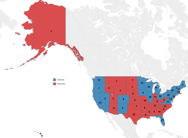
Figure 4 — Filled map showing electoral vote winners for the 2012 presidential election (displaying 50 states)
Clearly, a map designed to show how much area there is in a state fails with Electoral College results where the numbers are based on population not land mass. In the example above there’s A LOT more red then blue, but again, the blue guy won the election.
Perhaps a different type of chart will do a better job?
Symbol Map
Here’s a symbol map of the same data.
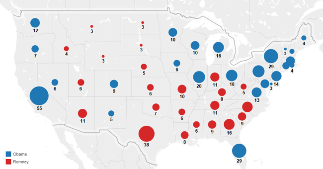
Figure 5 — Symbol map showing electoral vote winners for the 2012 presidential election (displaying 48 out of 50 states)
I think this is more accurate as there’s clearly more blue than red, but it’s still a tough read. What else might work?
Cartogram
Here’s a cartogram from Professor Mark Newman of the University of Michigan showing the same data, except the polygons for each state has been adjusted to reflect the population of the state.
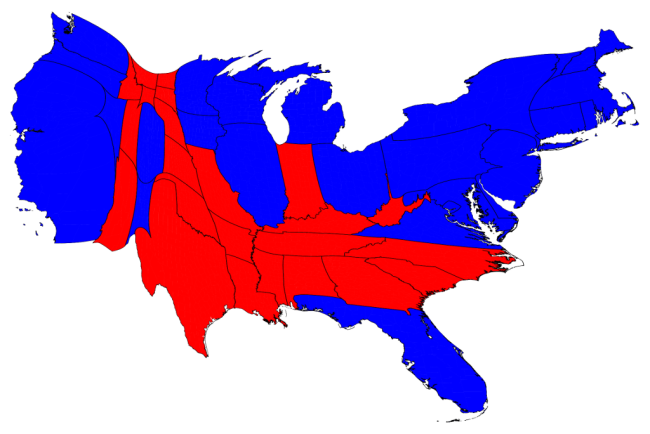
Figure 6 — Cartogram showing election results where the shape of the state is based on its population and not land mass.
While it’s very clear that there is more blue than red on this map there are two problems with this approach:
- There aren’t many tools that will support this type of distortion; and,
- This map will frighten small children.
Summary Bar Chart
Why not just display a simple bar chart showing the total number of electoral votes, like the one shown here?

Figure 7 — Electoral vote count by candidate
This is certainly very clear and we can see easily by how much Obama won, but we’re missing an important part of the story.
In US presidential elections a winner is chosen by tallying the electoral votes from each state and the summary bar chart doesn’t show us how each state contributes to the total for each candidate.
And the Winner is… ? The Treemap!
Here’s a treemap showing the exact same data.
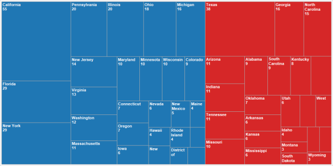
Figure 8 — Treemap showing 2012 electoral vote results
Of all the single visualizations I think this treemap tells the most complete story. We can see just how much states like California, Texas, Florida, and New York contribute to the total as well as gauge — to some degree — just how many more electoral votes Obama received than did Romney.
One shortcoming, however, is that we can’t see the names of all the states as some of the rectangles are too small.
One way to address this is by adding a tool tip, as shown here.

Figure 9 — Hovering over a mark allows me to see the name of the state and number of electoral votes.
While this works, a problem we should address is that the small states are not easily searchable. That is, if I want to know the results for Alaska, Hawaii, Delaware, etc., I have to go hunting for them.
At this point we’ve gotten about as far as we can get with a single chart. To tell the complete story – and to make it easy for people to find results for a particular state – we should create a dashboard.
The Electoral Vote Dashboard
Here’s a dashboard that puts two of the views together and that allows the user to find a particular state’s rectangle by selecting the state from a list.
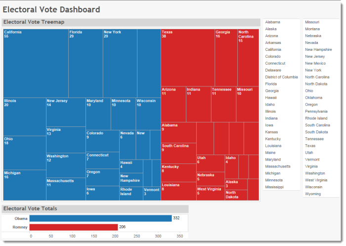
Figure 10 — Electoral votes dashboard. Selecting a state from the list will display that state’s rectangle in the treemap.
While the “star” of the dashboard is the treemap, the summary bar chart and the selectable list make the story complete and we get a solid understanding of the 2012 Electoral College results.
And we achieved this without using an actual map.
Click here to interact with dashboard.


