Business Visualizations

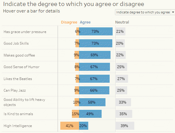
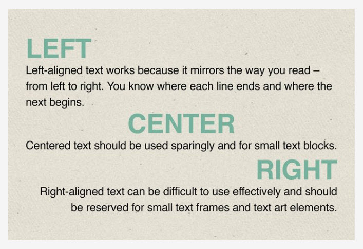
DON’T center, right-align, or justify text on a dashboard

By |2022-08-03T18:58:48+00:00December 3rd, 2019|Business Visualizations, General Discussions, Makeovers|

Or at least have a very good reason for doing so.   Note: My observations are for dashboards in languages where one reads from left to right. If you create dashboards in Aramaic, Arabic, Hebrew, Urdu, etc., just reverse everything.   IMPORTANT: Since posting I've received lots of feedback on this. I want to [...]

10 Fascinating Findings from the Data Visualization Society 2019 Community Survey

By |2020-09-14T14:06:14+00:00September 29th, 2019|Business Visualizations, General Discussions, Visualizing Survey Data|

September 29, 2019 Overview 1,359 people participated in the 2019 The Annual Data Visualization Community Survey conducted by The Data Visualization Society (DVS). The survey covers professional data visualization details like salary and hourly compensation, tool use, location, demographic data, audiences, organizational structure, and more. I think this is an ambitious, bordering on heroic, [...]

The Churn Dashboard Explained

By |2020-02-15T18:27:33+00:00August 6th, 2019|Business Visualizations, Makeovers|

August 6, 2019 Overview Since the release of The Big Book of Dashboards in the Spring of 2017 I’ve received a lot of requests to explain how to build the Churn dashboard in Tableau. I’m glad I waited to write the post as my friend and colleague Klaus Schulte came up with a considerably [...]