Business Visualizations

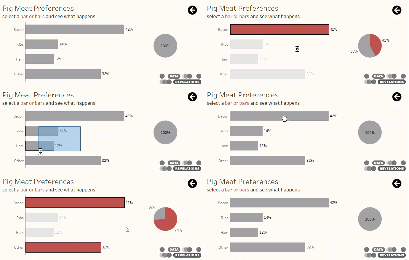
A Bar Chart and a Pie Chart Living in Harmony

By |2021-03-14T16:42:43+00:00December 2nd, 2018|Business Visualizations, General Discussions, Makeovers|

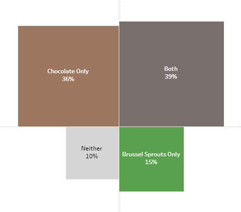
And a great way to visualize Pareto analysis December 2, 2018 Special thanks to Lindsey Poulter, Andy Cotgreave, Jeffrey Shaffer, Cole Nussbaumer Knaflic, Robert Kosara, Adam Crahen, and Joey Cherdarchuk. Overview While at this year’s Tapestry conference (by far my favorite conference) I had the good fortune to literally bump into Joey Cherdarchuk from [...]

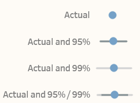
Chart Chat Live – Round 1

By |2022-03-23T20:40:46+00:00November 28th, 2018|Business Visualizations, Chart Chat, Videos|

November 28, 2018 Thank you to everyone that joined our first Chart Chat Live webinar. https://youtu.be/Z3wLmRvy4YQ In addition to the recording above, you can also download Steve’s slides here and download Jeff’s slides here. Recap After brief introductions, Steve discussed color and the use of BANs. Steve discussed “Lonely [...]

Showing uncertainty in survey results

By |2021-11-15T15:52:10+00:00August 20th, 2018|Business Visualizations, Visualizing Survey Data|

Visual representation of error bars using Tableau August 20, 2018 Much thanks to Ben Jones whose book Communicating with Tableau provides the blueprint for the calculations I use, Jeffrey Shaffer for providing feedback on my prototypes and sharing research papers from Sönning, Cleveland, and McGill, and Daniel Zvinca for his thoughtful and always invaluable [...]

Is this better than a Jitterplot? Could be

By |2025-01-12T16:08:17+00:00July 22nd, 2018|Business Visualizations, General Discussions, Visualizing Survey Data|

July 22, 2018 Overview After writing my blog post about why I still love the Jitterplot, I got some thoughtful feedback from Adam McCann, Jeffrey Shaffer, and the always provocative Daniel Zvinca. Dan had written a wonderful article suggesting a Stingray plot as an alternative, and Jeff and Adam’s comments encouraged me to revisit [...]

Rethinking the divergent stacked bar chart — placing the stronger views in the center

By |2020-02-17T02:20:59+00:00April 1st, 2018|Business Visualizations, Visualizing Survey Data|

April 2, 2018 Overview Followers of the Data Revelations blog and website know that my “go to” visualization for Likert scale data is a divergent stacked bar chart. Earlier this year there was some debate about whether this is a better approach than a stacked bar chart. I'm still completely in favor of the divergent approach, [...]

Does Gartner consider this when building its Magic Quadrant?

By |2020-02-17T23:42:09+00:00February 19th, 2018|Business Visualizations, Visualizing Survey Data|

February 20, 2018 Introduction So, we are a few weeks away from Gartner publishing its “Magic Quadrant” for business intelligence tools. This annual report irks me for two reasons: Wall Street analysts pay more attention to the report than I think is warranted; and, Practically every vendor finds something to crow about in a [...]

Comparing a target group with the entire population

By |2017-12-18T20:11:26+00:00December 18th, 2017|Business Visualizations, General Discussions, Visualizing Survey Data|

December 18, 2017 Updated September 27, 2018 to include single-select questions. Special thanks to Shaelyn McCole at Hootology who suggested the topic, Ryan Gensel at CPI who came up with a wonderful enhancement to the connected dot plot, and Jeffrey Shaffer at Data Plus Science who suggested some cosmetic improvements. Note: The original blog post only [...]

How to take the “screaming cats” out of stacked bar and area charts

By |2025-05-18T19:54:24+00:00November 26th, 2017|Business Visualizations, General Discussions|

November 25, 2017 Special thanks to Jeffrey Shaffer, Andy Cotgreave, and Rody Zakovich for feedback that helped improve the dashboard that appears at the end of this post. Overview It seems I’m not the only person who has been thinking about stacked bar charts (see posts from Cole Nussbaumer Knaflic, Jonathan Schwabish, and Andy Cotgreave.) [...]