Overview
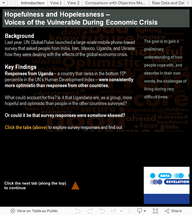
Last year, UN Global Pulse launched a large-scale mobile phone-based survey that asked people from India, Iran, Mexico, Uganda, and Ukraine how they were dealing with the effects of the global economic crisis.
The survey (conducted from May-August 2010) asked two multiple choice and three open-ended questions focusing on economic perceptions.
Note: The fully working dashboards may be found at the end of this blog post.
Key Findings
Responses from Uganda – a country that ranks in the bottom 15th percentile in the UN’s Human Development index – were consistently more optimistic than responses from other countries.
What could account for this? Is it that Ugandans are, as a group, more hopeful and optimistic than people in the other countries surveyed?
Or could it be that survey responses were somehow skewed?
Let’s explore the data to find out.
Voices of Vulnerable Populations during Times of Crisis
Clicking the second tab displays the following view.

Economic Change Index
So, why in the first graphic does Uganda warrant a positive blue bar and Mexico a negative orange bar? By moving your mouse pointer over a bar you can see just what it is that drives the Economic Change Index.
Here are the results for Uganda…

… and here are the results for Mexico:

The index itself (1.2 for Uganda and -1.6 for Mexico) is computed by applying Likert-scale values to each of the possible question responses. We’ll discuss the advantages of using this approach in a moment.
Fixed Responses vs. Using One’s Own Words
The first two questions in the survey gave respondents four choices from which to choose. The remaining three questions allowed people to respond in their own words.
You can explore these responses yourself by picking a question and a country from the drop down list boxes.

So, does the sentiment shown in the first fixed-response apply the open text responses as well?
Promising vs. Uncertain
Here is how people from Uganda responded to the question “In one word, how do you feel about your future?”…

… and here is a visualization of the responses from Mexico.

This, combined with responses to other questions, left me scratching my head. What are we not seeing that would lead to responses from Uganda — a country that is arguably in worse condition than the others — being so upbeat?
If you can’t wait for the answer, click here.
A Word about Word Clouds
I’ve analyzed a lot of survey data and I hate analyzing survey results where people get to provide free-form text responses because aggregating responses based on a common sentiment can be very difficult.
In many cases Word Cloud generators can convey the overall sentiment from multiple text responses. They are also interesting to look at and I do believe the ones shown above are a good reflection of respondent sentiment.
A problem occurs, though, when respondents use different terms that describe the same or similar sentiment. Consider the Word Cloud shown below.

One might think that most respondents were happy, but look what happens if we “linguistically normalize” the terms that are synonyms of “sad”:

It turns out that more people are in fact sad.
Note: There are products that are capable of parsing full sentences and are able to “disambiguate” and then normalize terms under umbrella concepts. The text responses to this particular survey, however, do not warrant this type of heavy artillery.
How We Calculate the Indices
The next tab in the workbook shows some alternative ways of visualizing the fixed-response survey results.

For these questions respondents were given four choices:
Easier / Better
Same
Worse / More Difficult
Much Worse/ Very Difficult
Notice that we display the calculated index atop the Likert-scale stacked bar charts. There are three advantages to calculating an index for Likert-scale responses:
- It makes it easy to weigh sentiment across many responses.
- It makes is possible to track sentiment changes over time.
- It makes it possible to compare results against various objective economic indices (e.g., GDP, UN HDI, etc.).
Note: I have no problem using even-numbered Likert scales, but I do think in this case sentiments will be skewed towards the low end as there are two levels of pessimism (e.g., “worse” and “much worse”) and only one of optimism (e.g., “better”).
I attempted to combat this by applying the following values to the responses:
Easier / Better = 3
Same = 0
Worse / More Difficult = -2
Much Worse/ Very Difficult = -4
While I think these values make sense, users of this dashboard are welcome to use the sliders and apply different values to each of the answers. The indices will be recalculated automatically.
A Composite Index
In an earlier version of this dashboard I created a “composite index” that combined results from the two fixed-response questions:

I think this is a valuable metric and one that I would include should UN Global Pulse make this study longitudinal (see below).
Mobile Pulse Survey Results vs. Objective Economic and Human Development Indicators
In the next tab we see survey responses (first column) vs. the United Nations Human Development Index Ranking (second column).

What could account for Ugandan survey respondents being the most optimistic despite the fact that they rank 143 out of 169 countries in the UN’s HDI Ranking?
I believe that the survey’s SMS Text-based approach is skewing the results.
Consider the third column where we see the number of mobile subscribers within a country as a percentage of that country’s population. In Uganda, at most 29% of the population has a mobile phone suggesting that those completing the survey may be better-off financially than others within their country. Survey responses may not, therefore, be a reflection of the country as a whole. (See The CIA World Factbook for mobile phone subscription information.)
This would not be the first time premature reliance on phone polls has derailed a survey (or in this case, just part of a survey). See A Couple of Interesting Examples of Bias and Statistical Sampling.
Make the Survey Longitudinal
Despite the shortcomings, I think there is a lot of value in conducting these types of agile, real-time surveys.
One ongoing challenge will be comparing subjective data among different countries as there are so many cultural / proclivity issues that are difficult to compare.
One way to do this would be to conduct a longitudinal study and see how sentiment changes over time. That is, instead of comparing Uganda with Mexico or India with Ukraine for a given year, track the changes over time, using an index. This would allow you to see the percent change in sentiment between time periods without having to worry about normalizing cultural differences.
I hope that UN Global Pulse will update this survey on a regular basis as there’s much we would be able to learn from such a study.