Overview
Tableau’s automatic axis feature can often present problems with survey data.
In this blog post we’ll look at how the problem crops up and what you can do to both fix the problem and make your visualizations more insightful.
The problem with auto-adjusting bars
Tableau’s automatic axis does a great job extending and contracting the length of bars so that a bar chart fills the view. In most circumstances this is a good thing but there are cases where it can inhibit your audience’s ability to correctly interpret your data.
Consider the chart below where we see the percentage of people that selected that top 2 boxes for a Likert scale question (in this case we see the percentage of people who selected Agree or Strongly Agree). Pay attention to the length of the top bar.
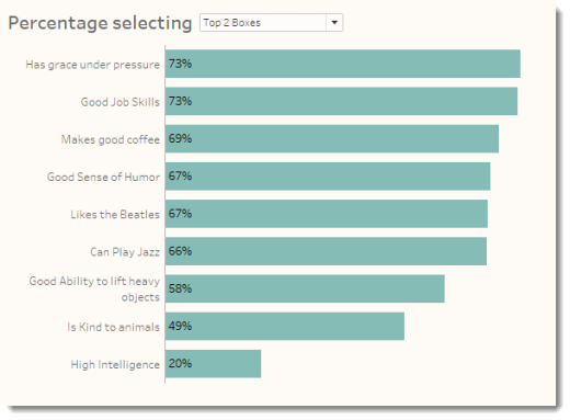
Figure 1 — Percentage of respondents that selected Agree or Strongly Agree (Top 2 Boxes). Notice the length of the top bar.
Now let’s see what happens when we change the view to show the percentage of people that only selected Strongly Agree (Top Box). Again, pay attention to the length of the top bar.
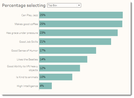
Figure 2 — Percentage of respondents that selected Strongly Agree (Top Box). Again, notice the length of the top bar.
There’s a HUGE difference here, but unless you look at the numbers (and the labels, as the sorting has changed) you’re going to miss it.
Make the differences pop by comparing with 100%
Here’s the same data but this time we’re showing the gap between each bar and 100%.
First, let’s see what the Top 2 Box view looks like.
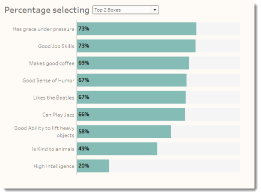
Figure 3 — Percentage of respondents that selected Agree or Strongly Agree (Top 2 Boxes) compared with 100%.
Now let’s see what happens when we change this to show only the Top Box.
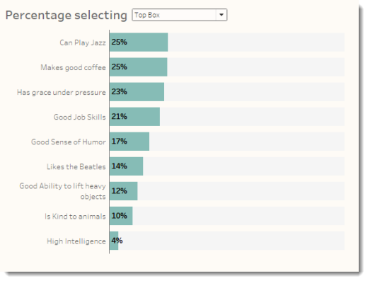
Figure 4 — Percentage of respondents that selected Strongly Agree (Top Box) compared with 100%.
As chef Emeril Lagasse might say “BAM!”
I’ll walk through how to create the 100% bars in a moment but I first want to show another instance where the auto-sizing bars can present a problem.
Showing demographics: comparing two similar charts
A similar issues comes into play with demographics dashboards. Consider the very simple dashboard below that shows the percentage of respondents broken down by location and gender.
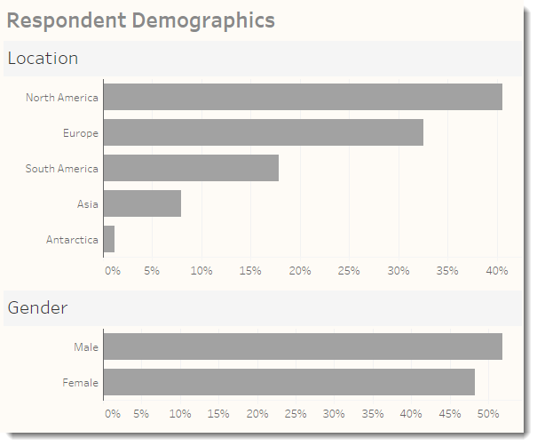
Figure 5 — Respondent demographics dashboard with auto-sizing bars.
Do you see the problem? No? Check out what happens when you hover over the North America bar and the Male bar.
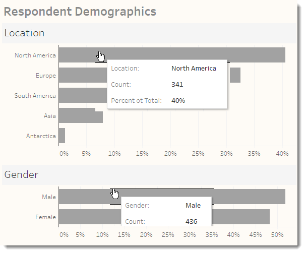
Figure 6 — Two independent charts with slightly different levels of magnitude.
The top bar in both cases is the same length, but in the top chart is represents 341 respondents (40%) and in the bottom chart it represents 436 people (52%).
The solution is to normalize the chart so that both have a common axis, as shown below.
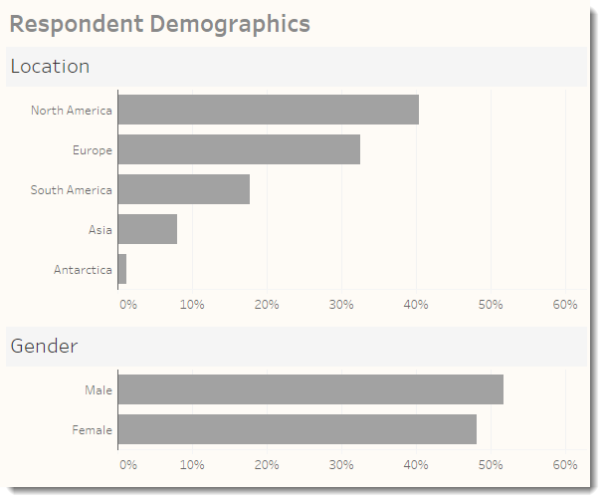
Figure 7 — Demographics dashboard with common (normalized) axes.
We will consider a couple of ways to produce this normalized axis later but first let’s tackle the 100% reference bars.
Building the reference bars visualization
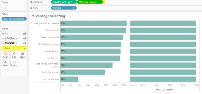
Let’s start with the view shown below which shows the percentage of folks that selected the Top N Boxes. Note that the completed dashboards may be found embedded at the end of this blog post.
Figure 8 — Initial view
- Create a calculated field called 100 Percent and define it as follows.
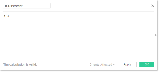
Yes, you will need to define at as “1.0” so that Tableau treats it as a float and not an integer. This will come up later when we need to create a dual axis and synchronize the charts. - Right-drag the newly-created field to Columns and select MAX(100 Percent) from the Drop Field dialog Box. Also make sure the mark is set to Bar and not automatic.
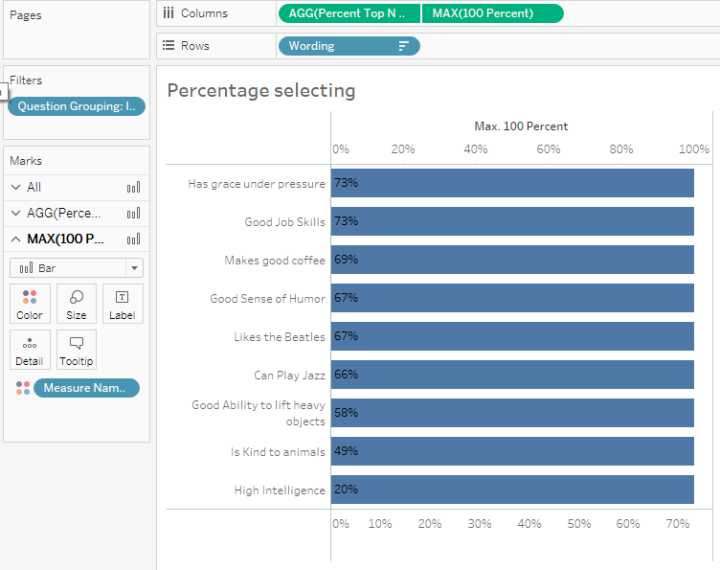
- Right-click MAX(100 Percent) on columns and select Dual Axis. Your screen should look like the one shown below.
- Right-click the axis at the top and select Move marks to back, then right-click the axis again and select Synchronize Axis. Your screen should look like this.
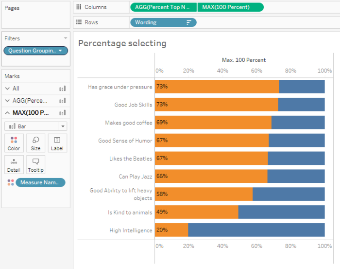
- Right-click the top axis and deselect Show Header, then modify the colors so that the 100% bars is a muted gray.
Normalizing the axis in the demographics dashboard
I’m going to recommend a different approach for the demographics dashboard as we really don’t need to show 100%; it’s very unlikely that any one segment will ever reach 100%. Instead I propose adding a hidden reference line placed at the maximum value that any demographic element is likely to reach, say 60%
Consider the Location demographic visualization below.
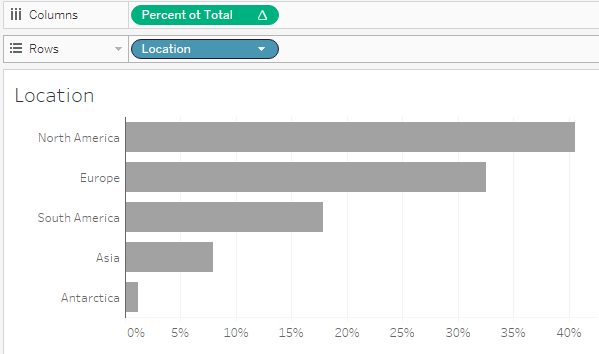
There are several ways to hard-code a reference line at 60%. Here’s one way to go.
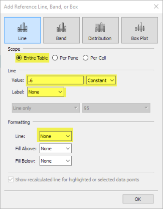
- Right-click the axis along the bottom and select Add Reference Line.
- When the Add Reference Line, Band, or Box dialog box appears, select Entire Table and indicate you want a constant set for .6. Make sure to set Label to None and Line to None as shown below.
- Repeat this for all the other worksheets that comprise your demographics dashboard.
“Wait!”, you may exclaim. “Why not just fix the axis at 60%?”
That will work… most of the time. But what happens if you fix the axis at 60% and you in fact have a bar that exceeds that value? If you fix the axis you are out of luck, but a hidden reference line will not constrain the axis; that is, it will make sure the axis extends to at least 60%, but the axis will go beyond that if needed.
Conclusion
Tableau’s tendency to auto-size an axis is great but can sometimes foster confusion. In this post we explored two different techniques that will help your audience make more accurate comparisons.