
Overview
This past week I enjoyed looking at and interacting with Matt Chambers’ car color popularity bump chart.
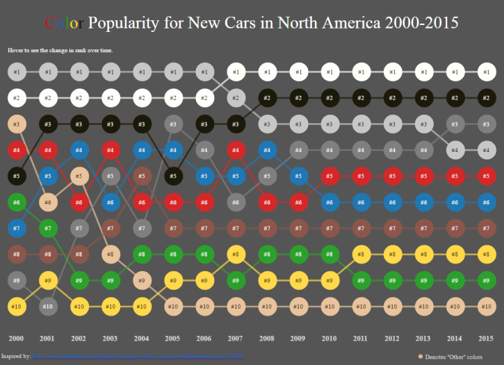
Figure 1 — Matt Chambers’ car color popularity bump chart. You can find the original Datagraver visualization upon which this was based here.
The key to this dashboard is interactivity as it’s hard to parse all the car colors at once. If you hover over one at a time it’s easy follow the trends, as shown here.
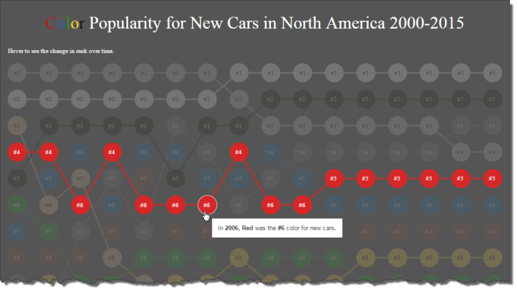
Figure 2 — Hovering over a color shows you that color’s ranking over time
Showing Rank Only
Over the past few months I’ve seen a lot of people making bump charts (myself included). As much as I like them I fear that people are leaving some critical insights out of the discussion as bump charts only show ordinal information and not cardinal information. That is, they show rank but not magnitude.
Consider the bump chart above. In 2009 White was the number one color, Black was number two, and Red was a distant sixth.
Figure 3 — Red appears to be a distant sixth
But was Red in fact “distant” or its popularity closer than it would appear? When you just show rank there’s no easy way to tell.
Showing Rank and Magnitude
Consider the dashboard below that shows the overall ranking and percentage popularity for car colors over the last ten years.
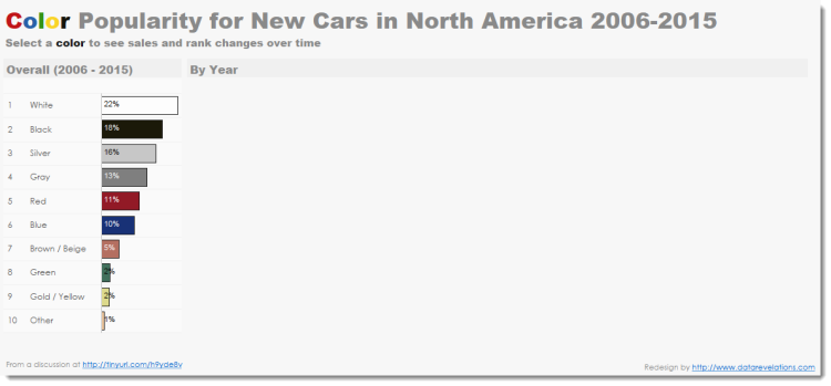
Figure 4 — Ranked Bar Chart dashboard with no colors selected
Right now we can see that over the last ten years white came in first place with 22% and Red came in fifth place with 11%. Now let’s see what happens if we select red and white, as shown below.
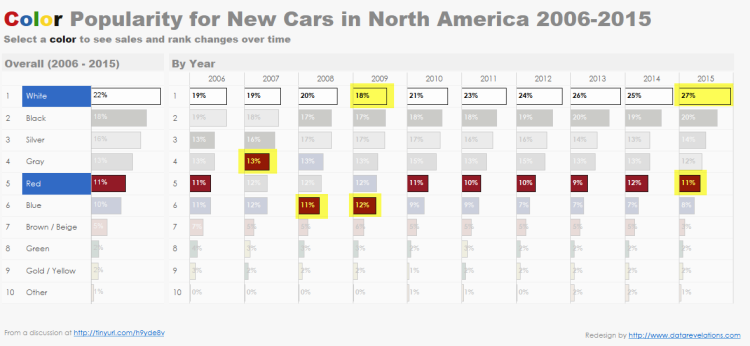
Figure 5 — Comparing popularity of white and red car over the last ten years.
Here we can see everything that the bump chart had plus so much more. Specifically, we can see that White was in first place for the past ten years and that Red was as high as fourth place in 2007 and as low as sixth place in 2008 and 2009. But we can also see that in 2009 White was only 50% larger than Red while in 2015 it was almost 150% larger!
Try it yourself
Click here to interact with the color popularity ranked bar chart.
Ranked Bars are Versatile
The ranked bar approach works well showing rank and magnitude over time and across different categories.
Consider the dashboard below that shows the sales for the top 20 products overall and then a ranked breakdown by one of three possible categories (Customer Segment, Region, and Year)
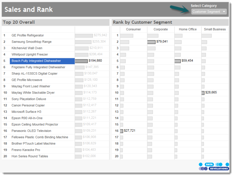
Figure 6 — Overall sales / rank and sales / rank broken down by Customer Segment.
Here we can see not only how the Bosch Full Integrated Dishwasher is ranked overall and within the four Customer Segments, but we can also see how much more and less the other products’ sales were.
Here’s the same dashboard showing a breakdown by Region.
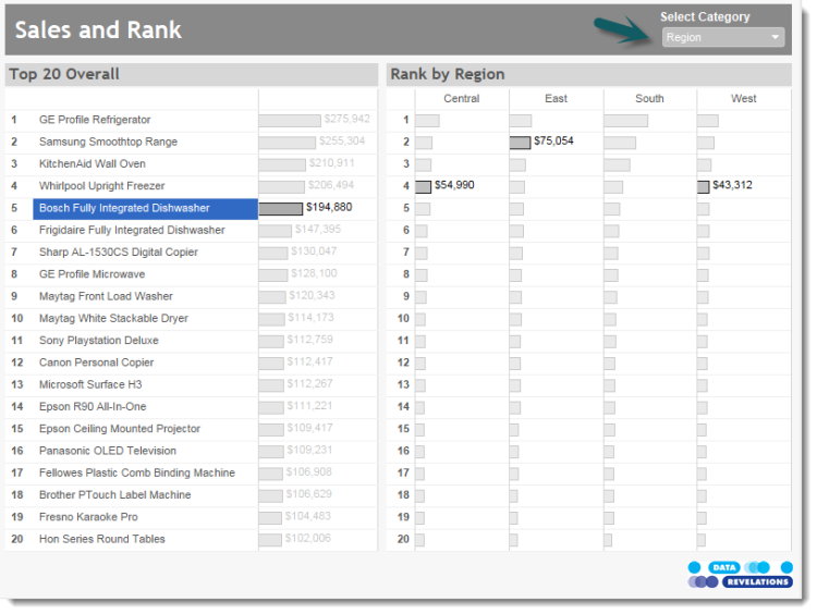
Figure 7 — Overall sales / rank and sales / rank broken down by Region.
The Bosch Dishwasher is fifth overall but it isn’t even in the Top 20 in the South. We can also see that it is Second in the East, ever-so-slightly behind the first ranked product (the Whirlpool Upright Freezer. You can see for yourself when you interact with the dashboard that’s at the end of the post).
Here’s the same data but presented using a bump chart.
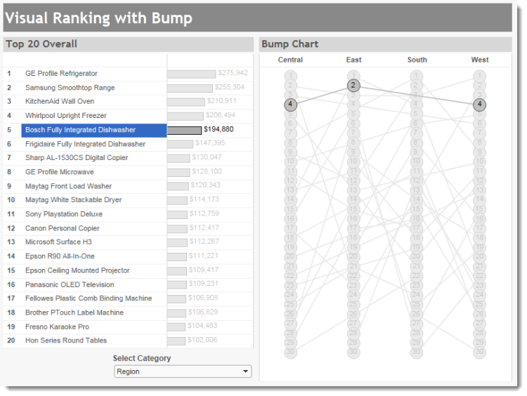
Figure 8 — Overall sales / rank and just rank by Region.
The bump chart looks cool but we only get part of the story as I can only glean rank.
Conclusion
The bump chart is a great choice if you want to show “soft” rankings, such as what place a team came in over time, but if you want to show rank and magnitude, consider the ranked bar chart instead.
Note: for step-by-step instructions on how to build a dashboard like the one below, see Visual Ranking within a Category.


