
Note: A big thank you to Daniel Zvinca who wrote a wonderful article advocating the “inside-out” approach that I recommend here.
Overview
My preferred way to visualize Likert-scale data in Tableau is a little cumbersome to create and I suspect some audiences won’t find it intuitive.
But it’s worth taking the effort to build, and it’s worth taking the time to show your audience how this will benefit them.
My Likert-Scale Polls
In July 2021 I conducted two polls.
Here’s the first one.
Which do you think is easier to understand, A or B?
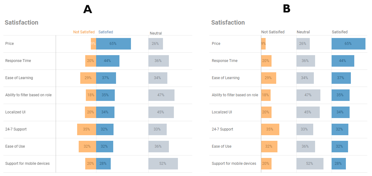
Figure 1 — The fist poll.
Spoiler alert: I much prefer A but was hoping folks would respond with B because it’s easier to create in Tableau.
Here are the results from 460 respondents.
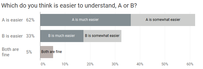
Figure 2 — First poll results. ”A” is the clear winner.
Sigh (number one)
Why am I sighing here? I guess I should be happy because I think that A is a better way to present the data. That divergent bar chart with the neutrals on the side… it’s easy to compare positives, negatives, and the all-important neutrals.
And if you don’t think the neutrals are important, please see Don’t Ignore the Neutrals and Got Likert data? Put the Neutrals off to one side.
Back to the sigs. Building the divergent bar chart in Tableau takes more effort than the three separate columns approach. But… now that I’ve figured out all the particulars you can just copy from the dashboard that’s embedded towards the end of this post and paste it into your own workbook.
How to stack the elements in the divergent bar chart
Now that were going to go with divergent bars with the neutral results on one side, what happens when we have more levels of positive and negative sentiment, as we see below? Note that I intentionally left out the neutrals in this poll so we can focus on the order of the negative and positive elements.
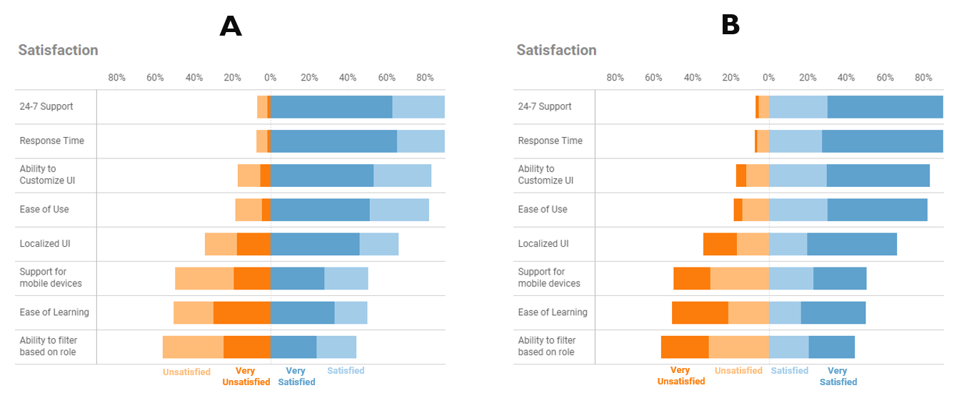
Figure 3 — The second poll.
Here are the results from 422 respondents.
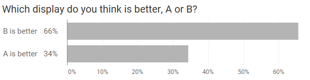
Figure 4 — Second poll results.
Sigh (number two)
Why the sigh here?
Because I want to convince you that although more people choose B, A is the better approach.
And once I convince you, I want you to have the ammunition you’ll need to convince others.
Why have the concentrated values in the center?
In the second poll I asked people to share their thoughts on why they preferred one choice over the other. Most people said that B was more intuitive because it ordered things like this:
Hate it
Dislike it
Neutral
Like it
Love it
They didn’t think this ordering made sense:
Dislike it
Hate it
Neutral
Love it
Like it
So, given that people prefer the “intuitive” ordering of B, why am I advocating getting people to be comfortable with the “inside out” approach of A, where the concentrated values are in the center?
It has to do with the “law” of stacked bar charts.
The problems with stacked bar charts
Have a look at the four bars in the Figure 5 below. Can you sort them from largest to smallest?
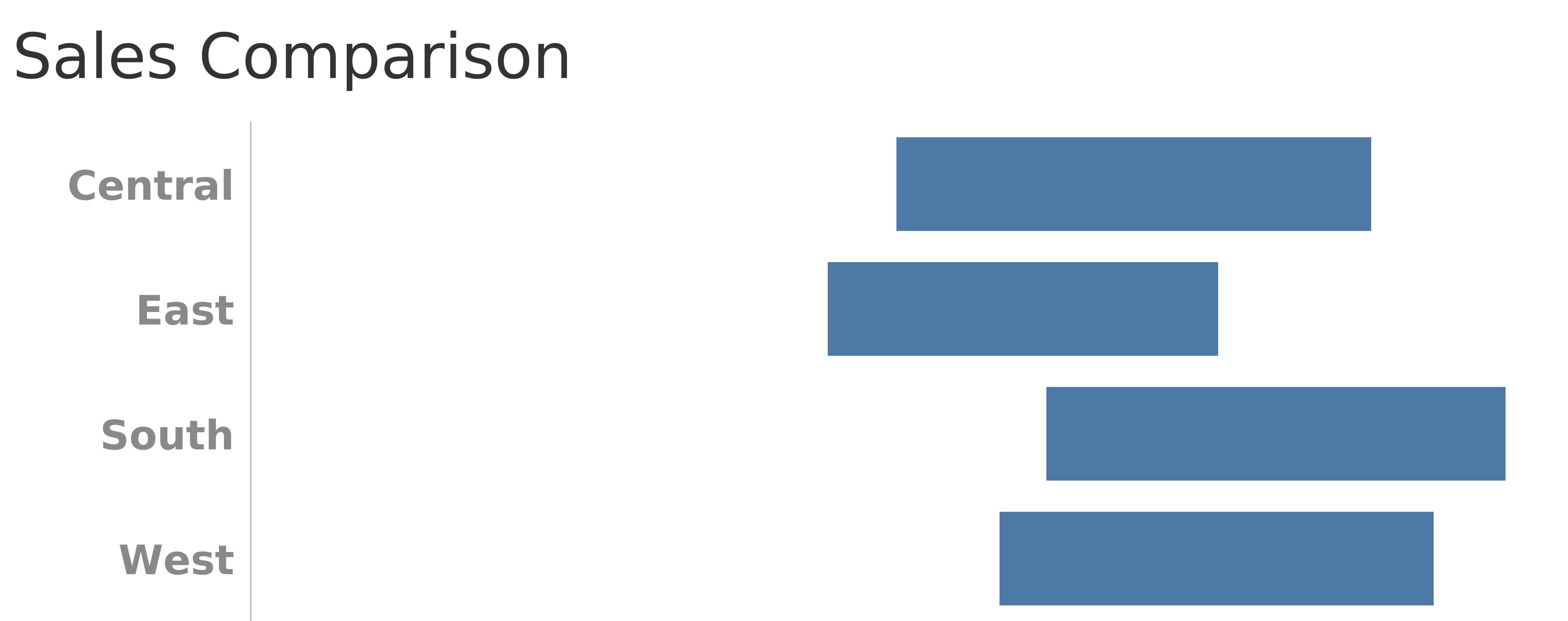
Figure 5 — Floating stacked bars.
Unless you have a ruler handy, sorting these floating bars is exceedingly difficult. Now let’s see what happens when we present them so they start from a common baseline.
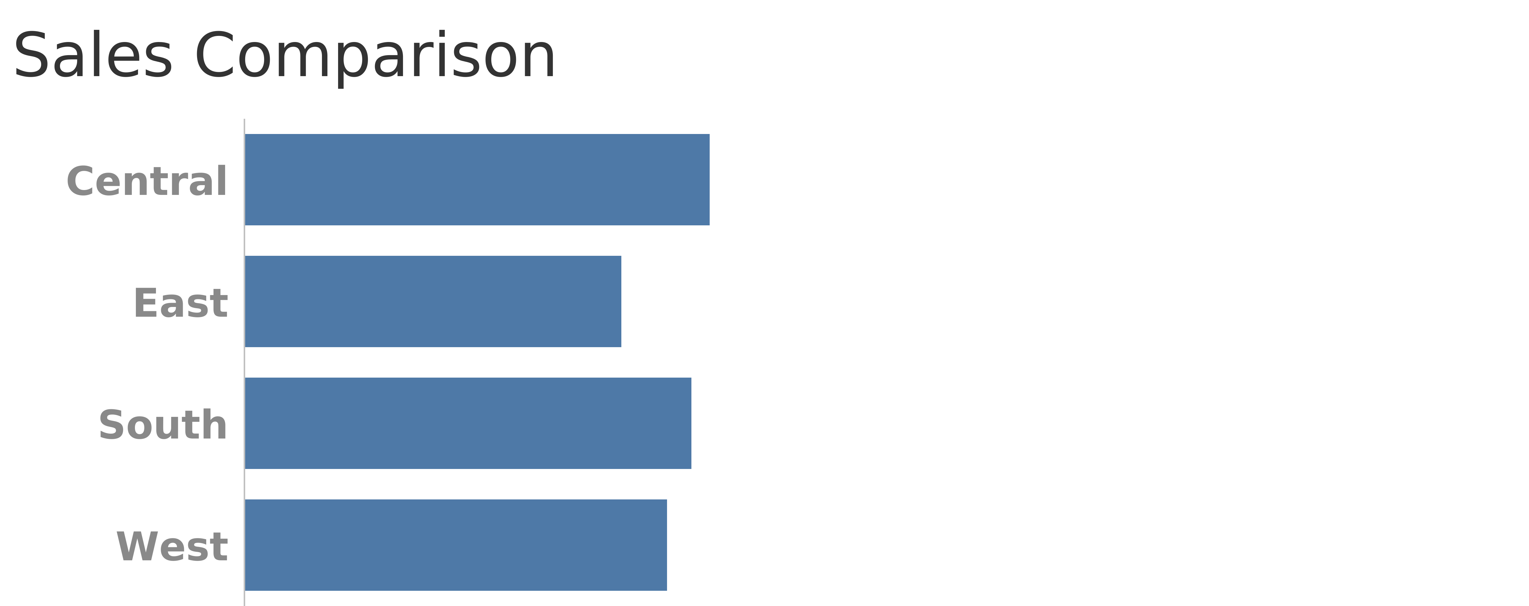
Figure 6 — Bars with a common baseline.
Now it’s much easier. The answer is: Central, South, West, East.
You may be thinking, “When would I ever have to compare the length of floating bars?”
That’s exactly what we’re asking people to do with the so-called “intuitive” stacked bar chart. Consider the example below.
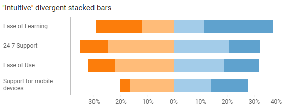
Figure 7 — “Intuitive” divergent stacked bar chart.
It’s easy to gauge the overall negative sentiment (oranges) and the overall positive sentiment (blues.)
But supposed you wanted to compare the extreme values; that is, the people who were very positive and very negative, as shown here.
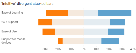
Figure 8 — The extreme values are hard to compare.
See the problem? It’s hard to compare the floating dark orange and dark blue bars because they don’t share a common baseline
But if we put those values along the center baseline it becomes much easier to compare.
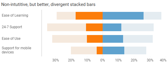
Figure 9 — The extreme values are easy to compare.
I don’t think people would care to know the percentages of people who are somewhat satisfied and somewhat dissatisfied, separated from the more extreme values. With the so-called “intuitive” approach that’s what you would be giving your audience, at the expense of being able to easily compare the more extreme values.
Note: this “law” of stacked bar charts is why I no longer recommend the approach in Figure 10. For years, this was my “go to” for Likert-scale data.
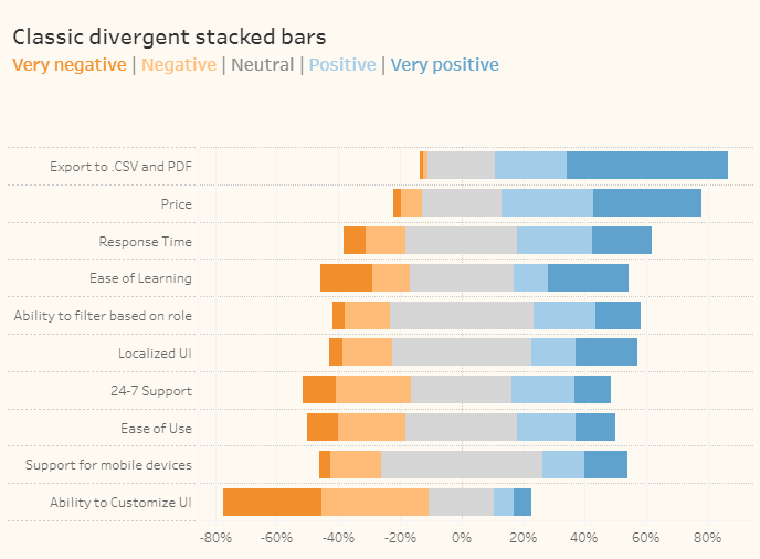
Figure 10 — my “classic” divergent stacked bar approach. I no longer recommend this.
How to get people to “get” the concentrated values diverging from the center
You’re going to have to educate your audience.
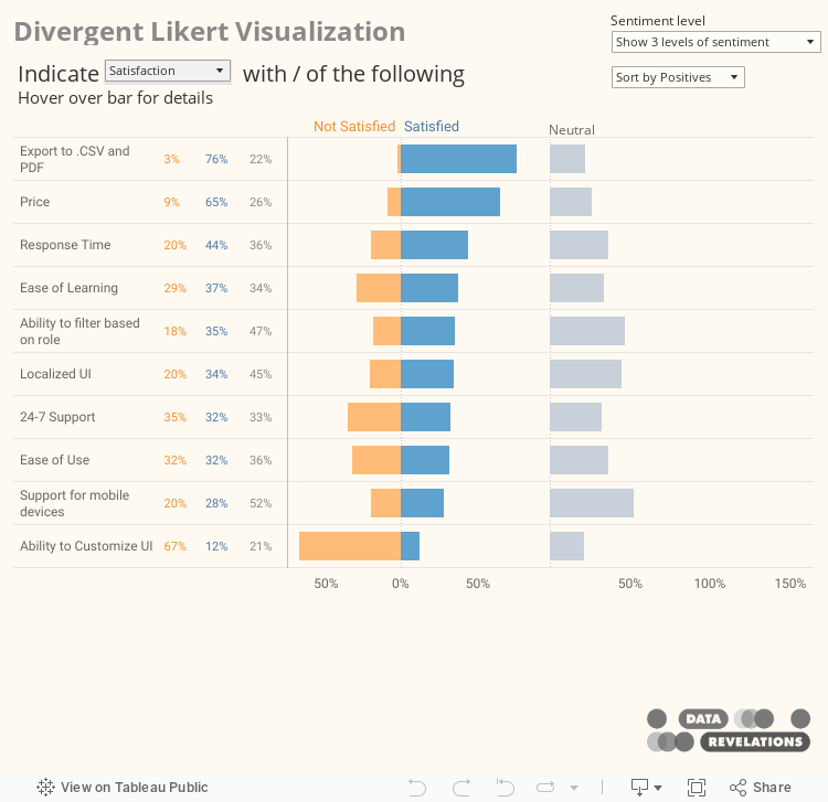
I would start with only showing three levels of sentiment (overall negatives, overall positives, and the all-important neutrals) as I do in Figure 11.
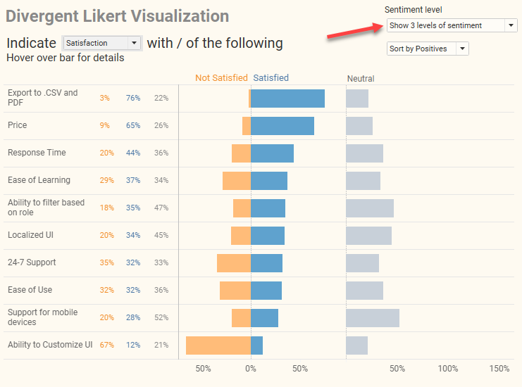
Figure 11 — Showing three levels of sentiment.
I’d encourage people to hover over a bar to see details, as we see in Figure 12.
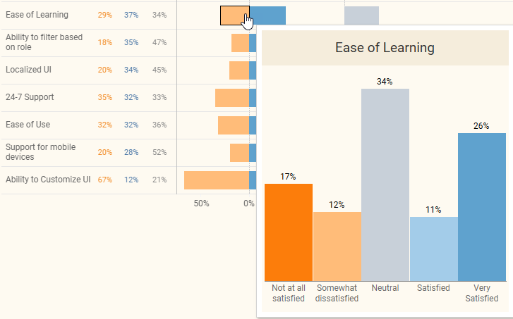
Figure 12 — Exploring and seeing details.
With this your audience now knows there are in fact five levels of sentiment. You can then show how to change the levels of sentiment and highlight the elements that will likely interest them, as shown below.
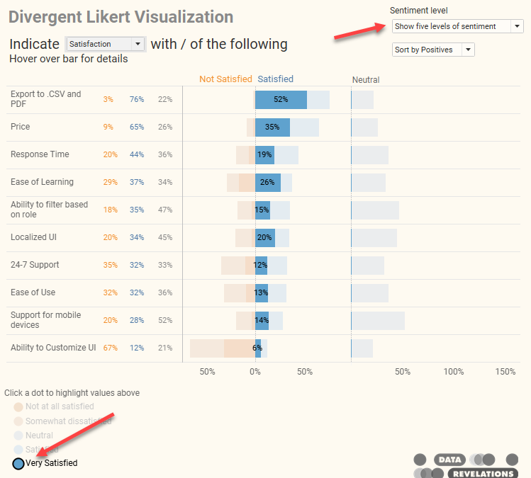
Figure 13 — Showing five levels of sentiment and highlighting the strong positives.
Try it for yourself
Here’s the embedded dashboard that will allow you to switch among different Likert-scale questions, change the level of sentiment, and control how the bars are sorted.
Interested in what’s under the hood? Notice that as you change which question is being displayed (Importance, Satisfaction, and Agreement) the labels at the top and the “zero” line always stays in the same place. Also notice that the size of the Neutral bars is on the same scale as the positive and negative bars.
All of this is accomplished using hidden reference lines that are controlled by some behind-the-scenes LoD calculations. I get into detail on how to build these at https://www.datarevelations.com/resources/got-likert-data-neutrals/


