Why you may be missing important insights if you only look at Percent Top 2 Boxes.
August 23, 2017
Overview
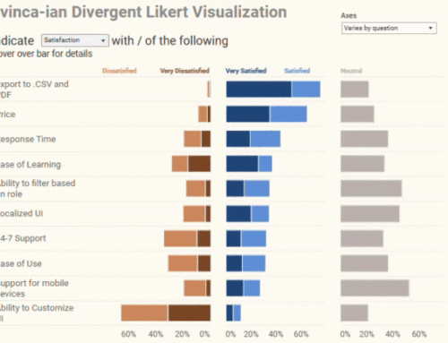
Anyone who has looked to this blog for insights into visualizing survey data knows that my “go to” visualization for Likert scale sentiment data is a divergent stacked bar chart (Figure 1).
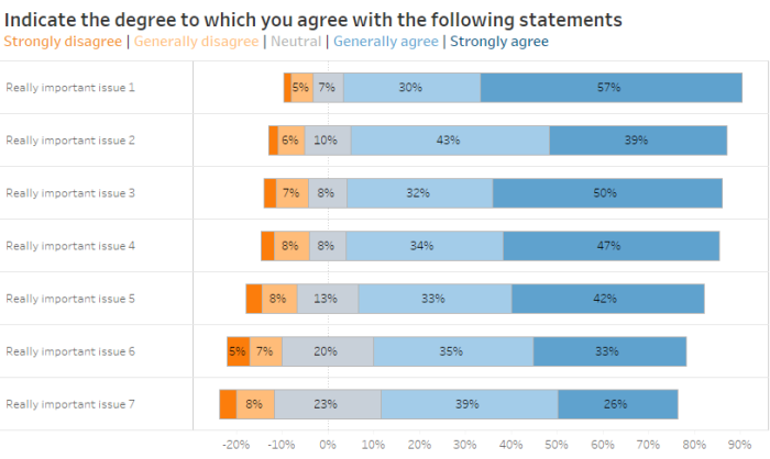
Figure 1 — Divergent stacked bar chart for a collection of 5-point Likert scale questions
You might prefer grouping all the positives and negatives together, showing only a three-point scale. Or perhaps you question having the neutrals “straddle the fence” as it were, with half being positive and half being negative. These are fair points that I’m happy to debate at another time as right now I want to focus on what happens when we need to compare survey results between two periods.
Showing responses for more than one period
As much as I love the divergent stacked bar chart, it can become a little difficult to parse when you show more than one period for more than one question. Consider the chart below where we compare results for 2017 vs. 2016 (Figure 2).
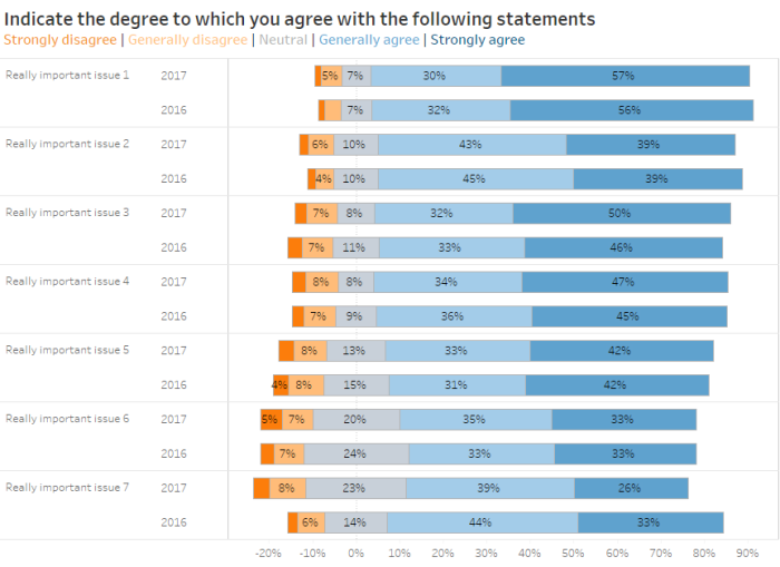
Figure 2 — Showing responses for two different periods
As comfortable as I am with seeing how sentiment skews positive or negative with a divergent stacked bar chart, I’m at a loss to compare the results across two different years. The only thing that really stands out is that there appears to be a pretty big difference between 2017 vs. 2016 for “Really important issue 7” at the bottom of the chart.
The allure of Percent Top 2 Boxes
It’s times like these when focusing on the percentage of respondents that selected Strongly agree or Generally agree (Percent Top 2 Boxes) is very tempting. Consider the connected dot plot in Figure 3.

Figure 3 — Connected dot plot showing difference between Percent Top 2 Boxes in 2017 and 2016.
Hey, that’s clear and easy to read. Indeed, this is one of my recommended approaches for comparing Importance vs. Satisfaction and it works great for comparing results across two time periods.
So, we’re all done, right?
Not so fast. While this approach will work in many cases, you should never stop exploring as there may be something important that remains hidden when you only show Percent Top 2 Boxes.
It’s not the economy, it’s the neutrals (stupid)
I was recently working with a client who had surveyed a large group about several contentious topics. The client believed that, much like the population of the United States, the surveyed population had become more polarized over the past year, at least with respect to these survey topics.
In reviewing the results for three questions, if we just focus on the positives (Percentage Top 2 Boxes) things look like they have improved (Figure 4.)

Figure 4 — Connected dot plot showing change in positives (Percentage Top 2 Boxes) between 2017 and 2016.
See? We have more positives (green) now than we did a year ago (gray.)
This may be true, but it only tells part of the story.
Consider the divergent stacked bar chart shown in Figure 5.
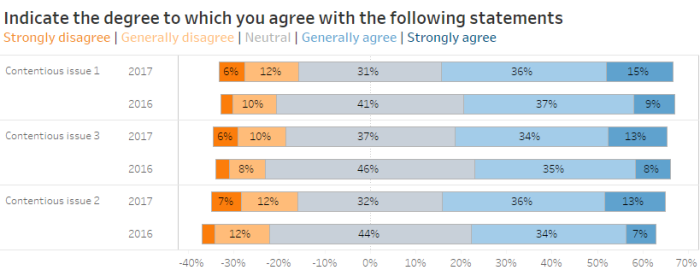
Figure 5 — 5-Point Divergent stacked bar char comparing results from 2017 and 2016
Woah… there’s something very interesting going on here, but it’s very hard to see. Maybe if we combine all the positives and negatives the “ah-ha” will be easier to decipher (Figure 6).
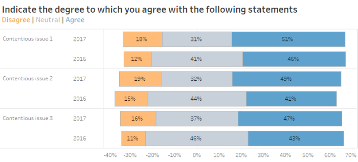
Figure 6 — 3-Point Divergent stacked bar char comparing results from 2017 and 2016. There are big differences between the two time periods, but they are hard to see.
Well, that’s a little better, but the story — and it’s a really big story — is still hidden. Let’s see what happens if we abandon both the connected dot plot and divergent stacked bar chart and instead try a slopegraph (actually, a distributed slopegraph, Figure 7).
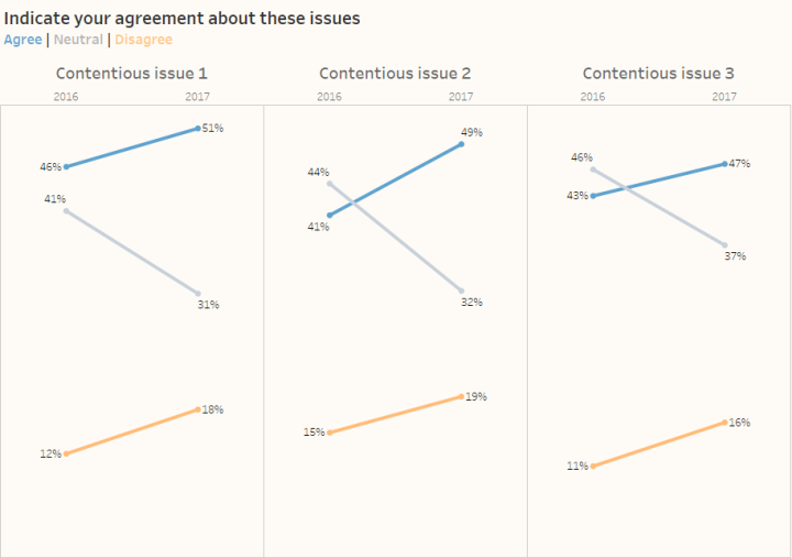
Figure 7 — Distributed slopegraph showing change in positives, neutrals, and negatives.
Now we can see it! Just look at the gray lines showing the dramatic change in neutrals. My client’s hunch was correct — the population has become much more polarized as the percentage of neutrals have plummeted while the percentage of people expressing both positive and negative sentiment has increased. You cannot see this at all with the connected dot plot and it’s hard to glean from the divergent stacked bar chart.
There is no, one best chart for every situation
I had the good fortune to attend one of Cole Nussbaumer Knaflic’s Storytelling with Data workshops. She uses a wonderful metaphor in describing how much work it can take to present just one, really good finding. I paraphrase:
“You have to shuck a lot of oysters to find a single pearl. In your presentations, don’t show all the shells you shucked; just show the pearl.”
For this last example, if I only had 30 seconds of the chief stakeholder’s time I would just show the distributed slopegraph as it is the “pearl.” It clearly and concisely imparts the biggest finding for the data set: the population has become considerably more polarized for all three issues.
But…
What happens if the chief stakeholder wants to know more? I would be armed with an interactive dashboard to answer questions like these:
“The people that disagree… how many of them strongly disagree?”
“The people that agree… how many of them strongly agree?”
“Are these findings consistent across the entire organization, or only in some areas?”
Conclusion
So, when showing changes in sentiment over time, which chart is best? The connected dot plot? The divergent stacked bar chart? The distributed slopegraph?
To quote my fellow author of the Big Book of Dashboards, Andy Cotgreave, “it depends.”
You should be prepared to apply all three approaches and choose the one that imparts the greatest understanding with the least amount of effort.
Note
I’ve had a number of debates with people about how I prefer to handle neutrals (half on the negative side and half on the positive side). If you find that troubling you can place the neutrals to one side, as shown in Figure 8.
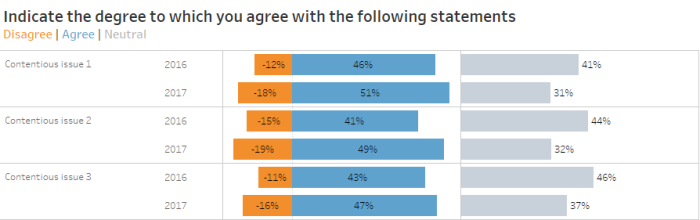
Figure 8 — Neutrals placed to one side providing a common baseline for comparison.