Steve’s Blog

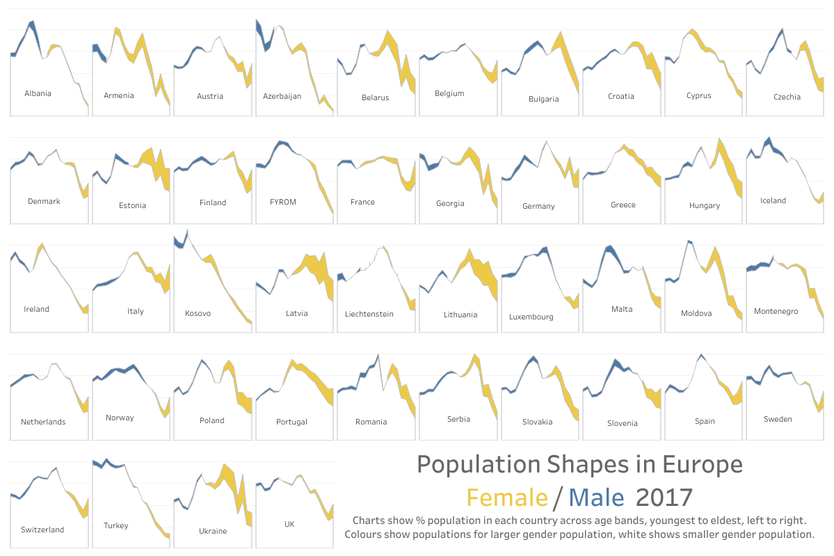
More about Population Pyramids (and why this community is amazing)

By |2024-09-13T14:22:05+00:00February 6th, 2019|Business Visualizations, General Discussions, Makeovers|

February 6, 2019 My earlier post on why I don’t like Population Pyramids generated a lot of communication on twitter and this communication lead to what I think is an elegant and analytically solid offering from Chris Love.  His contribution was in the result of iterating and collaborating with several people, including Dorian Banutoiu [...]

Good enough, good enough, good enough, and *not* good enough

By |2020-02-15T21:49:08+00:00January 21st, 2019|Business Visualizations, General Discussions, Makeovers|

Some thoughts on why pursuing the perfect chart is not a great use of your time January 22, 2019 Background During Chart Chat (Round Two) I discussed my affection for the lollipop chart and why I thought it was an acceptable alternative to the bar chart. My friend and colleague, Chris Love, was watching [...]

Chart Chat Live — Round 2

By |2020-03-28T23:37:46+00:00January 8th, 2019|Business Visualizations, Chart Chat, Videos|

Jeff and Steve discuss Jeff's makeover of the Nightingale "Rose" chart Lollipop charts Getting feedback from your audience (so you can see with fresh eyes) Joey Cherdarchuk from Dark Horse Analytics Pie Charts and Bar Charts living in harmony Padding in dashboards "Guess the author" Sankey diagrams Embellishments in music and dashboards Population pyramids [...]

A Bar Chart and a Pie Chart Living in Harmony

By |2021-03-14T16:42:43+00:00December 2nd, 2018|Business Visualizations, General Discussions, Makeovers|

And a great way to visualize Pareto analysis December 2, 2018 Special thanks to Lindsey Poulter, Andy Cotgreave, Jeffrey Shaffer, Cole Nussbaumer Knaflic, Robert Kosara, Adam Crahen, and Joey Cherdarchuk. Overview While at this year’s Tapestry conference (by far my favorite conference) I had the good fortune to literally bump into Joey Cherdarchuk from [...]

Chart Chat Live – Round 1

By |2022-03-23T20:40:46+00:00November 28th, 2018|Business Visualizations, Chart Chat, Videos|

November 28, 2018 Thank you to everyone that joined our first Chart Chat Live webinar. https://youtu.be/Z3wLmRvy4YQ In addition to the recording above, you can also download Steve’s slides here and download Jeff’s slides here. Recap After brief introductions, Steve discussed color and the use of BANs. Steve discussed “Lonely [...]

How to visualize check-all-that-apply questions using Tableau

By |2025-02-12T21:39:17+00:00September 12th, 2018|Visualizing Survey Data|

September 12, 2018 Overview I’ve recently seen some questionable approaches to visualizing check-all-that-apply questions (CATA questions) in Tableau. I’m concerned because many of these approaches won’t work if either you filter the data to only show some options, or if some of your survey participants skip the CATA questions. It’s the latter reason that [...]

Showing uncertainty in survey results

By |2021-11-15T15:52:10+00:00August 20th, 2018|Business Visualizations, Visualizing Survey Data|

Visual representation of error bars using Tableau August 20, 2018 Much thanks to Ben Jones whose book Communicating with Tableau provides the blueprint for the calculations I use, Jeffrey Shaffer for providing feedback on my prototypes and sharing research papers from Sönning, Cleveland, and McGill, and Daniel Zvinca for his thoughtful and always invaluable [...]

Is this better than a Jitterplot? Could be

By |2025-01-12T16:08:17+00:00July 22nd, 2018|Business Visualizations, General Discussions, Visualizing Survey Data|

July 22, 2018 Overview After writing my blog post about why I still love the Jitterplot, I got some thoughtful feedback from Adam McCann, Jeffrey Shaffer, and the always provocative Daniel Zvinca. Dan had written a wonderful article suggesting a Stingray plot as an alternative, and Jeff and Adam’s comments encouraged me to revisit [...]