Overview
I’ve been looking at various examples over at Stephen Few’s Perpetual Edge web site and one example (this one) really resonates with me as it deals with how to visualize Likert Scale questions.
For the past five years I’ve used Tableau to analyze literally thousands of survey questions, but I’ve never really been happy with how I presented Likert Scale questions results.
That said, a new version of Tableau has brought new capabilities…
But first, just what is a Likert Scale question?
You’re probably familiar with it, you just may not have known that it had a particular name. The scale, developed by Rensis Likert (pronounced Lick-ert, not Lie-kert), applies quantitative measures to qualitative answers. Consider the example below.

The “scale” part of the “Likert Scale” comes from applying values to each of the answers. Here’s a typical application:
Poor = 1
Fair = 2
Average = 3
Good = 4
Excellent = 5
I’ve purposely set up an example that asks ten questions of the survey taker (only six are shown above). Our challenge will be to come up with a way to sort how the company / employee / product ranks based on responses to the survey.
Note: An interactive dashboard that presents all the different approaches may be found at the bottom of this blog post.
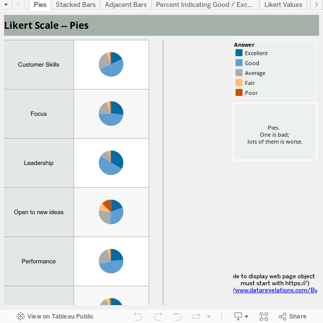
Approach One – Pie Charts
Yuck. One pie is bad, but ten pies?

 In addition to not being able to fit ten pies on the screen, there isn’t an easy way to visually rank these things. Sure, we can either label the pie slices or use color highlighting to reveal the percentages, but meaningful revelations will remain hidden.
There are very few cases where a pie chart will be your best bet for conveying information. If you need convincing, I implore you to read Stephen Few’s Save Pie Charts for Dessert and this most excellent example from the Wikipedia entry on pie charts.
Approach Two – Stacked Bars

This is somewhat of an improvement over pies in that I can fit everything neatly onto one screen and it’s easy to see really obvious places where the company / person / product is strong and weak. The downside is that we still need a legend and that it’s hard to sort the categories from strongest to weakest.
Approach Three – Adjacent Bars

This one is easier on the eyes (at least my eyes) than the stacked bars and there’s no need for a color legend, but I can’t fit this all on one screen (even if you change the orientation to vertical) and it’s still not easy to rank from strongest to weakest.
Approach Four – Percent Indicating Good or Excellent

I admit that I have used this approach (probably too often) as it fits on one screen, is easy to sort, and is easy to, well, “grok”. It also answers the question “what is the percentage of people that have a favorable impression” of something.
Unfortunately, this presentation is incomplete bordering on dishonest as not only are we combining “Good” and “Excellent” into one measure, we’re ignoring any important variations that might exist on the low end of the scale (Poor, Fair, and Average.)
Approach Five – Likert Values

Here we take advantage of the “scale” part of “Likert Scale” and apply numeric values to each of the five possible responses, and then take the average of all responses.
This approach fits on one screen, is easy to sort, and easy to understand. It is essential, however, to include the scale values in the presentation (“Poor = 1”, “Fair = 2”, etc.)
But even with that, I think too much that is important to understanding the data is missing.
Approach Six – Stacked Bars / Likert Values Combo

 Here we show both the details and the roll-up scores. The chart fits on one screen, is easy to rank, and you can explore the details.
For example, if you use the color highlighting capability you can easily see how many people indicated “Excellent” or “Good”.
Why Do Likert Scales Need to Have Adjacent or Linear Values?
Good question. It turns out that you may reveal a lot more if you reconsider using values like 1, 2, 3, 4 and 5. Maybe positive attributes (Excellent and Good) should have positive values and negative attributes (Poor and Fair) should have negative values? Using Tableau’s way cool Parameter control feature we can set the values as we see fit. The example below ditches the traditional approach and substitutes the following values:
Excellent = 5
Good = 3
Average = 0
Fair = -3
Poor = -5
Spreading out the scale this way really accentuates the differences.

Where to Go From Here
An interactive dashboard with each of the visualizations may be found below. Tableau users are welcome to download the source workbook and see how the visualizations were built.

Stephen Few's Likert example
Note: I know that Stephen Few has built some examples that I like even more than the combo chart. The problem is that they are difficult (but not impossible) to render using my visualization tool of choice. I’ve chosen instead to only show things that are easy to build using Tableau.
I’d be delighted to see any and all alternatives people come up with. Please share!