Using AI to communicate with data: I didn’t heed my own warnings!
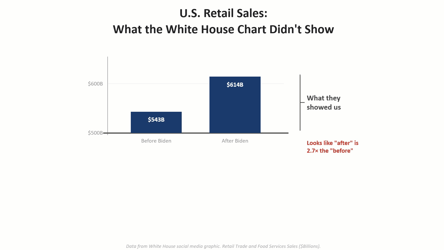
I had a blast last month bantering with Andy Cotgreave about five data visualization abominations and determining which one was the biggest T.U.R.D (Truly Unfortunate Representation of Data). I was inspired both by Andy and Enrico Bertini to show how the visualizations were misleading and how one could render an accurate and honest depiction of the data using AI. [...]