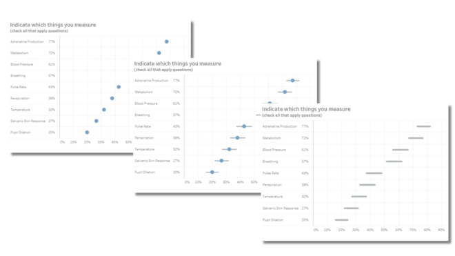
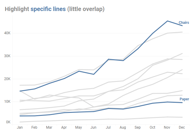
Chart Chat Live — Round 37
The Chart Chat hosts welcome guests Stephanie Woerner from MIT and Steven Franconeri from Northwestern and discuss their research proving that good data viz WORKS. https://www.youtube.com/live/he768qIHbxw
I’ve received a lot of requests to address the unique (and annoying) issues with getting SurveyMonkey data to play nicely with Tableau. The good news is that once you know where the stumbling blocks are it’s not very difficult to get your data “just so” so that you can create clear visualizations that provide solid [...]
The Chart Chat hosts welcome guest Alberto Cairo, author, professor, illustrator and hedonist. The quintet discuss and debate data visualization books and issues around "rules" in data visualization. https://youtu.be/Jxxzzvyhz04
Where and how to have discussions around data visualization From December 5 through 9, I took a break from Twitter to spark conversation on The Data Visualization Society’s Slack workspace. I want to thank the dozens of colleagues who joined me for this experiment as we needed, and got, a critical mass of participants. [...]
The Chart Chat hosts welcome guest RJ Andrews, founder of InfoWeTrust, historical data visualization scholar, modern-day data viz practitioner, and curator of the amazing Visionary Book series. https://youtu.be/_jid3-KaN3E
The Chart Chat hosts welcome guest Philip Bump, National Correspondent for The Washington Post and creator of the "How to Read This Chart" newsletter. Bump and the hosts each get a crack at doing a makeover of a historical (and hysterical) visualization. https://youtu.be/JZvJF3inor8
The Chart Chat hosts welcome guest Cole Nussbaumer Knaflic who discussed her new book, Storytelling with You. https://youtu.be/2MVJhgQjtVc
I subscribe to a lot of newspapers and magazines (some of which I read), but to satisfy my interest in data visualization, I find the best information often comes from people I follow on Twitter and from newsletter subscriptions. I’ll confess that I’m surprised at how many good conversations I see about data visualization on [...]
As people who read my newsletter or attend Chart Chat know, I was one of the volunteers who contributed to The Carbon Almanac. I also subscribe to the Carbon Almanac daily newsletter (it’s excellent). Here’s what came in the other day. I used to travel a lot to give public and private workshops. Then the [...]
A big thanks to Josh Wilson for encouraging me to write about this and an extra big thanks to Jonathan Drummey for doing the heavy lifting on making the AND approach work. A downloadable dashboard with all the examples can be found at the end of this post. Overview While cutting / filtering a question [...]