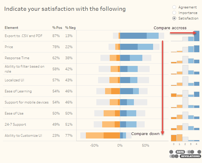
Visualizing Survey Data

Comparing a target group with the entire population

By |2017-12-18T20:11:26+00:00December 18th, 2017|Business Visualizations, General Discussions, Visualizing Survey Data|

December 18, 2017 Updated September 27, 2018 to include single-select questions. Special thanks to Shaelyn McCole at Hootology who suggested the topic, Ryan Gensel at CPI who came up with a wonderful enhancement to the connected dot plot, and Jeffrey Shaffer at Data Plus Science who suggested some cosmetic improvements. Note: The original blog post only [...]

Showing percentages? Look out for these pitfalls

By |2017-10-25T15:45:06+00:00October 25th, 2017|Business Visualizations, Visualizing Survey Data|

Overview Tableau’s automatic axis feature can often present problems with survey data. In this blog post we’ll look at how the problem crops up and what you can do to both fix the problem and make your visualizations more insightful. The problem with auto-adjusting bars Tableau’s automatic axis does a great job extending and contracting [...]

Getting your survey data “just so” using EasyMorph

By |2021-10-11T17:24:48+00:00September 20th, 2017|Visualizing Survey Data|

September 20, 2017 Overview As anyone who has read anything on my blog that relates to survey data knows, the number one impediment to success with Tableau is getting your data “just so.” Until recently I recommended two different approaches. You can either use Alteryx and have a rock solid, robust, fully-featured, (and expensive) solution [...]

How to Visualize Importance vs. Satisfaction Survey Responses

By |2022-09-23T16:30:10+00:00May 10th, 2017|Business Visualizations, Visualizing Survey Data|

May 10, 2017 Overview A nod of appreciation to Tom Davenport who first brought this issue to my attention. Most organizations want to wildly exceed customer expectations for all facets of all their products and services, but if your organization is like most, you're not going to be able to do this. Therefore, how should [...]

The second thing you should do when working with survey data

By |2020-06-23T15:41:13+00:00January 15th, 2017|Visualizing Survey Data|

By Steve Wexler, January 15, 2017 Overview Before going any further this post assumes you’ve gotten your data “just so”; that is, you’ve reshaped your data and have the responses in both text and numeric form. If you’re not sure what this means, please review this post. Taking inventory by finding the universe of all questions [...]

Title