Overview
I received a number of comments from my last post (see https://www.datarevelations.com/likert-scale-nirvana.html) including what I think is a better approach for staggered Likert scale visualizations from Joe Mako.
Joe’s approach with various “kitchen sink” added functionality is shown in the interactive dashboard below. Notice that you can control whether neutral values are displayed, sorting, Likert scores, and so on.
There’s some great stuff going on here but for this blog post I will focus on a simpler version of this visualization that just presents the staggered Likert scale bars without the various bells and whistles.
How the Viz Works
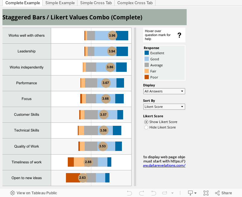
Let’s look under the hood of this simpler visualization (it’s the second tab in the workbook.)

Here we have Gantt bars (1) where the start position of the bars is determined by the table calculation Gantt Percent (2) and the thickness (or size) of the bars is determined by the table calculation Percentage (3).
Indeed, if you drag the Percentage pill off the Size shelf you’ll see more clearly how Gantt Percent dictates the position of the bars.

So, all we need to do is figure out how the two table calculations work.
To do this, let’s look at the third tab in the workbook where we present a cross tab view of the data with several intermediary calculations. Both Tableau (and Joe) recommend building this type of view when first building table calculations.

Let’s look at all the Measure Values.
Number of Records
This SUM() function gives us the number of responses for each answer category (e.g., for the first question 9 people responded “Poor”, 17 responded “Fair”, 73 responded “Average”, and so on.) We could also have used CNTD(ID) to determine these values.
Count Negative
We had to address this in the bar graph approach we used in the previous blog post and we’ll run into the same problem here as we need a way to signify that all the “Poor” and “Fair” responses should go to the left of the zero, along with half of the “Average” responses. Our formula for determining this is
IF [Score]<3 THEN 1
 ELSEIF [Score]=3 THEN .5
 ELSE 0 END
Total Count Negative
Let’s look at the table calculation for this formula.

This tells Tableau to take the TOTAL of the SUM of all the Count Negative values addressing along the Answer field.

Note that in this case addressing across Answer is the same as Pane Down; however, it is much safer to use Answer as you can never be sure how the table construct may be changed as you explore different visualizations.
Total Count

This gives us the total number of responses for each question.
Note – from here on all Table Calculations in this example are computed along Answer.
Gantt Start
We will use this calculation to determine the left / right offset for the block of Gantt bars. That is, for each question we have a bunch of bars that are stacked together and spread out horizontally. This calculation will determine how far to the left or right of the center (0) the stack should start.
The formula we use is
-[Total Count Negative]/[Total Count]
Very simply, this is the percentage of responses that are negative. Questions where most of the responses are positive (e.g., “Excellent:, Good”, etc.) will be close to the center (0); questions where most of the responses are negative will start much further to the left.
Now that we know where the stack of bars will start, we need to know where to position each of the Gantt bars (the bar for “Poor”, “Fair” etc.). The Percentage table calculation will help is figure this out.
Percentage
This formula is very straightforward
SUM([Number of Records])/[Total Count]
Remember, we are addressing across Answer so this tells Tableau to add up the responses for a particular Answer and divide by the total number of responses for all possible answers; that is,
For Poor
9 / 417 = 2.2%
For Fair
17 / 417 = 4.1%
etc.
Incidentally, we will use this table calculation to determine the size (thickness) of the Gantt bars once we’ve determined exactly where to place them. We determine the exact placement using Gantt Percent.
Gantt Percent
Here’s the formula
PREVIOUS_VALUE([Gantt Start])+ZN(LOOKUP([Percentage],-1))
This tells Tableau to look grab the previous Gantt Percent value (if there is no previous, for the first record in the partition, use Gantt Start value as the previous) then “lookup” the previous row’s Percentage value and add that to what you have. If there is no “previous row” the ZN() function converts the NULL value to a zero.
Let’s see how this works with an example.

For the first row there is no previous Gantt Percent value, so we start with -15.0% (Gantt Start value). We then “lookup” the previous Percentage value (which is null) so we get a zero. This yields a result of -15% for Gantt Percent for the first record.
For the next row we use the previous Gantt Percent value (-15.0%) and then look at the previous row’s Percentage (2.2%). When we add these together we get -12.8%.
For the middle row (what would be the position for the “Average” bar) we start with the previous Gantt Percent value (-12.8%) and add the previous row’s percentage value (4.1%) yielding -8.8%.
Conclusion
Well, I hope this really is the conclusion as this is my fourth blog post about Likert scale visualizations.
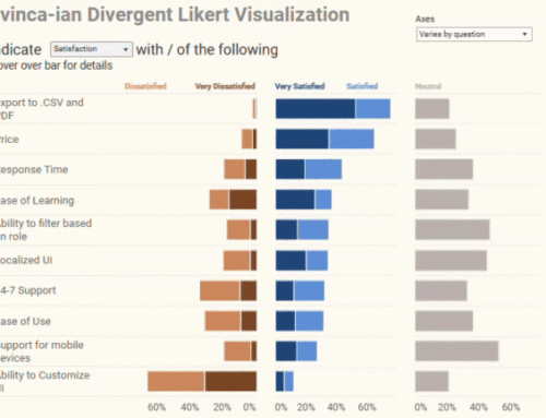
I do like the staggered (or divergent) bar approach and will use it often. I also prefer the Joe’s Gantt Bar method we explore here to the stacked bar approach I wrote about in https://www.datarevelations.com/likert-scale-nirvana.html.
But if I were to introduce other dimensions (e.g., region, age groups, time, etc.) I would probably just use a Likert Score bar and show the percentage breakdown using a tool tip like the one we discussed in https://www.datarevelations.com/a-little-more-on-likert-scale-questions.html.