Overview
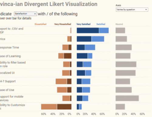
I’ve written a lot about this subject (see https://www.datarevelations.com/the-likert-question-question.html and https://www.datarevelations.com/a-little-more-on-likert-scale-questions.html) but some recent discussions with friends / colleagues Joe Mako and Naomi Robbins (along with some long plane rides to and from the Midwest) encouraged me to see how difficult it would be to create a “staggered” Likert scale chart like the one shown below.
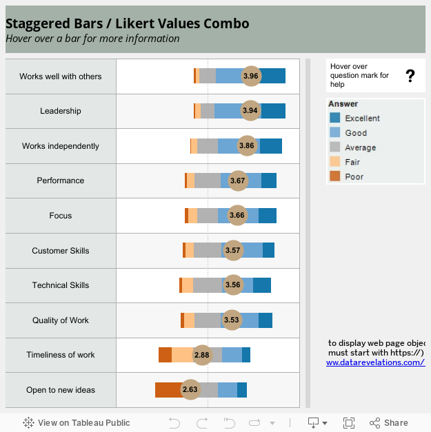
Actually, I came up with this approach several months ago but there were some “uglies” that I needed to work around. Let’s look under the hood and see how this works and how to hide the “uglies”.

I’ve already addressed how to display the Likert score circles (which I love now more than ever) in a previous post so we’ll just focus on how to get the colored bars with emphasis on how to get the positive attributes to the right of the zero, the negative attributes to the left, and how to split the neutrals.
Measure Names
Formula for Dark Blue and Dark Orange Bars
Here’s the underlying formula for determining the number of responses that were Excellent.

This is pretty straightforward; just take the number of records where the score was 5 (Excellent) and divide by the total number of responses.
Here’s the formula for determining the number of responses that were Poor.

Same idea as before, but this time we add up all the “Poor” responses and make them negative.
Splitting the Neutrals
I’ve always preferred even-numbered Likert scale questions as you force people to take a stand as respondents cannot take the exact middle ground.
Not so with odd-numbered Likert scale questions, so we need to take all the neutrals and make half of them positive and half of them negative, as we do here:


It’s the same concept as with the Excellent / Poor responses but we divide by twice as many total responses to split the difference.
Dealing with the “Uglies”
There are at least three things that would prevent me from publishing this in its current form.
1) Too many items in the legend.

(The “neutrals” are broken up into two groups.)
2) Weird ordering of the legend. To get the bars to stack properly I had to order the items in the legend as shown above. Ugly.
3) Color highlighting does not display amounts the way I would like.

This is the results of clicking S_Percent_Average_Neg in the color legend. I only see half the neutrals and I see negative numbers.
The Hack (I mean “Solution”)
So, how can I display the values for each color bar and have a legend that does what I need it to do?
I “cheated” with the legend and am just using a static graphic, specifically, a screen shot of how I would like the legend to appear. Go ahead and wrap your knuckles in it – It’s hollow.
As for allowing people to see the underlying values, I just applied “Cotgreavean” tool tip bars, as shown here.

So, I do wish I could just select all the neutrals and see their values, but I’m satisfied with this approach and like that the offsets help convey the positive / negative sentiment.
Please download and if you come up with a nicer way to handle the legend, I’d love to see it.