Overview
I spend a lot of time with survey data and much of this data revolves around gauging people’s sentiments and tendencies using either a Likert Scale or a Net Promoter Score (NPS) type of thing.
Examples
Here’s an example of gauging sentiment using a 5-point Likert scale.
Indicate how satisfied you are with the following:

Here’s an example of measuring tendencies, using a 4-point Likert scale.
How often do you use the following learning modalities?

So, what’s a good way to visualize responses to these types of questions?
Over the past ten years I’ve spent thousands of hours working on the best ways to show how opinion and tendencies skew one way or another. I have found that in most cases a divergent stacked bar chart helps me (and more importantly, my clients) best see what’s going on with the survey responses.
In this blog posts we’ll
- See an example of a divergent stacked bar chart (also called a staggered stacked bar chart)
- Work through a data visualization improvement process
- Show how to visualize different scales (e.g., NPS, Top 3/Bottom 3, 5-point Likert, etc.)
- Show sentiment and tendencies over time
- Present a dashboard that will allow you to experiment with different visualization approaches
Note: for step-by-step instructions on how to build a Likert-scale divergent stacked bar chart in Tableau, click here.
Divergent Stacked Bar vs. 100% Stacked Bar
Readers of my newsletter and folks visiting the web site may have seen my redesign of a New York Times infographic that showed the tendencies of politicians to lie or tell the truth. Here’s the 100% Stacked Bar chart that appeared in the New York Times.

Figure 1 — 100% stacked bar chart.
Here’s the redesign using a divergent stacked bar chart.

Figure 2 — Divergent stacked bar chart.
With both the 100% stacked bar chart and the divergent stacked bar charts the overall length of the bars is the same, but with the divergent approach the bars are shifted left or right to show which way a candidate leans. I, and others I’ve polled, find that shifting the bars makes the chart easier to understand.
How We Got Here — Likert Scale Improvement Process
Consider the table below that shows the results from a fictitious poll on the use of various learning modalities.

Figure 3 — Survey results in a table.
I can’t glean anything meaningful from this.
What about a bar chart?

Figure 4 — Likert scale questions using a bar chart. Yikes.
Wow, that’s really bad.
What about a 100% stacked bar chart?

Figure 5 — 100% stacked bar chart using default colors.
Okay, that’s better, but it’s still pretty bad as Tableau’s default colors do nothing to help us see tendencies that are adjacent. That is, “Often” and “Sometimes” should have similar colors, as should “Rarely” and “Never.”
So, let’s try using better colors…
(…and don’t even think about using red and green.)

Figure 6 — 100% stacked bar chart using a more appropriate color scheme.
This is certainly an improvement, but the modalities are listed alphabetically and not by how often they’re used. Let’s see what happens when we sort the bars.

Figure 7 — Sorted 100% stacked bar chart with good colors.
It’s taken us several tries, but it’s now easier to see which modalities are more popular.
But we can do better.
Here’s the same data rendered as a divergent stacked bar chart.
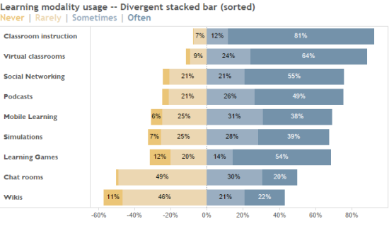
Figure 8 — Sorted divergent stacked bar chart with good colors.
Of course, we can also look take a coarser view and just compare Sometimes/Often with Rarely/Never, as shown here.
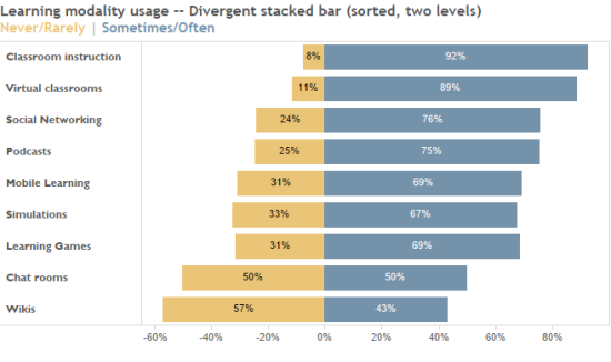
Figure 9 – Divergent stacked bar chart with only two levels of sentiment.
I find that the divergent approach “speaks” to me and it resonates with my colleagues and clients.
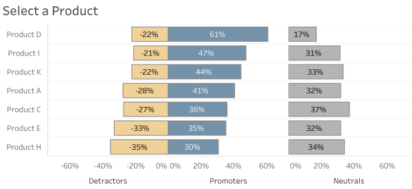
Experiments using Different Scales
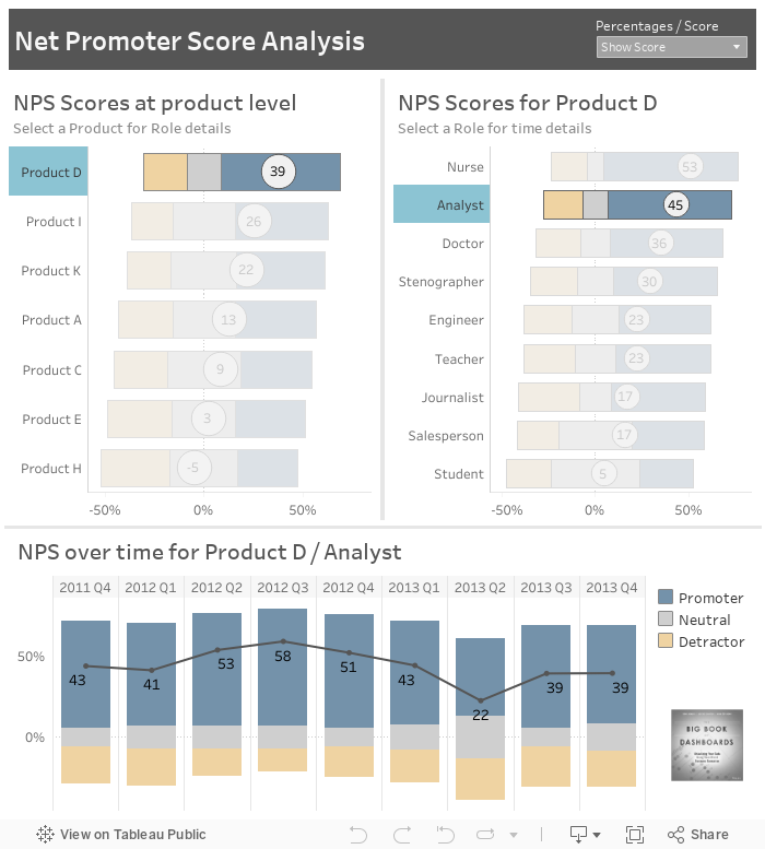
A while back Helen Lindsey was kind enough to send me some data that contained responses to some Net Promoter Score questions. Specifically, folks were asked to rate companies/products on a 0 to 10 or 1 to 10 scale.
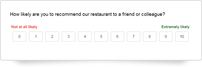
Figure 10 — The classic Net Promoter Score (NPS) question
We compute NPS by subtracting the percentage of folks that are promoters (i.e., people who responded with a 9 or a 10), subtracting the percentage of folks that are detractors (i.e., people who responded with a 0 through 6) and multiplying by 100.
But sometimes my clients have questions that are on a 10 or 11-point scale but instead want to compute the percentage of folks that responded with one of the top three boxes minus the percentage of folks that responded with the bottom three boxes.
I realized that the Lindsey data set could provide a type of “sandbox” where we could experiment with different sentiment scales including NPS, Top 3 minus Bottom 3, 5-point Likert, 3-point Likert, and 2-point Likert.
Let’s look at the results of some of these experiments.
NPS
Here are two ways we can visualize NPS data. The first shows the percentages of people that fall into the three categories.
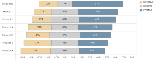
Figure 11 — NPS showing percentages
Here’s the same view, but with the NPS score superimposed over the divergent stacked bars.
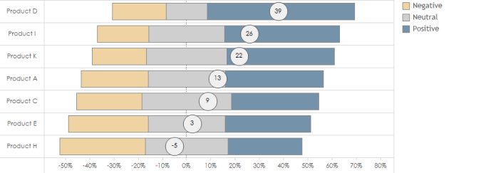
Figure 12 — NPS with score superimposed
NPS over Time
It turns out that divergent stacked bars are great at showing NPS trends over time. Here’s a view using percentages.
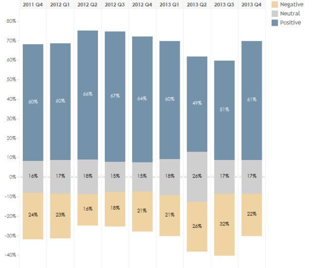
Figure 13 — Divergent stacked bar showing NPS over time with percentages
Here’s the same view but with the score superimposed.
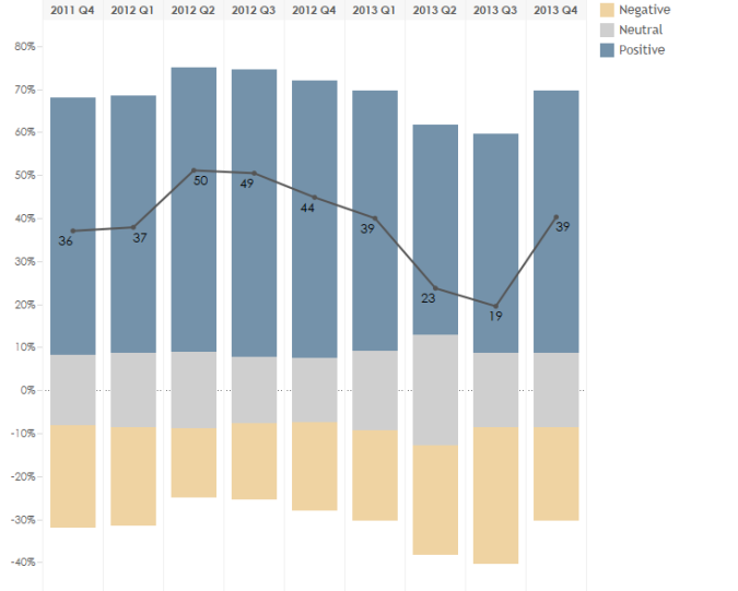
Figure 14 — Divergent stacked bar showing NPS over time with scores
Note – for some other interesting treatments of showing sentiment over time, see Joe Mako’s visualization on banker honesty.
Net = Top 3 minus Bottom 3
Let’s take the same data but divide it into the following buckets:
- Positive = Top 3 Boxes
- Neutral = Middle 4 Boxes
- Negative = Bottom 3 Boxes
Here are the associated visualizations.

Figure 15 — Top 3/Bottom 3 showing with percentages

Figure 16 — Top 3/Bottom 3 with scores
Five, Three, and Two-Point Likert Scale Renderings
Let’s suppose that instead of asking a questions on a 1 through 10 scale we instead asked folks to select one of the following five responses:
- Strongly disagree
- Disagree
- Neutral
- Agree
- Strongly agree
Here’s the same NPS data but rendered using a five-point Likert scale.

Figure 17 — Divergent stacked bar chart showing all responses
And here’s the same data, but divided into positive, neutral, and negative sentiments (3-point Likert).

Figure 18 — Divergent stacked bar showing positive, neutral, and negative
Finally, here’s the same data, but only showing positive and negative sentiments (2-point Likert).

Figure 19 — Divergent stacked bar showing just positive and negative
What about those neutrals?
I don’t have a problem comparing the magnitude of the neutral percentages that we saw in Figure 11,
but some of my colleagues suggest that you may want to isolate the neutrals in a separate chart, as
shown in Figure 20.
Alternative approach to dealing with neutrals in a divergent stacked bar chart.
Here we have a common baseline to compare the positives, the negatives, and the neutrals as
opposed to Figure 11, where the neutrals center at zero.
Other related posts I think you will find useful
How to take the “screaming cats” out of stacked bar and area charts. This addresses the biggest problems with stacked bar charts.
Survey data: don’t ignore the neutrals. Sometimes the most important story is how neutrals change over time.
Try it yourself
Here’s a Net Promoter Score dashboard featured in The Big Book of Dashboards. Feel free to interact and download.