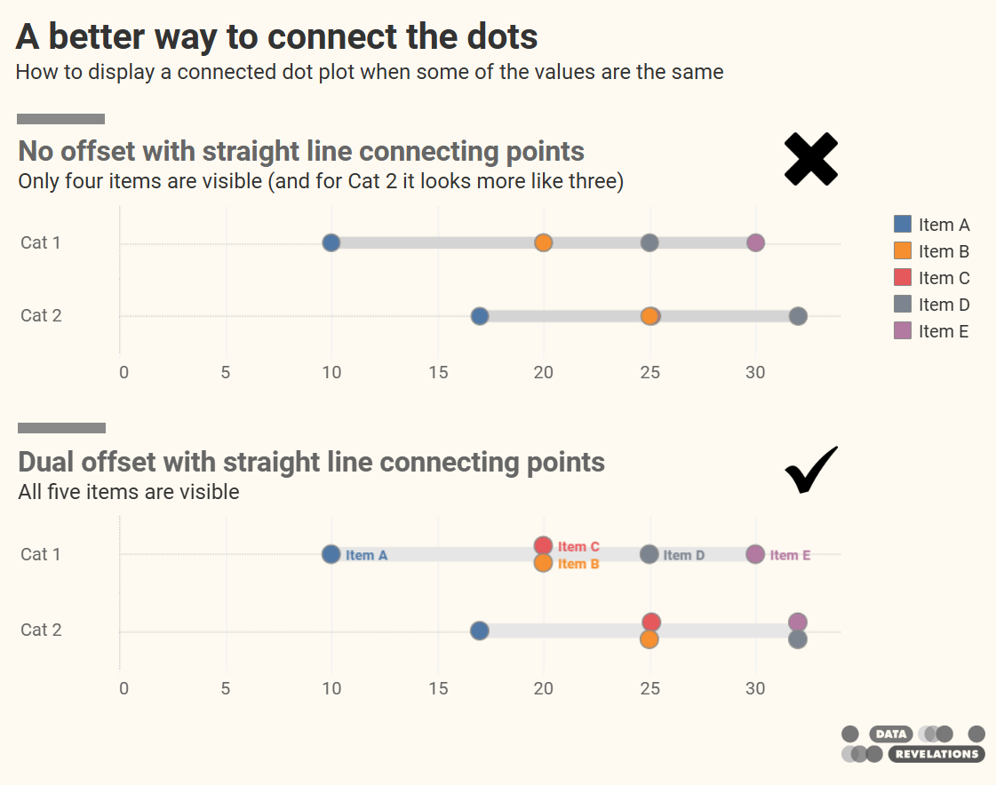
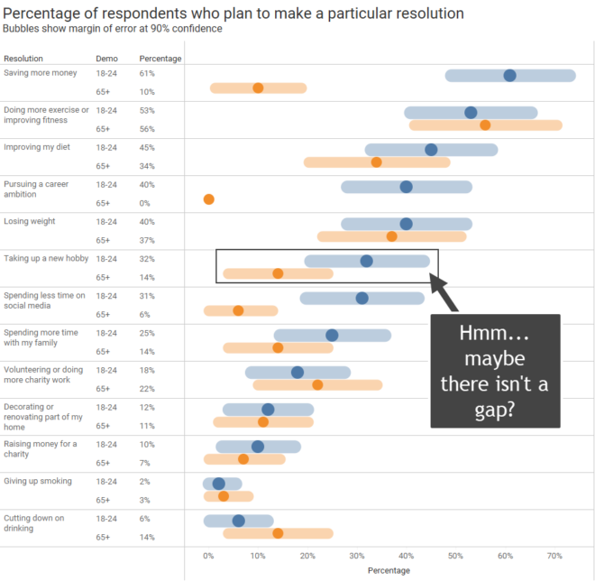
A better way to connect the dots
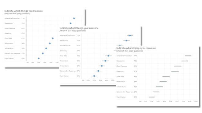
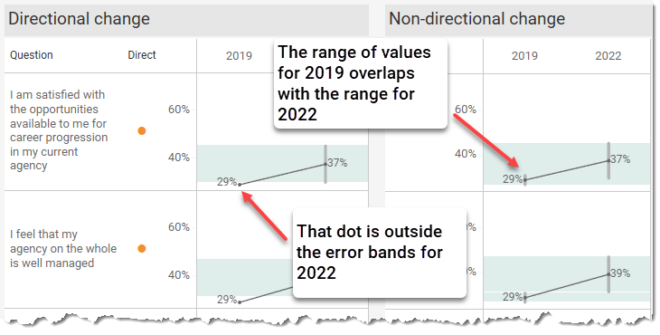
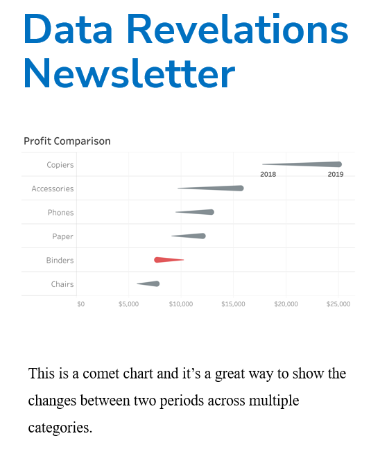
A deep thanks to Ken Flerlage for helping me out with one of the tricky parts. The connected dot plot (aka, gap chart, dumbbell chart, and barbell chart) has become my “go to” for showing the differences within demographic groups for virtually any survey data question type (Percent top two boxes, Check-all-that-apply, Median hours worked, [...]

