Survey data

WTF? Why doesn’t this survey data stuff work?

By |2022-08-03T21:39:44+00:00December 10th, 2020|Business Visualizations, Visualizing Survey Data|

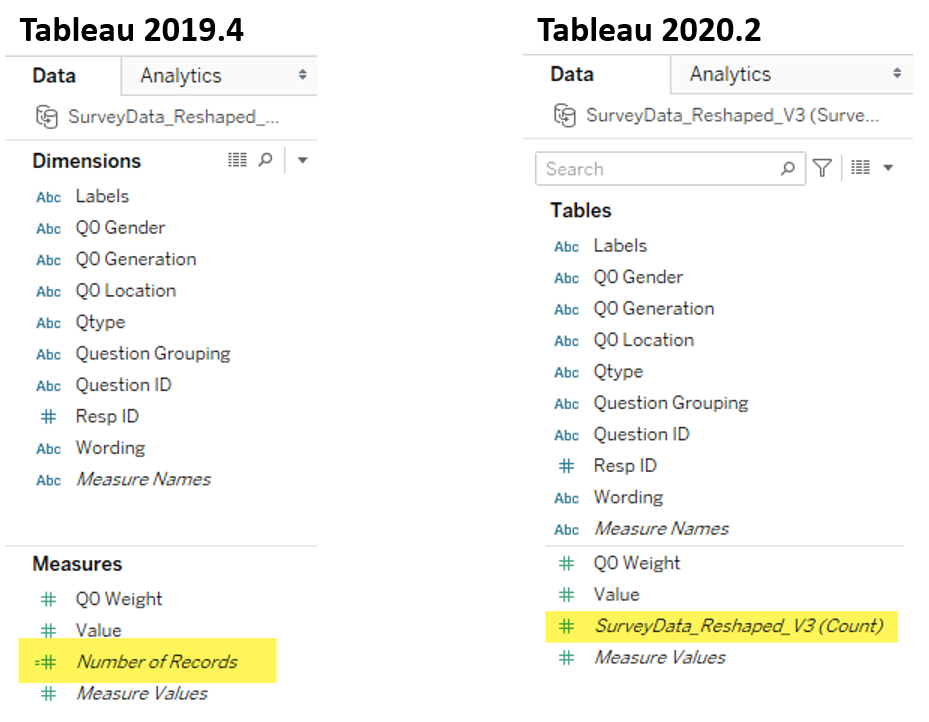
Overview I’ve written almost ten years’ worth of blog posts on visualizing survey data using Tableau (see https://www.datarevelations.com/visualizing-survey-data/). The good news is that dozens of how-to articles that are currently on my website are relevant and the techniques work. That said, Tableau made a HUGE change in how you can model data with the release [...]

Set Controls and survey data – how to compare responses for this group vs that group vs overall

By |2020-09-30T14:24:58+00:00September 30th, 2020|Business Visualizations, Visualizing Survey Data|

September 30, 2020 Overview Tableau introduced Set Controls in 2020.2. Set Controls look like checkbox filters but instead of adding and removing data from a view they determine which elements are in a set and which are not. This feature can be very useful in visualizing survey data. But why not just use filters? [...]

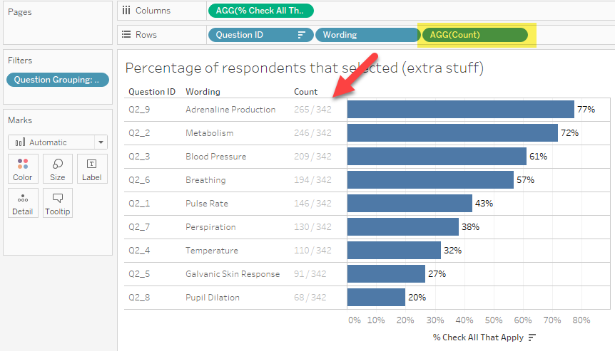
How to visualize check-all-that-apply questions using Tableau

By |2020-02-16T22:56:33+00:00September 12th, 2018|Visualizing Survey Data|

September 12, 2018 Overview I’ve recently seen some questionable approaches to visualizing check-all-that-apply questions (CATA questions) in Tableau. I’m concerned because many of these approaches won’t work if either you filter the data to only show some options, or if some of your survey participants skip the CATA questions. It’s the latter reason that [...]

Does Gartner consider this when building its Magic Quadrant?

By |2020-02-17T23:42:09+00:00February 19th, 2018|Business Visualizations, Visualizing Survey Data|

February 20, 2018 Introduction So, we are a few weeks away from Gartner publishing its “Magic Quadrant” for business intelligence tools. This annual report irks me for two reasons: Wall Street analysts pay more attention to the report than I think is warranted; and, Practically every vendor finds something to crow about in a [...]

Getting your survey data “just so” using EasyMorph

By |2021-10-11T17:24:48+00:00September 20th, 2017|Visualizing Survey Data|

September 20, 2017 Overview As anyone who has read anything on my blog that relates to survey data knows, the number one impediment to success with Tableau is getting your data “just so.” Until recently I recommended two different approaches. You can either use Alteryx and have a rock solid, robust, fully-featured, (and expensive) solution [...]