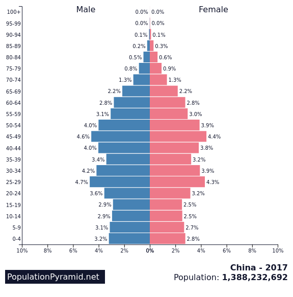
General Discussions

Comparing a target group with the entire population

By |2017-12-18T20:11:26+00:00December 18th, 2017|Business Visualizations, General Discussions, Visualizing Survey Data|

December 18, 2017 Updated September 27, 2018 to include single-select questions. Special thanks to Shaelyn McCole at Hootology who suggested the topic, Ryan Gensel at CPI who came up with a wonderful enhancement to the connected dot plot, and Jeffrey Shaffer at Data Plus Science who suggested some cosmetic improvements. Note: The original blog post only [...]

How to take the “screaming cats” out of stacked bar and area charts

By |2017-11-26T13:48:52+00:00November 26th, 2017|Business Visualizations, General Discussions|

November 25, 2017 Special thanks to Jeffrey Shaffer, Andy Cotgreave, and Rody Zakovich for feedback that helped improve the dashboard that appears at the end of this post. Overview It seems I’m not the only person who has been thinking about stacked bar charts (see posts from Cole Nussbaumer Knaflic, Jonathan Schwabish, and Andy Cotgreave.) [...]

Marginal Histograms — They’re Not Just for Scatterplots

By |2017-04-25T13:21:35+00:00April 25th, 2017|Business Visualizations, General Discussions|

April 25, 2017 Overview I became a big fan of adding a marginal histogram to scatterplots when I first saw them applied in Tableau visualizations from Shine Pulikathara and Ben Jones. For those not familiar with how these work, consider the scatterplot shown in Figure 1 that shows the relationship between salary and age. [...]

Dr. Strangechart

By |2017-03-20T07:49:10+00:00March 20th, 2017|Business Visualizations, General Discussions, Makeovers|

Or How I stopped worrying and learned to love appreciate the Marimekko March 19, 2017 Overview Readers of my blog know that I suffer from what Maarten Lambrechts calls xenographphobia, the fear of unusual graphics.  I’ll encounter a chart type that I’ve not seen before, purse my lips, and think (smugly) that there is undoubtedly [...]

Creating Auto-Adjusting Equal-sized Quadrants in Tableau

By |2017-02-22T13:34:27+00:00February 22nd, 2017|General Discussions|

February 22, 2017 Overview Earlier this week Gartner, Inc. published its “Magic Quadrant” report on Business Intelligence and Analytics (congratulations to Tableau for being cited as a leader for the fifth year in a row). Coincidentally, this report came on the heels of one of my clients needing to create a scatterplot where there were [...]

In Praise of BANs (Big-Ass Numbers)

By |2017-02-15T16:18:05+00:00February 15th, 2017|General Discussions|

Overview Prior to working with Jeffrey Shaffer and Andy Cotgreave on the The Big Book of Dashboards I tended to look at BANs -- large, occasionally overstuffed Key Performance Indicators (KPIs) --  as ornamental rather than informational.  I thought they just took up space on a dashboard without adding much analysis. I’ve changed my mind [...]

How to help make sure people don’t get it wrong

By |2017-01-17T13:43:07+00:00January 17th, 2017|General Discussions|

By Steve Wexler January 17, 2017 This is a follow-up to the post Jeff Shaffer and I wrote about what can happen when people fail to question sources and inadvertently amplify baseless findings. Overview There’s been great feedback on things the community can do to maintain all the good things about Makeover Monday (MM) and [...]

Title