I spend half my time as a musician and the other half as a data visualization “scientist”. I love both professions but one downside shared by both professions is that I cannot listen to music nor glance at a chart without trying to figure out what is going on inside the music and inside the chart.
Consider this snippet from a recent NY Times / CBS Poll on Americans’ Views on Gun Control:
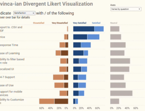
I was able to interpret this and all the other charts in the article quickly, but I found myself wondering if the information would read or “sing” better with a divergent stacked bar chart instead of a standard stacked bar chart. Here’s a version I created using Gantt bars in Tableau:
I like how the divergent (or” staggered”) approaches shows the skew in sentiment.
For information on how to create this type of chart, see Likert Scales: The Final Word and Masie’s Mobile Pulse Survey.
Note: I’m not able to post the workbook as I created it using Tableau 8 and I do not have access to Tableau 8 Public yet (it is in restricted beta). As per Joe Mako’s comments below, you can find a downloadable solution at http://public.tableausoftware.com/views/firearmownership/Dashboard.


