Note: While the information in this blog is useful, I’ve discovered some better ways to perform intra-question analysis; I just haven’t blogged about them yet. Feel free to nag me.
January 3, 2018 update. I’ve written a two-part post that explores better ways to conduct intra-question analysis. Please see this post.
Overview
So, I thought I was all done with this subject (see https://www.datarevelations.com/using-tableau-to-visualize-survey-data-part-2.html) but a couple of blog readers (Matt and Tony) “busted” me and pointed out that my approach did not address a way to conduct intra-question analysis. That is, we could cut Likert scale and check-all-that-apply questions by gender, location, etc., but there was not an easy mechanism to compare responses for people that answered “yes” to one question with their Likert scale opinions on another question. To put it another way, we did not have a way to see whether or not folks that answered “no” to voting in the next election strongly agree with the statement that a candidate is good at playing jazz.
I’ll confess that I don’t perform this type of analysis that often, but when I do, an addition to drinking Dos Equis, I find that the most interesting insights usually come from a scatterplot analysis where, for example, we compare the responses for annual household income with how much respondents are willing to pay per month for Internet service.
Note: If you have not already done so, please read Part 1 and Part 2.
Further note: click here to download the sample survey data.
Final note: The interactive visualization may be found at the end of this blog post (you’ll find the download link there as well).
What it Looks Like When it’s Done
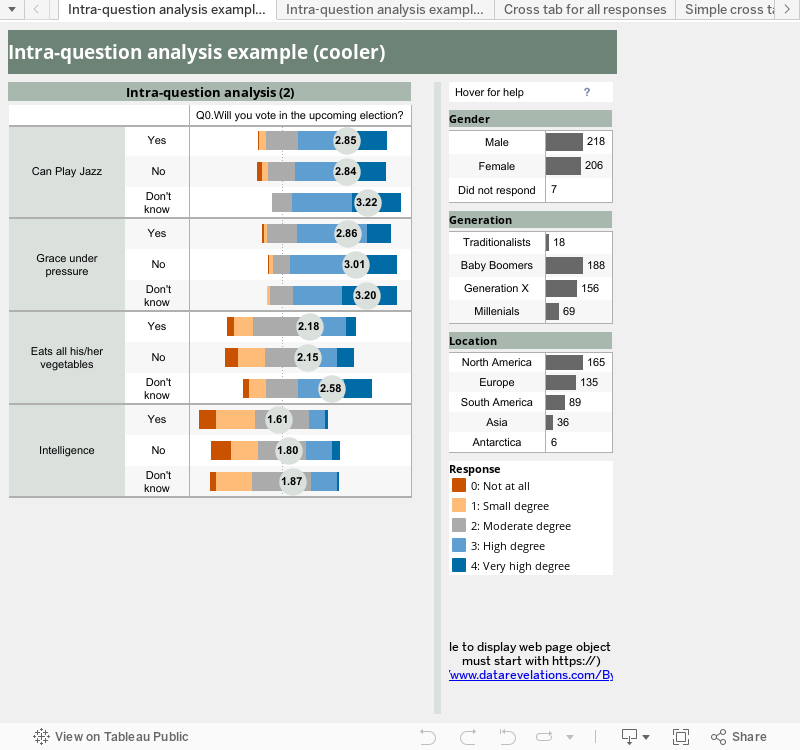
Consider the example below where I compare responses to the question “Will you vote in the upcoming election?” with respondents’ Likert scale opinions on a candidates’ ability to play jazz, their grace under pressure, consistency in eating all his/her vegetables, and intelligence.
")
Comparing plans to vote in next election with several Likert-scale questions
Notice that I’m using a staggered Likert scale visualization to offset negative from positive responses. Joe Mako busted my chops last time for not doing this in my survey analysis visualization.
That said, I am going to build a simplified visualization (the one below) as I want our focus to be on intra-question analysis, not the best way to fashion Likert-scale visualizations.
")
A simpler visualization
Getting Two Sets of Questions by Joining a Table to Itself
(Or joining a table that’s really similar to the primary table)
If you downloaded the data source workbook you will see there is a tab called “Use This One” that contains data that looks like this:

Data from the “Use This One” table
There’s another tab called “Reshaped Questions” and it contains the exact same information, but without the demographic columns:

Data from “Reshaped Questions” table.
To achieve our goals we will need to join these two sheets (or tables) using ID as a common field.
Editing the Data Connection and Joining the Tables
We need to edit the Tableau data connection, indicate that we want to use multiple tables, and then add a table (in this case the table called “Reshaped Questions”). We then need to fashion an inner join that looks like this:

Joining the two tables
Note: This approach will generate A LOT of additional rows (180K vs 9K). Once you figure out just which questions you want to include in your intra-question analysis you may want to refine your extract and exclude questions you don’t need.
Tableau will add two new dimensions to the mix, as shown below.

New dimensions giving us two sets of data
So, Let’s See What We Got
If we place ‘Reshaped Questions$’_Question and ‘Reshaped Questions$”_Reponse on the columns shelf, Question and Response on the rows shelf, and CNT(Number of Records) on the Text mark shelf, we’ll see a complete cross tab of all questions and responses plotted against all questions and responses.

Cross tab of all questions
Now we can refine our view by looking at just one question from the Reshaped Questions table and a handful of questions from the “Use This One” table, as shown here.

Comparing results from one questions with responses from several Likert-scale questions
Next, by moving things around a little bit and by changing the CNT formula to show a percentage of the total, we start to glean some interesting insights.

Refining the cross tab
And finally, if we apply some of the Likert scale visualization techniques we explored in several earlier blog posts, we start to see some interesting patterns (e.g., folks that don’t know if they will vote in the upcoming election offer more positive responses to the Likert-scale questions.)

Further refinement combining stacked bars and circle marks
So, Why is this Part 2 ½ and not Part 3?
There is so much more we could explore with respect to intra-question analysis, but I have a backlog of posts I need to write. I did, however, want to get people heading in the right direction.
One thing I will encourage people to explore is using parameters to allow consumers to select which questions they want to see displayed, especially if you build scatterplots.
Matt and Tony, I hope this addresses some of the missing pieces in visualizing survey responses in Tableau.