September 12, 2018
Overview
I’ve recently seen some questionable approaches to visualizing check-all-that-apply questions (CATA questions) in Tableau. I’m concerned because many of these approaches won’t work if either you filter the data to only show some options, or if some of your survey participants skip the CATA questions.
It’s the latter reason that really gets me as I rarely see a case where everyone who participates in a survey answers every question. If you count everyone that participated in a survey, and not just the folks that answered the CATA questions, your calculations will be off (and they could be off by A LOT.)
In this blog post I’ll show a simple technique for displaying CATA percentages as well as how to make a minor modification so the technique will work with weighted survey data, too.
Getting your data setup correctly
Before going any further, you’ll need to make sure your data is tall and not wide. That is, instead of the data looking like this…

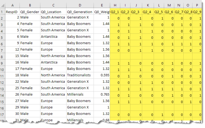
Figure 1 — Wide survey data. Check-all-that-apply questions are highlighted in yellow.
… the data should look like this:

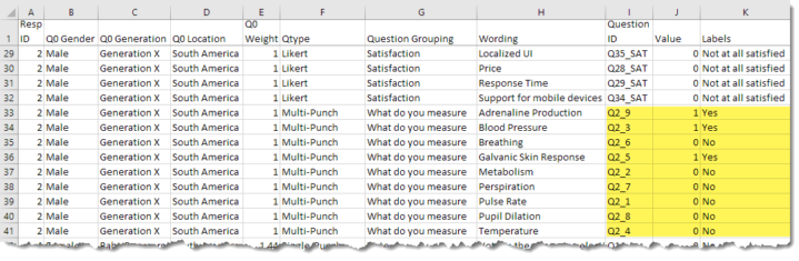
Figure 2 — A snippet of the data showing some responses for Resp ID 2. Note that we can see that this respondent selected “Yes” (1) for Q2_9, Q2_3 and Q2_5.
If this is all new to you, please see Getting Survey Data “Just So.”
I also want to make sure the data is coded as 1s and 0s (1=Yes, 0=No, Blank=Didn’t answer). If your data is not setup this way, make sure to check out Dealing with Survey Tools that Don’t Code Check-all-that-apply Questions Correctly or Using Tableau Prep to Fix Problems with Check-All-That-Apply Questions.
Creating the Check-all-that-apply percentage calculation
Consider the screenshot below where we have a filter that allows us to only focus on the CATA questions in our survey data. I’ve added Question ID and Wording to the Rows shelf.

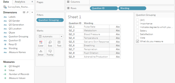
Figure 3 — Just looking at the group of related CATA questions.
Now we just need to fashion a calculation that will show us the percentage of people that selected one of the nine items; that is, we need to know how many people have a “1” associated with Q2_1, Q2_2, etc.
Here’s the calculation that will do the trick for us.

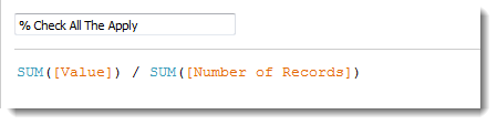
Figure 4 — How to determine the percentage of people that selected an option.
A quick translation into English would be:
Add up everybody that answered “1” (meaning they selected an option) and divide by the number of people that answered the question.
Let’s see if this works. We can change the default numeric format to percentage, drag the field onto columns, and then sort in descending order.

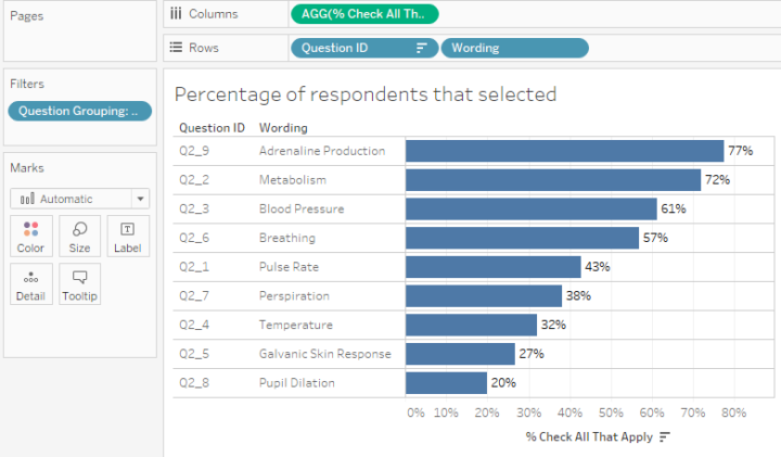
Figure 5 — Completed check-all-that-apply arrangement in Tableau.
Well, just look at that! We didn’t need COUNTD(), table calcs, LoD expressions, etc., and we can filter this to our hearts content and everything will work perfectly.
Also, if we want to also know the number of responses, we can use this calculation…

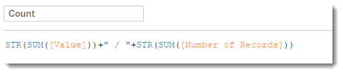
Figure 6 — String calculation to show count of people that selected an item and the total number of people that responded to the question group.
… and get something that looks a bit fancier.

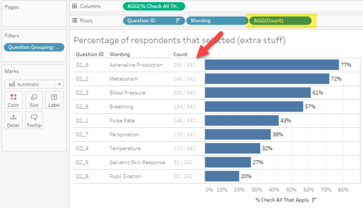
Figure 7 — Percentage check-all-that-apply with response count.
But “weight”… there’s more!
In addition to this being a really easy calculation that will work when you filter, add additional dimensions, etc., we can modify it so that it works great with weighted data.
And just what do I mean by “weighted” data? We use weighting to adjust the results of a study so that the results better reflect what is known about the population. For example, if the subscribers to your magazine are 60% female but the people that take your survey are only 45% female you should weigh the responses from females more heavily than males.
You may recall that our data has an additional weighting variable in it called Q0_Weight (see Figures 1 and 2). Here’s what the weighted percentage check-all-that-apply calculated field looks like.

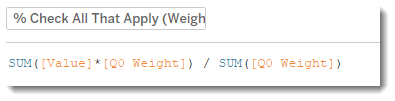
Figure 8 — Percent check-all-that-apply for weighted data.
Conclusion
If your data is setup correctly, it’s easy to visualize check-all-that-apply questions with a simple calculated field that will work with both regular and weighted data.
Related posts
Dealing with Survey Tools that Don’t Code Check-all-that-apply Questions Correctly
Hi Steve, just wanted to thank you for this guide, it was great! Really easy to follow and I just saved a ton of time putting together a dashboard with over a dozen responses.
Tiago,
I’m glad you found this useful.
Steve
Hi Steve,
I did the exact same thing (data is “just so” using you method) to create the check-all-that-apply question, however, my sum “number of records” are not right. It still shows total respondents which includes respondents who didn’t answer CATA question. For example, I have 1300 total respondents for the survey, but only 1000 of them answered the CATA question, but my sum “number of records” is 1300 and my calculation is not correct. Any ideas?
Thank you!
Chang,
My guess is that you did not either remove the Null values during preparation or filter the Nulls from within Tableau. Either technique should reduce the number of records from 1300 to 1000.
In tableau simply drag the measure that has the 0s or 1s (I usually call this the [value] field to the filter shelf, indicate you want all values, then indicate you don’t want the nulls.
Steve
Thank you, Steve! This is super helpful!! I was just wondering is there a way that I can create a filter based on check-all-that-apply question, so I can apply the filter to other question? For filters in general, if I pivot the data “just so”, I couldn’t figure a good way to create filters based on questions as there’s not variable name showing in Tableau.
Hi Steve! Thanks for all your amazing material and help!
I have a question about this type of survey question. I have a question that is sort of a double check-all-that-apply. The question is similar to “Take a look at the table below. Please tell us if you have used one of the services listed along the top, for any of the reasons listed along the side. Select all options that apply”. The data is coded to include all variations as a column. So the question is coded as Q2_1_1 (vs Q2_1 as it is in your example). I’m having a really hard time figuring out how to visualize this. Any help you could provide would be great!
Thanks!
Ann,
So, for each service (which in itself was a check-all-that-apply question) there are several check-all-that-apply questions. The first was “what do you use” and the second was “for the things that you use, how do you use it?”
I can see several ways to do this — one is just a series of descending bar charts for each service. The second would be a gap chart / barbell chart, kind of what Charlie is doing here, but the dots would be the different ways people use each service. https://public.tableau.com/profile/charlie.hutcheson#!/vizhome/MMCONSUMERSPENDING/Dashboard1?publish=yes
I don’t have a data set that would allow me to build some examples quickly. This does strike me as worthwhile, but I don’t have the bandwidth right now to explore it.
Steve
Hey Steve,
your tutorial on how to visualize survey data has been extremely helpful in a dashboard i’ve been building. However, i’m hitting a wall as to what I can do with this way of “setting up data just so”. The raw data I have has ~20,000 rows with 5 select all that apply and ~25 Likert scales.
When I pivot and convert the ~25 likert scales – the data set becomes ~500k rows.
When I then pivot the Select all that apply questions – i end up with upwards of 3-4 million rows.
This is however not a problem for most of the visualizations I need.
It only becomes a problem when I look for correlations between the different likert scales, because it requires me to join two of the same data set and find correlations between them both.
How do I go about treating this?
Avaneesh,
Two thoughts. One is that you can always treat one or more of the Likert question as demographic questions as well as regular questions and not pivot them (or pivot them, but also leave them unpivoted). You can also do some exploratory intra-question analysis following the instructions here: https://www.datarevelations.com/intra-question-1.html
Steve
Thanks Steve! That pretty much perfectly answers my question!
Hi Steve,
I followed you here through Tableau Community. Thank you for the tutorial on the visualization of survey data.
The requirement of my client is that each chart must filter all other charts in the dashboard for a focused view. This is where CATA (check all that apply) questions create a mess. (by the way, I have over 20 CATA questions).
I click on a bar of one chart, and it leaves some charts blank. This is because the CATA questions (columns) are pivoted under the same column. It would be great if you can please suggest some solution to this issue.
Thanks and Regards,
Vaibhav Bhadane
Vaibhav,
It sounds like you are trying to conduct intra-question analysis. I’ve written a couple of blog posts on this. See
https://www.datarevelations.com/intra-question-1.html
and
https://www.datarevelations.com/using-tableau-to-visualize-survey-data-part-3-dealing-with-multiple-memberships-for-respondents.html
also
https://www.datarevelations.com/using-tableau-to-visualize-survey-data-part-2-%c2%bd.html
Note that there is also a way to do this with set actions. If time permits I’ll try to put together a blog post.
Steve
Thank you, Steve!
I will look into these blog posts 🙂
Hi Steve:
Thank you so much, you have been a lifesaver as I have learned Tableau! I’m wondering if you could help me with something. I had a survey in Qualtrics that I used to create a few dashboards. Everything works fine except when I try to use the responses for a check-all-that-apply question as a filter for another question. If I click on a single answer question item, it will filter the CATA responses, but it won’t work if I click on the CATA responses (hope that makes sense). Thanks for any advice you can provide.
Paul,
What you describe is a form of intra-question analysis. I have written about this in a few places:
https://www.datarevelations.com/intra-question-1.html
https://www.datarevelations.com/using-tableau-to-visualize-survey-data-part-2-%c2%bd.html
https://www.datarevelations.com/using-tableau-to-visualize-survey-data-part-3-dealing-with-multiple-memberships-for-respondents.html
A also encourage you to watch this video from the 2018 Tableau Conference. I get into some stuff related to breaking down by CATAs:
https://youtu.be/ORyAZTmQ4nk
If you think “yes! that has just what I need” the workbook can be found near the top of
https://www.datarevelations.com/visualizing-survey-data
Steve
Thank you for such a quick response, Steve! I will review the blogs and the video.
I am at a loss how you got your [value] calculation in order to set up the “%Check all that apply” calculation. Probably a silly question, but I can’t seem to find this info anywhere. Thanks for all of the helpful info you provide!
Jennifer,
[Value] is in the data source. There is a field / column called [Value] and it contains either 1s or 0s for this type of question (vs. 1,2,3,4 or 5 for Likert scale responses). See https://www.datarevelations.com/resources/surveyjustso/
Steve
Hi Steve – I am so grateful you’ve provided this information. I’m working now with survey data for the first time and was wondering how to get my percentages for CTAC questions. So this is perfect. (Ialso pretty much bumble around in Tableau with just-in-time on-the-job learning). However. BUT, I’m not sure if I set something up wrong, I do not have a Measure for “number of records.” I have a Extract(Count) measure. I’ve made my percentage calculation as SUM([NumericResponse]) / COUNT([Extract]) and then included a filter for Value = 0 or 1 (i.e., not including NULLS.) That gets me the correct values, but I’m wondering why I don’t have “number of records” as a measure. I used your blog post about how to set up survey data using Tableau Prep and structured my Question Helper file just like yours. Thank you! Christy
Christy,
Tableau “broke” a lot of things with the introduction of version 2020.2.
The easiest thing to do would be to create a calculated field called [Number of Records] which would contain the following calc:
1
Yup. Just the number 1. The would place a “1” in every row and when you create a calc like
SUM([Number of Records])
it will give you what you need.
I need to write a blog post on this as you are not the only person that will be tripped up by this.
Steve