Overview
As I’m mentioned before the number one impediment to success with visualizing survey data in Tableau is getting the data in the right format so you can do all the dazzling things you want to do.
Up until very recently none of the survey tools vendors had done anything to make things easy so you had to pursue one of the following options:
- Use the Tableau add-in for Microsoft Excel (only works on a PC and can be very cumbersome if you have data that needs to be updated.)
- Use the pivot feature in Tableau 9.x (works great but is missing some important functionality, especially for larger surveys.)
- Use Alteryx (Best-in-class but it has its own learning curve and is pricey.)
- Get somebody to do this for you (like that’s going to happen.)
But now there is another choice and it warrants its own blog post.
Say hello to the Qualtrics web connector
Survey vendor Qualtrics has developed a web data connector so that you can connect directly to your Qualtrics surveys from inside Tableau. While the connector does not have everything I would want (more on this in a moment) this offering presents a great step forward for Qualtrics users that want to better see and understand their data using Tableau.
In this blog post we’ll look at the following:
- Wide vs. tall data (and why we need it to be tall)
- How to connect to Qualtrics survey data using Tableau
- How you can get the data “just so” using data blending
- Dealing with null values
- Benefits and possible drawbacks
Wide vs. Tall Data
Most survey tools present the data in a one-column-for-each-question format that looks something like this.
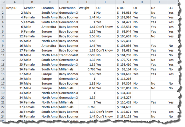
Figure 1 — One row per respondent, one column for each question
We will be absolutely miserable working with the data in this format so we need something that can reshape the data so that we have a separate row for each question, as shown below.
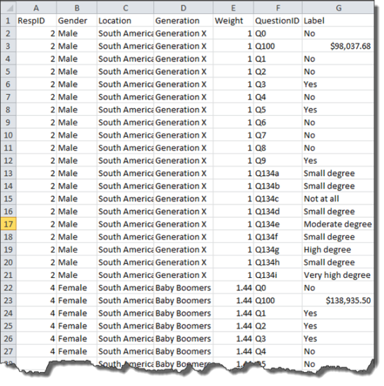
Figure 2 — Each respondent is listed many times (one row for each question)
Actually, we want to do more than just reshape the data. Ideally we want to get something that looks like this.
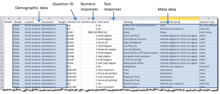
Figure 3 — Ideal format for survey data
Qualtrics can get us most of the way there, and with some simple data blending it can get us all of the way there.
How to connect to Qualtrics survey data
Let’s assume you have a Qualtrics ID and at least one survey with some data.
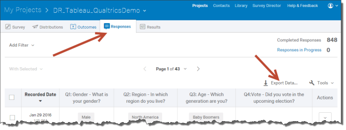
- Log into Qualtrics.com and access the survey to which you will want to connect.
- Click the Responses tab and click the Export Data button, as shown here.
- When the Export Responses dialog box appears, click Tableau, then copy the URL, as shown below.
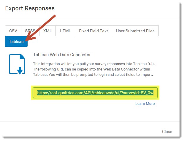
- Close the dialog box and open Tableau.
- From within Tableau indicate you want to connect to a new data source and select Web Data Connector.
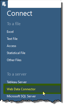
- When the Web Data Connector dialog box appears paste the survey URL that you copied from Qualtrics.
- When asked, enter your Qualtrics username and password and click Log In.
Qualtrics will then ask you which fields you want from your survey and which fields you will want to transpose - Start by indicating that you want to select all fields and transpose all the fields, as shown below.
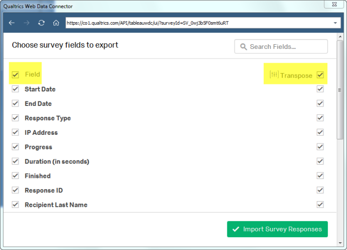
- Indicate which fields you won’t need and which you will not need transposed. In this example we will want Response ID, Q1: Gender, Q2: Region and Q3: Age to be separate columns, but all other selected fields need to be transposed (pivoted).
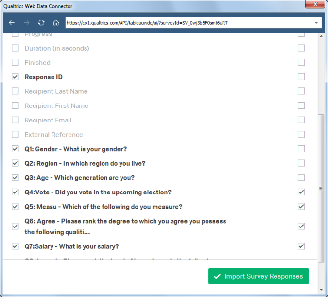
- Click Import Survey Responses and wait a little bit as Tableau imports the data and create a Table Data Extract file.
So, just what do we have here?
After specifying that we want the vast majority of questions (fields) to be transposed, here’s what we’ll see from inside Tableau.
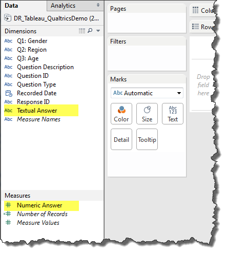
Figure 4 — Dimensions and Measures generated by the Qualtrics Web Data Connector
It may not look like much but the fact that we get both text and numeric responses to the survey questions will be a huge time saver.
Here’s what we get if we place Question ID, Question Description, Textual Answer, and Numeric Answer on the Rows shelf. Please note that Numeric Answer has been converted to discrete so we can easily see how the text responses line up with the numeric responses.
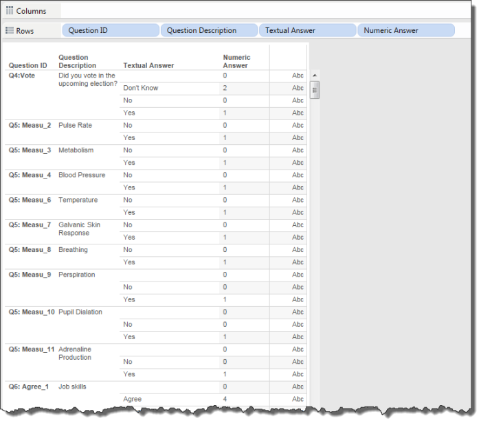
Figure 5 — “What do we have here?” viz that shows Question ID, human-readable translation of the Question ID, all possible text responses, and all possible numeric responses.
Here I can see how each Question ID maps to a human-readable translation of the Question ID (i.e., the Question Description) as well as all possible text responses and all possible numeric responses. Yes, there are some null values here, but we’ll deal with them in a moment.
I wish I can express just how beautiful this is! This has almost everything I could possibly want and I barely had to lift a finger.
Okay, what did I mean by “almost”?
This particular survey does not contain many questions so I could work with what I have right now without too many problems. But if I had a survey with hundreds of questions then I would benefit greatly from having some way to group related questions together.
Fortunately I can do this easily using Tableau’s blending feature.
How you can get the data “just so” using data blending
I need to create a separate Excel file that groups the Question IDs so that I can more easily find and manipulate the data in Tableau.
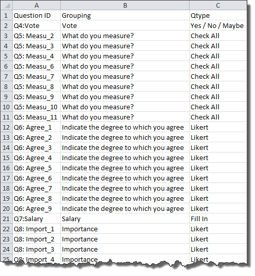
Figure 6 — Example of a “Question Helper” file.
Note: In some cases it isn’t just convenience that warrants creating this “helper” file. NPS analysis and Importance vs. Satisfaction analysis will be very difficult without building a scaffolding file like the one shown above.
Let’s see how to create the blend.
- On a new worksheet drag Question ID onto rows.
- Click the Add New Data Source
- Connect to the Helper File indicate whether or not you want to create an Extract (of course you do!)
Notice that there is a link field on Question ID in what will be the secondary data source.
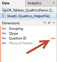
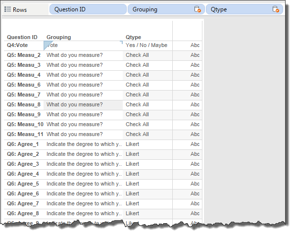
- Drag Grouping the right of Question ID and then Qtype to the right of Grouping as shown below.
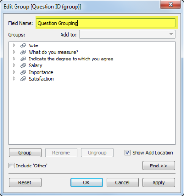
- Right-click the Grouping pill and select Create Primary Group.
- Rename the field Question Grouping as shown below.
- Right-click the Qtype pill and select Create Primary Group.
- Rename the field Qtype and click OK.
At this point we no longer need the secondary data source as we’ve created some very useful groups in the primary data source. - Remove the Grouping and Qtype pills from the Rows shelf.
- Close the secondary data source.
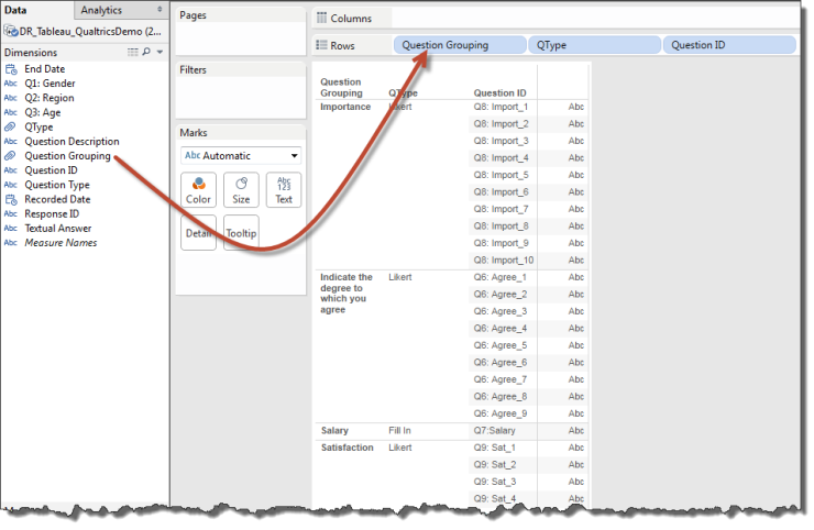
- Drag Question Grouping and QType to the left of Question ID as shown below.
Putting this to use
Let’s see how to put all this to good use; specifically, let’s see how to visualize a check-all-that-apply question.
- In a new sheet drag Question Grouping to the Filters shelf and select What do you measure, as shown below.
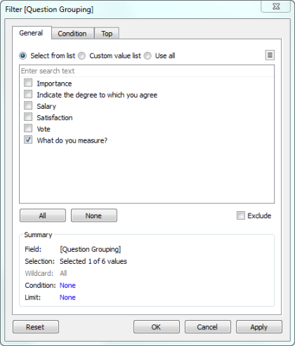
- Drag Question Description to rows.
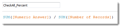
- Create a new calculated field called CheckAll_Percent and define is as follows:
- Right-click the newly created measure and indicate you want to change its default numeric format to Percentage with 0 decimal places.
- Drag CheckAll_Percent to the Columns shelf, turn on mark labels, and sort in descending order.
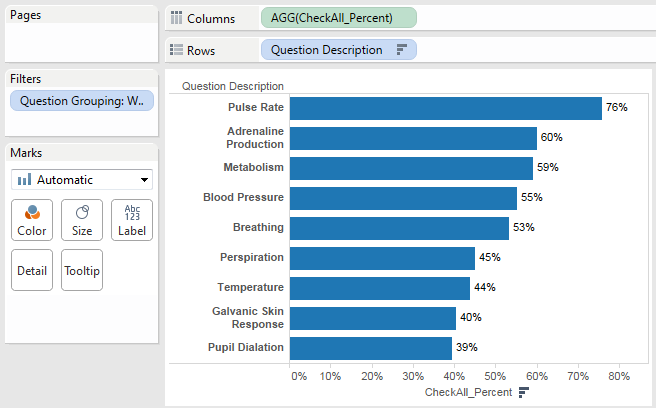
Figure 8 — Percentage of respondents that measure Pulse Rate, Adrenaline Production, and so on.
Dealing with nulls
As we saw earlier we have some nulls and we need to make sure they don’t muck up the visualization.
As of this writing the Qualtrics Web Connector writes a 0 as the numeric answer and a blank as a textual answer for Nulls. I would have expected either a “99” or an actual NULL value as we cannot simply filter the 0 values as sometimes a 0 means “no”, sometimes it may mean “strongly disagree,” and so on.
Fortunately, the Qualtrics Web Connector does write an unambiguous blank that we can use as our filter.
Let’s see how to remove the null values in the visualization above.
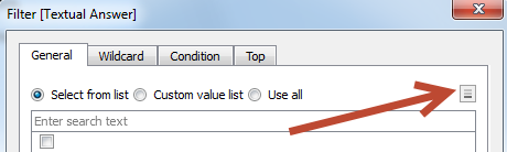
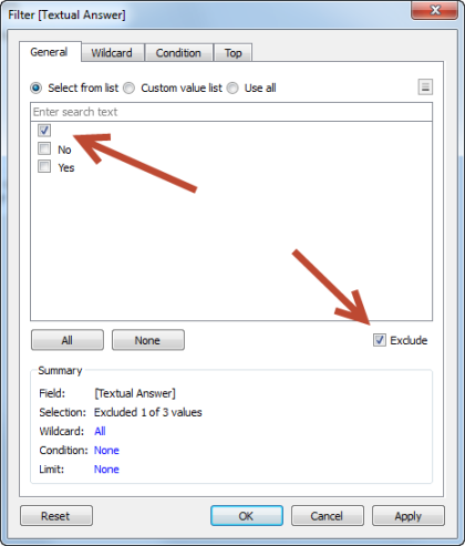
- Drag Textual Answer to the Filters shelf.
- When the Filter dialog box appears indicate that you want to see Fewer values, as shown below.
- Indicate that you want to Exclude blanks, as shown below.
Benefits and possible drawbacks
So, just what are the benefits and potential drawbacks of using the Qualtrics web connector?
Benefits
There are two clear benefits to using the Qualtrics web connector:
- You can get the data the way you need it with very little effort – there’s practically no learning curve.
- As you get more survey responses you just need to update the Extract. The workflow is seamless.
Possible drawbacks
- What happens when there are many questions? It’s unclear how well this will work when you have many questions, let alone many survey responses. Navigating the connection dialog to find the fields you want and don’t want to transpose may prove cumbersome.
- Weighted data. For those that need it, there needs to be some mechanism in the workflow to weigh survey responses. This is something that can be automated using a tool such as Alteryx.
- The Qualtrics web connector is not free and the pricing will vary based on a variety of factors. Given this, there may be cases where it makes sense to sacrifice Qulatrics’ ease and seamlessness for a more powerful and flexible ETL solution.
Conclusion
If you are Qualtrics user who wants to explore and visualize data using Tableau you should definitely take the Qualtrics web connector for a test drive as Qualtrics has made the task of getting survey data into Tableau easy and seamless.
If you’re using a different survey tool and want to visualize your data with Tableau, you may want to consider switching to Qualtrics.